
Bob Lee (QSC)
In case you missed it, I work for QSC Audio!
- Jul 3, 2001
- 12,668
- 2,036
- 67
- Disclosures
- Former Technical Communications Developer, QSC Audio

TalkBass has been independent since 1998. Add your voice.
Create a free account to reply to discussions, view embedded media, and browse with fewer display ads.
Join free Log in
Want zero display ads or expanded classifieds tools? Compare plans.
Bob Lee (QSC) said:Cool, but they look like "FE."



jrthebassguy said:Link Removed
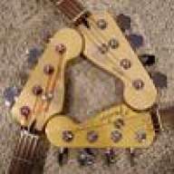


Blisshead said:Ok, OK, no need to make fun. I was using to show that the FC is somewhat transparent.

Drake Kennedy said:That's closer, but I still think that the second F line shouldn't go inside of the C, and maybe bring the C out a little farther from the main vertical line of the F. You could make the C a little narrower as well, that might help.

Bob Lee (QSC) said:Cool, but they look like "FE."