• TalkBass has been independent since 1998. Add your voice.
    Create a free account to reply to discussions, view embedded media, and browse with fewer display ads.
    Join freeLog in
    Want zero display ads or expanded classifieds tools? Compare plans.

How involved are you in your bands Artwork?

So I received probably my favourite birthday present ever today - a painting I had done about 20 years ago for school (the project was to interpret a famous painting). It is something I hadn't seen in about 20 years - and beyond all the emotions that flooded back in my memory from seeing it (in fact it is 2 hours later, and I am still flabbergasted at how old and young it made me feel at the same time), it got me thinking about all the artwork I have done for my band over the years, from painting/drawing and photography all the way to learning about typography and fonts.

I am wondering if there are any other TalkBass members who have taken on the task of creating the artwork for the band you are in as well as if you have a preferred method of working (do you operate in the analog world, or do you produce everything digitally, etc.).

Please feel free to share the artwork you have created for your band (including music videos if you had a major role in conceptualizing/filming/editing the video).


As for my painting I received today - I had chosen to interpret a Picasso through the lens of 60s psychedelia of which I was very into when I painted this in Grade 8:
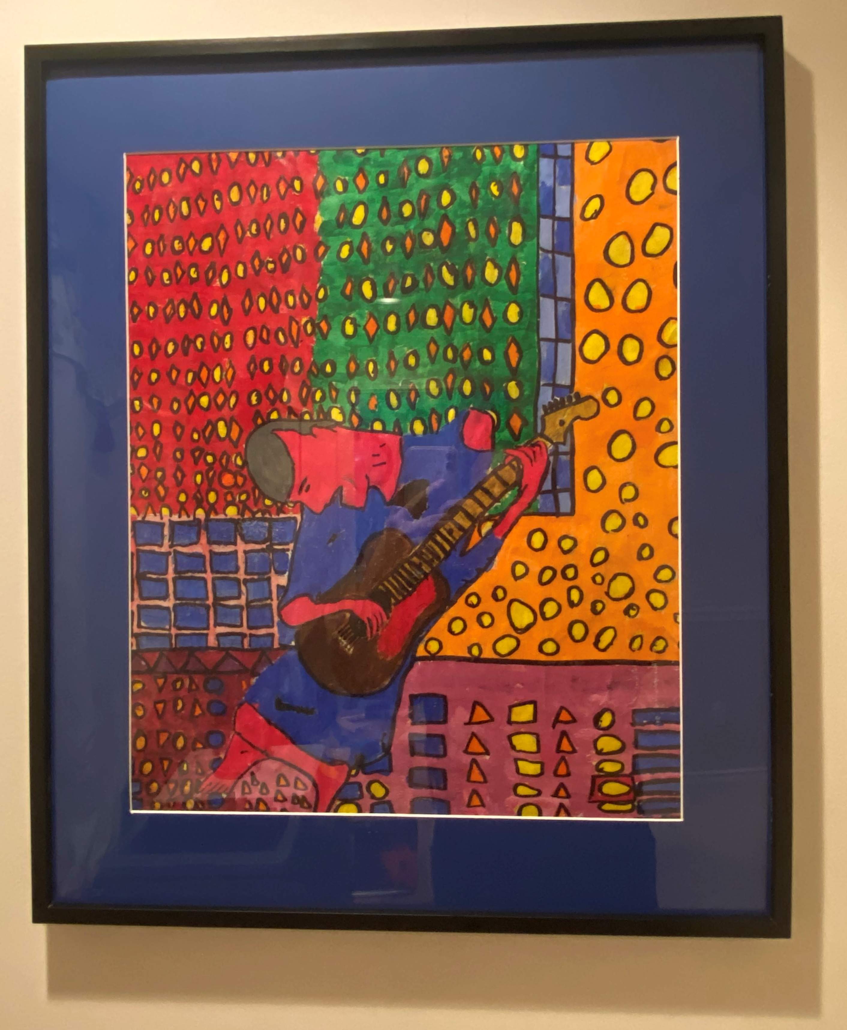
picasso.jpg


For myself - I operate mostly in the digital realm now (Paint Shop Pro), but I do draw using pens and pencils and sometimes import that into my workstation and I take a lot of photos of random stuff sometimes getting a really cool image I wasn't even looking for. I am planning on investing in a proper drawing pad for my PC soon.
 
  • Like
Reactions: JRA and Oddly
We seem to have fallen into a natural division of labors in our band, and I’m the one that creates graphics.

I also had a similar assignment to yours in college; we had to not interpret a famous painting, but do a painting in the style of a famous artist. We were told to choose someone we didn’t like, the theory being that we might know all about an artist we were a fan of. I asked if I could choose an artist I didn’t understand instead, and was told that was acceptable. I chose Jackson Pollock. It came out like this:

8159090B-9738-4E98-B8CA-3EE69CC327B5.jpeg


It’s a lot harder than it might seem at first—I threw away at least four prior attempts in which the paint all ran together and made a huge gloomy mess. I read several books on Pollock and got a sense of his working methods, and finally got this. I also found some industrial paint in my grandparents’ garage to get closer to what Pollock used, and my dad had some aluminum paint, which Pollock liked because it changed with the light.

As for our band graphics, I mostly stumble around in Illustrator (I still miss Freehand, which I found much more intuitive). Sometimes I incorporate photos. This is the one we’ve used most often:

A40BEB17-DB73-4F6E-83A1-C4D95BABA2AF.jpeg


Sometimes this one:

A23A91C9-0080-410A-988B-6CD568E52AF8.jpeg


Once in awhile this one:

D9BB6614-6ACD-4C71-9A19-C4C8F2621255.jpeg


I’m probably overdue to make something new. In fact I’m sure of it. :D
 
We seem to have fallen into a natural division of labors in our band, and I’m the one that creates graphics.

I also had a similar assignment to yours in college; we had to not interpret a famous painting, but do a painting in the style of a famous artist. We were told to choose someone we didn’t like, the theory being that we might know all about an artist we were a fan of. I asked if I could choose an artist I didn’t understand instead, and was told that was acceptable. I chose Jackson Pollock. It came out like this:

View attachment 4144639

It’s a lot harder than it might seem at first—I threw away at least four prior attempts in which the paint all ran together and made a huge gloomy mess. I read several books on Pollock and got a sense of his working methods, and finally got this. I also found some industrial paint in my grandparents’ garage to get closer to what Pollock used, and my dad had some aluminum paint, which Pollock liked because it changed with the light.

As for our band graphics, I mostly stumble around in Illustrator (I still miss Freehand, which I found much more intuitive). Sometimes I incorporate photos.

I’m probably overdue to make something new. In fact I’m sure of it. :D

Jackson Pollack isn't my favourite artist, but I never had a strong negative reaction to his artwork - like the Burroughs shotgun paintings (though less comically extreme), my understanding of his style is that the end result embodies the moment of creation - it is interesting how this type of abstraction coupled with seemingly random/wild abandon can conjure up images within images without intent.

I really like your interpretation - the way it dances up and outward with colours that remind me of 80s Zappa is fantastic. I am sure it looks even better and more textured in real life.

Out of the three band images - they are all really good, with the first having the best colour scheme and the 2nd having much tighter geometry (seriously it looks like it could be the cover of a music education book, I love it!). But the third image is the coolest of the three - the photo, has a slight menace to it (conjures up the beat generation when I see it) it would make a great album cover, if it was me I'd move the band logo either to the top or more preferably the bottom and let the image drive the concept.


I made this digital collage from a series of photos I took, based on a concept loosely described by our guitarist:

Dig it man - really liked the tune as well. The image has that 70s/80s fantasy novel cover look to it - like retro hyper realism, if that makes sense.

I do about 90% of my bands graphics and web design. I also screen print our shirts, patches, posters etc. Here’s the posters I printed up for the tour that COVID killed.

That is fantastic - love the poster, I am looking into investing in a decent printer to do this type of stuff for our band as well. Have been entertaining an idea of doing small run cardboard sleeve albums, just to hand out to friends and stuff, or sell when we busk.
 
I figure I'll post the album covers I've designed for our band newest to oldest - and somewhat the thought process behind them:

a2179735947_10.jpg

This was a cover I designed for our last single - the drawing was found outside on the street, and the guitarist saved it and brought it to me. I loved what it looked like and took a picture of it and then went about recolouring it, adding a nicer paper texture and then added the title of the song. Taking care not to cover the artist's signature should they ever see it and want to reach out.

a4166224424_10.jpg


This cover dates back about 7 years - I was very interested in Peter Gabriel's first few albums and how he manipulated film to generate them when I conceptualized this.

I owe a beer to whoever can guess how this image was made - there is a slight saturation boost, but that is pretty much what Calgary looks like in the dog days of summer.

a4260384368_10.jpg


Although it may or may not show - I was heavily inspired by Stanley Kubrick and Clockwork Orange when I was designing this, specifically the cream colour background which I spent hours agonizing over while I was designing it. Simple things like getting the spacing on the letters just right - the correct shadowing, etc. are often what I spend the most time on.

a1539846790_10.jpg


This was one of those happy coincidences - our fence got tagged with this, and the drummer took this picture for the landlord. I saw it and loved the whole concept of the graffiti right away - instantly knew it was going to be the record cover.

a3428714171_10.jpg


This album cover is funny - it is all photocopies of our faces, we took them on a state of the art photo copier at the place I was working. Took dozens of photo copies - conceptually the album is cover songs and loop-based original tracks, there is some language on the album and I really like the idea of having a censor logo on it but I preferred the film based rating system. Made sense considering the album opens up with Dan Aykroyd introducing the band.

a1132507424_10.jpg

This album cover wasn't the first one I designed for this record, but long story short I designed a digipak with a top hat for the inside cover that held a little pamphlet with this image on it (so you could pull the rabbit out of the hat). The rabbit was designed a jeweler from Florida who lent the design to us at no cost save for proper credit to his business. I still really dig this cover - especially the sonic kaliedscope background that I designed by taking pictures of light and applying heavy contrast and ripple effects in Paintshop Pro.

a2759858839_10.jpg

Finally - this was something I drew at work on a shipping label using a bic pen, and later imported into Paintshop Pro and heavily effected. The drawing itself was very stream of consciousness based - and took me 5 shifts to complete. The glowing eyes at the top are actually a picture I took of PNC Park at night. This was done about 5 years after my Picasso interpretation - and I was still very much into psychedelic shapes and colours.
 
  • Like
Reactions: JRA and farace
Generally, the most important thing in a logo or album cover is to easily convey information about the band, rather than creativity - especially since the image seen is going to be a lot smaller than an LP cover. Take a look at the Sgt. Pepper cover on your phone (never mind you don't have the sleeve, spine, or back).
 
Generally, the most important thing in a logo or album cover is to easily convey information about the band, rather than creativity - especially since the image seen is going to be a lot smaller than an LP cover. Take a look at the Sgt. Pepper cover on your phone (never mind you don't have the sleeve, spine, or back).

For me personally - I think that creativity is king, I'd much have an interesting cover that works conceptually with the songs contained within. I create all my artwork to be record sleeve sized - even if it never gets printed at that size, and am never worried what it looks like on a phone.

It all depends on the type of music you are playing though - a top 40 cover band likely doesn't need to be as creative as an original act when it comes to artwork / image (that said I have known some fairly creative cover band names over the years, most of it is tongue in cheek stuff though).
 
For me personally - I think that creativity is king, I'd much have an interesting cover that works conceptually with the songs contained within. I create all my artwork to be record sleeve sized - even if it never gets printed at that size, and am never worried what it looks like on a phone.

It all depends on the type of music you are playing though - a top 40 cover band likely doesn't need to be as creative as an original act when it comes to artwork / image (that said I have known some fairly creative cover band names over the years, most of it is tongue in cheek stuff though).

Point is if you are releasing original material, odds are it won't be in an LP (unless you are funding a vanity project) - any sales distribution will be downloads, or perhaps a few CDs sold at a show. So why not plan the artwork to maximize impact in that form?
 
Point is if you are releasing original material, odds are it won't be in an LP (unless you are funding a vanity project) - any sales distribution will be downloads, or perhaps a few CDs sold at a show. So why not plan the artwork to maximize impact in that form?

I totally understand your point of view - but I create artwork for nobody really outside myself, not that I don't take into consideration what the image will look like in the smaller form factor. I think all of the album covers except for my first one (a MySpace live EP release) look great on my iPhone.

In addition to the front cover's for each album - I have designed full album artwork with lyrics books, not all of it is released of course but I plan to eventually print small runs of them to hand out at shows.

I've released all my music for free download - I did it about 4 or 5 years ago now, just as I was about to turn 30. I figured, why not - I don't know anybody who pays for music anymore and I always felt awkward selling it anyways.

I am not worried about money - not that I couldn't use more of it, but I have a decent career type job with lots of skills outside of music and that does me fine (it even informs my art at times), and I am not even really concerned about finding a fan base - we have had decent reviews on our albums over the years, great responses at live shows, etc. not a big fan base by any means, but always a good response. If someone happens on to our records and enjoys them, that is awesome but if not - doesn't matter to me.

So long story short - I prefer to make the art I want to make, than surrender to the new industry form factor.
 

Latest posts