One of the most frequent complaints I've seen regarding the new forum is that there is too much whitespace, and that, as a result, there is far more scrolling necessary to read a thread than under the old software. I'm not convinced that is actually true.
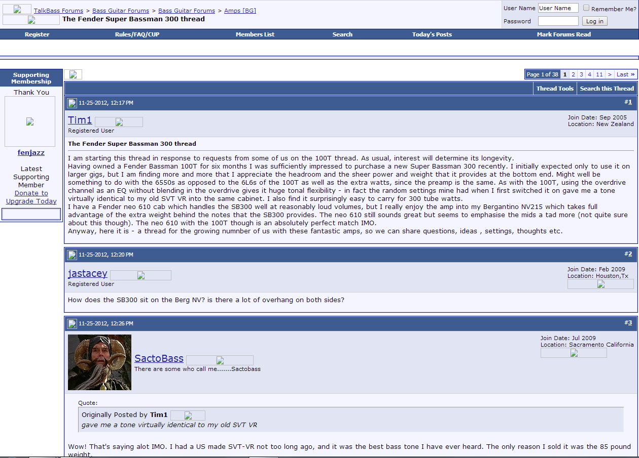
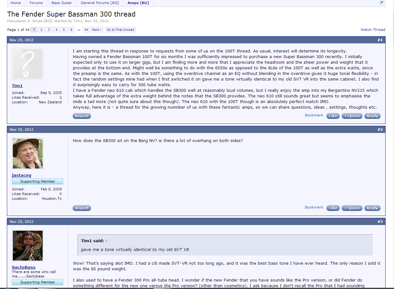
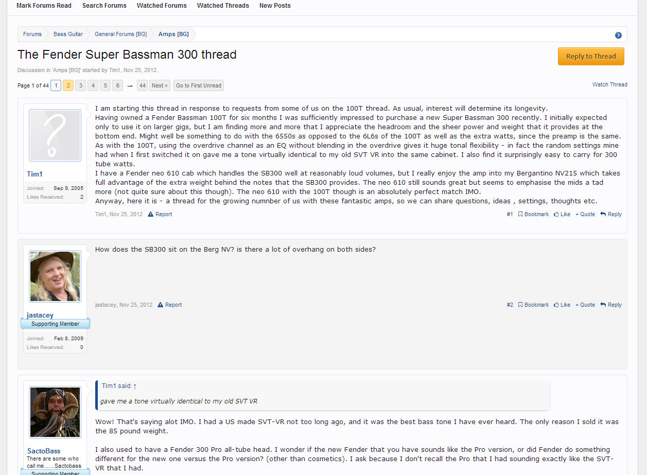
I'm attaching three screen captures of a thread that I selected at random. The first screen capture is from the old site, captured from web.archive.org. The second screen capture is from the same thread, using the TalkBass Retro theme. The third screen capture is from the same thread, using the the TalkBass 2014 default theme. I did my best to align the top of the screens in the same spot for each capture within the confines of the different layouts.
As it turns out, the old style TB displays the least amount of information for this particular thread. Both themes of the new forum displayed more information than the old TB, and -- surprise -- the TB 2014 theme displayed even more information than the TB Retro theme.
Both themes in the new forum leave a significant amount of whitespace under the post as the result of the avatars and other information being on the left of each post, rather than above the post. But the old forum left a significant amount of whitespace on the left of, and above, each post. At least with this one example that I picked completely at random (my only criterion in selecting it was that it happened to be the first thread I found using web.archive.org), the newer styles are different from the old in the location of the whitespace, but they are not worse in terms of the amount of scrolling necessary to view the thread.
(1) Old style TB
(2) TalkBass Retro theme
(3) TalkBass 2014 default theme
I'm attaching three screen captures of a thread that I selected at random. The first screen capture is from the old site, captured from web.archive.org. The second screen capture is from the same thread, using the TalkBass Retro theme. The third screen capture is from the same thread, using the the TalkBass 2014 default theme. I did my best to align the top of the screens in the same spot for each capture within the confines of the different layouts.
As it turns out, the old style TB displays the least amount of information for this particular thread. Both themes of the new forum displayed more information than the old TB, and -- surprise -- the TB 2014 theme displayed even more information than the TB Retro theme.
Both themes in the new forum leave a significant amount of whitespace under the post as the result of the avatars and other information being on the left of each post, rather than above the post. But the old forum left a significant amount of whitespace on the left of, and above, each post. At least with this one example that I picked completely at random (my only criterion in selecting it was that it happened to be the first thread I found using web.archive.org), the newer styles are different from the old in the location of the whitespace, but they are not worse in terms of the amount of scrolling necessary to view the thread.
(1) Old style TB
(2) TalkBass Retro theme
(3) TalkBass 2014 default theme



 Otherwise, I think this is great, especially now that I can get back on at work >.> As always, if I can do anything to help, just let me know (I'm pretty sure you know how to reach me
  ) Thanks, Paul!