• TalkBass has been independent since 1998. Add your voice.
    Create a free account to reply to discussions, view embedded media, and browse with fewer display ads.
    Join freeLog in
    Want zero display ads or expanded classifieds tools? Compare plans.

5 string Ricken-Musicman Bass.

Working on the trussrod cover.

Specialshout out to @Barticus for the laser cutting.
9FC71473-7F44-42D3-9248-84BBB20D8603.jpeg 55F73F42-9B4C-49F8-9DD7-503E1D9078C0.jpeg 810AA9DF-97DF-40D3-AF47-70FA7566A0C7.jpeg
 
"Here I am, brain the size of a planet, and they tell me to take you up to the bridge. Call that job satisfaction? 'Cos I don't."

View attachment 4967979
  • "You think you've got problems? What are you supposed to do if you are a manically depressed robot? No, don't try to answer that. I'm fifty thousand times more intelligent than you and even I don't know the answer. It gives me a headache just trying to think down to your level."
 
"Here I am, brain the size of a planet, and they tell me to take you up to the bridge. Call that job satisfaction? 'Cos I don't."

View attachment 4967979

  • "You think you've got problems? What are you supposed to do if you are a manically depressed robot? No, don't try to answer that. I'm fifty thousand times more intelligent than you and even I don't know the answer. It gives me a headache just trying to think down to your level."

Mos def version is my favorite movie of all time.
 
Just got (like 10 minutes ago) the truss rod covers from @Barticus. They look fantastic!

He sent me a couple of choices:
As originally designed:
20230218_133953.jpg

Unfortunately due to the materials, it's too thick for the strings...

Option 2:
20230218_133938.jpg

The cream is maple (we couldn't get the cream acrylic to cut... at all!) So I could leave it as is, or try and stain it to match the burst.

Option 3:
20230218_133926.jpg


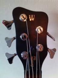
What do you guys think? Again, the cream is maple, so in theory I could stain it to match the headstock...
 
Side view of the top cover.
View attachment 4972874

That abalone one looks way cool. Too bad about it being too tall. I don't suppose the bottom could be sanded/filed down to make it shorter?

Second place vote goes to the cream lettering on black background. I'd leave it as it is rather than staining it. That pops out a little more than the other one.

If you want subtle though, staining the cream background one will get you there. I'd go the eye catching route, but that's just me.