• TalkBass has been independent since 1998. Add your voice.
    Create a free account to reply to discussions, view embedded media, and browse with fewer display ads.
    Join freeLog in
    Want zero display ads or expanded classifieds tools? Compare plans.

Build II - Paradox MJ5 - New design!

Having another idea: what if I would tape a line with small masking tape around the wenge accent layer, then one line of tape above of it (parallel) and remove the lower one. Then tape of the top completely. That way I would leave a small accent line of clear maple creating the same effect as with the headstock and I would not disguise the wenge accent layer.. Would that be doable? It would certainly be cool if it would...
 
You could have the headstock decals made of die-cut vinyl. That would give them a small amount of dimension, and make it a lot easier to apply than those silly waterslide things.

Vinyl has a significantly larger thickness and difficulty in application compared to decals. Also, vinyl is adversely affected by many of the solvents in common finishing products.
 
Agreed with the signature on the headstock as you have pictured, minus the "guitars" part and perhaps slightly enlarged, like a point or so. Definitely not much.

Also like the logo in Gold or Silver on the color background. Should pop against almost any color, really.

wraub
 
I think the full name outlined looks really good
Untitled-2_zps977f54de-1_zps976c2804.jpg
 
Agree, the test I did this afternoon also had the logo outlined, like so:

Link Removed

Looks good to me, but too small for the placement I had in mind:

Invalid Link Removed

Tried some other things, but nothing good enough to publish.

I may decide to finish the bass before I have decided on the logo, because I will almost certainly use a decal (waterslide or vinyl as suggested).

For now: Merry Christmas to you all!!!
 
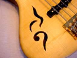
The broad sweeping curves of the bass do not suit a small detailed and somewhat linear logo unless there is balance with contrast and shape. This is why the pickguard logo idea fits "just so".

The void at the top left sticks out and and the angle against the logo and the top end of the headstock are too obtuse and incongruous. If that angle were slighter then it wouldn't clash so much. Perhaps if the font were not so wide (and hence shallow) then a large leading capital H and slightly larger "GUITARS" (150%?) would tie in a little better? I prefer the font as opposed to mashing in a different style though.

Fuzzy JD head. Sorry. Unmitigated opinion. Hey Tuesday, all.
 
What about if you made the 'H' taller, made 'b' taller than it is but not as tall as the 'H' and finally made the 'k' somewhat taller but shorter than the 'b'. The thinking here is that the shape of the logo would fill more of the space at the top of the headstock and more closely follow the curve.
 
...and just to clarify that last post, what I mean is to make the top half of the letters taller but leave the bottom half as they are. In other words leave the horizontal line in the 'H' as it is, leave the loop in the 'b' as it is and leave the left-arrow-shape in the 'k' as it is but elongate the vertical lines.

Stunning build by the way.
 
Started over, found some new fonts and 'sketched' (by transforming a font) an 'H' that's very close to what I had in mind and came up with this:

  • Looks good both upright and sideways.
  • Has both the name and a soon to be recognizeable logo :smug:.
  • It's much better / easier to read (also from a distance).
  • Fit's the rather tight headstock space better (and opposed to what some suggested I do not like filling it exactly in the same shape as the outline, tried, but looks cheesy).
  • And (not sure about that part) I can print the model name on there too..

Link Removed

I'm pretty happy with it. Now, on with the Christmas party.. :bassist:
 
You have the Finnish vote! :-D
The weighting of the fonts looks more appropriate. The void in the top left was noticed first, however the H lines up nicely with the lines inferred by the tuners and centrally across the falling line of the headstock end. Ideal.

I like the R in "Habraken". Returning lines that don't meet the ascenders of individual letters have always been a favourite of mine. Pretty much like the "P" and "R" in the original Palatino. Palatino Sans is quite nice also.

I am not however a typo geek, but I will certainly defend its honour in a bar fight or drunken street scuffle.
 

Latest posts