

Enjoy the benefits of a premium membership!
Upgrade Account
-
TalkBass has been independent since 1998. Add your voice.
Create a free account to reply to discussions, view embedded media, and browse with fewer display ads.
Join free Log in
Want zero display ads or expanded classifieds tools? Compare plans.
You are using an out of date browser. It may not display this or other websites correctly.
You should upgrade or use an alternative browser.
You should upgrade or use an alternative browser.
Build II - Paradox MJ5 - New design!
- Thread starter roberthabraken
- Start date
More options
Who Replied?
For now: Merry Christmas to you all!!!
Rob: Is this accurate? (Starting at about 3:45)

You have the Finnish vote! :-D
You also have the Tennesseeish vote.
Link Removed
I like this. Easy to read, unique identifying symbol, and very clean and neat.
I have to say, this build is truly impressive. It has inspired me to sit down and brainstorm my own unique design and hope that I could (some day) reach the level of craftsmanship found here. I'm very excited to see the finished bass! Cheers!


Love love love this build.
I'm wondering how the logo would look if you keep this layout, but substitute the "habraken" with the more hand-written looking type. I think the "H" looks great, as does the rest of the logo really, but I do really like your original choice of font for spelling out your name. It may need to be a solid line (not outlined) so as not to clash with the "H". I would also try making the model name non-italicized to balance out the wavy lines of a wavy habraken. In the end it may be too many curly lines, but it might be cool.
For what it's worth, I like that you've dropped the "guitars" for the on-the-instrument logo. Save that for the website and the business cards, as others have said before me.
Keep up the excellent work!
I'm wondering how the logo would look if you keep this layout, but substitute the "habraken" with the more hand-written looking type. I think the "H" looks great, as does the rest of the logo really, but I do really like your original choice of font for spelling out your name. It may need to be a solid line (not outlined) so as not to clash with the "H". I would also try making the model name non-italicized to balance out the wavy lines of a wavy habraken. In the end it may be too many curly lines, but it might be cool.
For what it's worth, I like that you've dropped the "guitars" for the on-the-instrument logo. Save that for the website and the business cards, as others have said before me.
Keep up the excellent work!

Love love love this build.
I'm wondering how the logo would look if you keep this layout, but substitute the "habraken" with the more hand-written looking type. I think the "H" looks great, as does the rest of the logo really, but I do really like your original choice of font for spelling out your name. It may need to be a solid line (not outlined) so as not to clash with the "H". I would also try making the model name non-italicized to balance out the wavy lines of a wavy habraken. In the end it may be too many curly lines, but it might be cool.
For what it's worth, I like that you've dropped the "guitars" for the on-the-instrument logo. Save that for the website and the business cards, as others have said before me.
Keep up the excellent work!
I agree with most of this, but I would move the big 'H' to the left a bit, use the original single line Habraken, and still put the Paradox J5 on the truss rod cover.
HaMMerHeD said:
Yes, completely accurate actually, although a bit exaggerated to make it sound more interesting and the meaning is not what you think. The black helpers are black because they go through chimneys. But this is a different event than Christmas. We celebrate both Sinterklaas and Christmas. Sinterklaas is a former saint and is celebrated on the 5th of December. Christmas is celebrated almost like at your place, but traditionally not with gifts and such, but nowadays most people do. I really wished everyone a good Christmas, Sinterklaas is already back to Spain

Thanks all for the nice words! Glad you like it too, or at least, the fact that we're getting close 
Thanks Nick!! I am glad my thread inspires you. I invite you to go this route yourself, a very satisfying and learnful way to spend your free time.
Thanks Robin!! I will try that, but I feel that combining two handwritten fonts (the one of the H and the one I first used for Habraken) isn't that good of a match in any way. I feel you get better looking results by combining a plain and clear font with a handwritten one, or use the same script font for both applications.
But I will certainly try it out tomorrow, if it comes out as a good alternative, I'll post it here too.

Doesn't ring a bell ....
Yep, I've made such a variant too, but when not on the bass, I like the H more centered, so I was struggling a bit to find the best position. As I mentioned, not sure about the model name, it kinda fills a void and makes the picture complete, but wouldn't harm to move that to the back of the bass. I'll fine tune everything tomorrow. Thanks for your excellent suggestion(s)!
And now I'm going to get some sleep. Had a fantastic Christmas, cooked a five course Italian diner for my whole family today (10 people). Great fun, but tired (it's half past one already...).
I like this. Easy to read, unique identifying symbol, and very clean and neat.
I have to say, this build is truly impressive. It has inspired me to sit down and brainstorm my own unique design and hope that I could (some day) reach the level of craftsmanship found here. I'm very excited to see the finished bass! Cheers!
Thanks Nick!! I am glad my thread inspires you. I invite you to go this route yourself, a very satisfying and learnful way to spend your free time
.Love love love this build.
I'm wondering how the logo would look if you keep this layout, but substitute the "habraken" with the more hand-written looking type. I think the "H" looks great, as does the rest of the logo really, but I do really like your original choice of font for spelling out your name. It may need to be a solid line (not outlined) so as not to clash with the "H". I would also try making the model name non-italicized to balance out the wavy lines of a wavy habraken. In the end it may be too many curly lines, but it might be cool.
For what it's worth, I like that you've dropped the "guitars" for the on-the-instrument logo. Save that for the website and the business cards, as others have said before me.
Keep up the excellent work!
Thanks Robin!! I will try that, but I feel that combining two handwritten fonts (the one of the H and the one I first used for Habraken) isn't that good of a match in any way. I feel you get better looking results by combining a plain and clear font with a handwritten one, or use the same script font for both applications.
But I will certainly try it out tomorrow, if it comes out as a good alternative, I'll post it here too.
Heh. It does seem a little redundant.
"Spaceballs, the toilet paper"!!!
Doesn't ring a bell
....I agree with most of this, but I would move the big 'H' to the left a bit, use the original single line Habraken, and still put the Paradox J5 on the truss rod cover.
Yep, I've made such a variant too, but when not on the bass, I like the H more centered, so I was struggling a bit to find the best position. As I mentioned, not sure about the model name, it kinda fills a void and makes the picture complete, but wouldn't harm to move that to the back of the bass. I'll fine tune everything tomorrow. Thanks for your excellent suggestion(s)!
And now I'm going to get some sleep. Had a fantastic Christmas, cooked a five course Italian diner for my whole family today (10 people). Great fun, but tired (it's half past one already...).
Thanks Robin!! I will try that, but I feel that combining two handwritten fonts (the one of the H and the one I first used for Habraken) isn't that good of a match in any way. I feel you get better looking results by combining a plain and clear font with a handwritten one, or use the same script font for both applications.
But I will certainly try it out tomorrow, if it comes out as a good alternative, I'll post it here too.
After looking again, I realized that the capital "H" and the original hand-written "Habraken" are two different fonts. I agree that this would probably be too busy looking when used together as a logo. Instead of my original suggestion, i wonder how things look using the same hand written font ( either one) for both the capital "H" and the "Habraken". It may be redundant, but I could also see it helping to emphasize the "H" as a stand-alone calling card for your work.
Yes, completely accurate actually, although a bit exaggerated to make it sound more interesting and the meaning is not what you think. The black helpers are black because they go through chimneys. But this is a different event than Christmas. We celebrate both Sinterklaas and Christmas. Sinterklaas is a former saint and is celebrated on the 5th of December. Christmas is celebrated almost like at your place, but traditionally not with gifts and such, but nowadays most people do. I really wished everyone a good Christmas, Sinterklaas is already back to Spain
That's awesome!
My oblique Spaceballs reference (Mel Brooks parody of Star Wars) was how the product ("guitars") is somewhat redundant in the name "Habraken Guitars" when it is printed on a guitar.
https://www.youtube.com/watch?v=AcY090XV284&feature=youtube_gdata_player
4:58
https://www.youtube.com/watch?v=AcY090XV284&feature=youtube_gdata_player
4:58
My oblique Spaceballs reference (Mel Brooks parody of Star Wars) was how the product ("guitars") is somewhat redundant in the name "Habraken Guitars" when it is printed on a guitar.
https://www.youtube.com/watch?v=AcY090XV284&feature=youtube_gdata_player
4:58
Sorry, didn't catch that, didn't even know Spaceballs was a movie (frankly, I hardly know that Star Wars is...)


Hopkins
Commercial User
I like the 'H', I also like the idea of the full name in block letters, because block letters wont clash with any other font.
I think that maybe the H should be at the top of the headstock by itself, with the full name moved somewhere else, The truss rod cover would work well.
I think that maybe the H should be at the top of the headstock by itself, with the full name moved somewhere else, The truss rod cover would work well.
Sorry, didn't catch that, didn't even know Spaceballs was a movie (frankly, I hardly know that Star Wars is...)
Count yourself lucky.
I like the 'H', I also like the idea of the full name in block letters, because block letters wont clash with any other font.
I think that maybe the H should be at the top of the headstock by itself, with the full name moved somewhere else, The truss rod cover would work well.
I'll try that too, thanks.
Count yourself lucky.
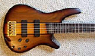
Meanwhile... the bass is curing from its first layer of varnish..

And I do have a little surprise with the finish (or a little disaster if it doesn't turn out well). More to come if I finished this step.
Hopkins
Commercial User
I'll try that too, thanks.
The reason I bring it up is,
Looking at it, to me it reeds, H. Habraken, and with the two so close together, its a bit redundant.
If the two were seperated, Habraken, in block letters would just clarify what the H on the headstock stands for, instead of H Habraken as one name.

Rob, I've always been a big fan of clean logos on headstocks. The H would look really nice by itself on the headstock. The more text you put around it the less it will stand out. Maybe put your name and model horizontally (in playing position) between the tuner, similar to Roscoe, or even on the back of the headstock. As always just my opinion though.
Thanks, as always, I'll consider it.
After a few hours (varnish should be rather dry, not completely cured though) I did a second coat as per wipe on poly instructions I found on the internet. After doing so I feel I'd rather have waited somewhat longer, as the second coat didn't spread as smooth as the first one did. But I hope I can still sand it out / back to a smooth finish?? What do you guys recommend: 240g, 320g to start with?
I'm getting a little bit better at finishing eacht time, but this is definitely not my best quality..
After a few hours (varnish should be rather dry, not completely cured though) I did a second coat as per wipe on poly instructions I found on the internet. After doing so I feel I'd rather have waited somewhat longer, as the second coat didn't spread as smooth as the first one did. But I hope I can still sand it out / back to a smooth finish?? What do you guys recommend: 240g, 320g to start with?
I'm getting a little bit better at finishing eacht time, but this is definitely not my best quality..


