Another way to think about it is this:
AC current starts at 0, increases energy in one direction, reaches peak (+), decreases energy, hits 0, and then increases energy in the other direction, hits peak (-), decreases energy, and hits 0 again.
When you measure peak value, you’re getting the power at its highest moments in the cycle, the positive or negative peak.
But most of the time that wave isn’t at peak. It’s approaching peak or approaching zero most of the time. It’s not constantly putting out that full peak power.
RMS (Root Mean Square) is a sort of “averaging” calculation to get a number that better represents the useable power of the current taking into account that its not actually at peak most of the time. It’s analogous to the power you’d get from DC, which isn’t oscillating, which is a constant flow of current at a steady voltage.
To go further at the risk of complicating things:
- I put “averaging” in quotes because it’s not actually the average. The numeric average is Peak * 0.637 and isn’t really representative of any useful real world value.
- If you look at the shape of a sine wave (AC current) on an accurate graph. (peak value is at 1 and -1, and then mark where RMS is approx 71% up the Y axis,) you’ll notice the angle of the wave is much steeper up to the RMS line, and much shallower above RMS to the peak. If you think about a speaker reproducing this sine wave, from 0 to the RMS point the cone is moving very fast. From RMS to peak it’s slowing down. At peak it stops. Then it goes the other way, moving slowly to the RMS point then faster from RMS, down to zero, and repeat in the other direction. So if you think about the speaker moving slower when it moves between RMS and Peak, you realize it’s doing less work pushing air during that time vs between 0 and RMS. The cone is moving the most air/doing the most work between -RMS and +RMS. Ergo the RMS value is kinda the “real life” value of what the amp is doing.
-Another visual cue is to look at that same Sine Wave with the RMS line. Look at the “area under the curve.” The area between the waveshape and the 0 line. That area represents the energy the wave has. Now look at the area below the RMS line vs above the RMS line. The area below RMS is much larger than above. Another way to look at that is the waveshape between RMS and Peak is contributing much less energy to the current than the area below RMS.
All this is just a long way to say what’s been mentioned before: Peak and RMS are just measurements, inherently linked to one another. Doesn’t matter that class the amp is or how much time the circuit runs. They’re just calculations on an AC current sine wave measurements. It doesn’t matter what’s creating the electricity. It’s just what the multimeter or oscilloscope reads when measuring the current.
Marketing departments like to use Peak values because mathematically they’re bigger values. There’s also a lot of clever calculus that can be done and measurements that can be taken at different points in the circuitry for the marketing departments to get even larger numbers for the Peak Value.
(Think of it like an internal combustion engine. The horsepower it puts at the shaft is different from the HP that can be measured on the other side of the transmission, which is different than how much HP you can measure at the rear wheels on a dyno. There’s mechanical loss along the drivetrain and a HP rating at the shaft will be higher and not a lie, but you’ll never be able to put that down to the wheels. Clever peak ratings aren’t necessarily a lie but you’ll never be able to put that out at the speaker cone.)





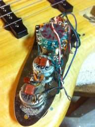





 I have it paired with a Trickfish 1x12 w/tweeter. Haven’t had a chance to turn it up because NYC apartment life. But it sounds great even at low volumes. With my 4 string with EMG PJs direct to output (no pots, and a switch for tone open/full-rolloff), gain hits the LED without ever showing clipping, I have to keep the master volume on the 2nd or 3rd tick. My Carvin is much lower output and I need to use the +9dB input and turn up the master a bit more, but I still have to keep it below 1/4 volume otherwise it starts getting a bit too loud for neighbors.