
Enjoy the benefits of a premium membership!
Upgrade Account
-
TalkBass has been independent since 1998. Add your voice.
Create a free account to reply to discussions, view embedded media, and browse with fewer display ads.
Join free Log in
Want zero display ads or expanded classifieds tools? Compare plans.
You are using an out of date browser. It may not display this or other websites correctly.
You should upgrade or use an alternative browser.
You should upgrade or use an alternative browser.
Custom 7 string fretless for Bob
- Thread starter wilser
- Start date
More options
Who Replied?
I think i have a thing for dark/light coloured wood combinations. Looks great.
I'm curious do people find that the lines at the bottom of the fingerboard aid them better for intonation than say dots on the edge of the fingerboard. Or is it more stylistic design than functional design (not that it doesn't work....you know what i mean)
I'm curious do people find that the lines at the bottom of the fingerboard aid them better for intonation than say dots on the edge of the fingerboard. Or is it more stylistic design than functional design (not that it doesn't work....you know what i mean)

I think i have a thing for dark/light coloured wood combinations. Looks great.
I'm curious do people find that the lines at the bottom of the fingerboard aid them better for intonation than say dots on the edge of the fingerboard. Or is it more stylistic design than functional design (not that it doesn't work....you know what i mean)
I guess I should answer this one, (mostly my specs-I'm thrilled to be the lucky recipient
 ).
). My fretless 4 stringers have almost no postition guides.
However with my current (Laggan) fretless 7, I find the C and F strings pretty unforgiving, especially when attempting chords.
The partial lines should help with that.
I've also asked Wilser for (per fret position) dots on the top edge.
I wanted this combination instead of full-across fret lines because I prefer the look of a (mostly) uninterrupted fingerboard.
Got me thinking about that too Bob... I just made the switch over (or attempting to) to an unlined fretboard... scarey!!! Nightmarish... my friend who did the conversion (my ibanez 6 string) laughlingly said he was "taking away the training wheels) which included the dot markers. sooooo after about 2 weeks of fear and shakey hands, he has yielded on putting brass dot markers on the top side so I won't lose my mind. The partial fret lines is a cool idea though... keep us posted!
Here's how the project stands as of today. I will start slotting the partial fretlines soon!
[Invalid or Expired Link Removed]
[Invalid or Expired Link Removed]
I will start slotting the partial fretlines soon!
Id like to see that.

I think it could be very effective, artistic, and beautiful if, instead of having the partial lines stop along a straight line, have them stop lined up with the nearby dark line in the ziricote FB wood.Here's how the project stands as of today. I will start slotting the partial fretlines soon!
[Invalid or Expired Link Removed]
[ edit ] On second thought, this would probably look great with black line strips, but not look right with maple or other light fillers.
I think it could be very effective, artistic, and beautiful if, instead of having the partial lines stop along a straight line, have them stop lined up with the nearby dark line in the ziricote FB wood.
[ edit ] On second thought, this would probably look great with black line strips, but not look right with maple or other light fillers.
Peter, I think that's a great idea! and in my opinion would look great even with the light colored lines.
But my concern is that Bob always made it a point to stress that he didn't want over the top design or visuals, so I don't know if he'll like this. Hopefully he'll read the thread and opine.
Peter, I think that's a great idea! and in my opinion would look great even with the light colored lines.
But my concern is that Bob always made it a point to stress that he didn't want over the top design or visuals, so I don't know if he'll like this. Hopefully he'll read the thread and opine.
Here I is!!
(Was just doing a pre-breakfast-with-the-guys lurk.)

Following the dark grain could be very cool.
-BUT-
Like you said Wilser, I'm going for tidy and functional.
Another concern would be once you got a certain distance away, you wouldn't see the grain pattern so well.
Then it would just look like uneven lines.
A contrasting sapwood f-board would be perfect for that idea.
Thanks for the input pilotjones, I'm always open to ideas for improvement.
Off to breakfast!

I don't understand the partial lines at the bottom of the board. IME that placement would not be visible to the player so why put them on at all?
I don't understand the partial lines at the bottom of the board. IME that placement would not be visible to the player so why put them on at all?
It may seem that way, but even on a 7, the entire fingerboard is visible to the player, as are any markings.
I have (visible) dots between the G and C strings on my Laggan fretless seven.
F basses and other makers put dot markers between the two furthest strings.
Heck, on Yves Carbonne's fretless 12 string, he has very short line markers on the furthest face edge of that enormous f-board.
I will say sometimes on the Laggan, at just the wrong angle, the smaller dots can get obscured by the one string above.
So having the partial lines instead of dots will eliminate that (minor) issue.

Yeah, the radius is either close to being flat, or no radius at all on the bigger (ERB) basses. So when you look down you have a pretty good view of the entire fingerboard. Although I do agree, I think I'd prefer the lines at the top. But then again I haven't put much thought into it, I'm not the builder or customer in this case.
Wilser, great work as always.
Wilser, great work as always.
That's what I was thinking, with white lines. If you happened to be going for black lines, the lines and their "uneven" termination would disappear to the eye as about the same time as you visually lost the guiding wood grain itself.Another concern would be once you got a certain distance away, you wouldn't see the grain pattern so well.
Then it would just look like uneven lines.
YW.Thanks for the input pilotjones, I'm always open to ideas for improvement.
Yeah, the radius is either close to being flat, or no radius at all on the bigger (ERB) basses. So when you look down you have a pretty good view of the entire fingerboard. Although I do agree, I think I'd prefer the lines at the top. But then again I haven't put much thought into it, I'm not the builder or customer in this case.
Wilser, great work as always.
A radius would not matter.
Check out the high register markings on the NS EUBs.
If you can see the string, you can see the markings beneath.
If this were a 5ver I wouldn't have face markings.
My (current) short-coming is with the intonation while attempting chords/taps using the C and F strings.
I asked mighty Wilser for per-fret dots on top, so you can mentally "connect" the top edge dots with the partial lines.
Here's a crude depiction of the player's perspective (kind of).
A radius would not matter.
Check out the high register markings on the NS EUBs.
If you can see the string, you can see the markings beneath.
If this were a 5ver I wouldn't have face markings.
My (current) short-coming is with the intonation while attempting chords/taps using the C and F strings.
I asked mighty Wilser for per-fret dots on top, so you can mentally "connect" the top edge dots with the partial lines.
Here's a crude depiction of the player's perspective (kind of).
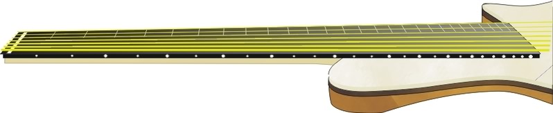
You just made me turn my laptop upside down to get the right perspective. Bass is looking good and on my six string (fretted) I can see the frets at the C string, I don't see how it would be much different with one extra string.
lowsound
You just made me turn my laptop upside down to get the right perspective.
Excellent point, thanks!
That is better!
- - on my six string (fretted) I can see the frets at the C string, I don't see how it would be much different with one extra string.
Bingo!!
We now return to the Wilser's awesome custom build thread already in progress - - -
0
.nwod-edispu saw eno tsrif ehTWait, sorry for being noob, but what's the difference in the two pictures you posted?


