This will probably sound harsh; I'll apologize but you asked, and you're free to ignore my opinion...
I _DO_ understand how hard it is to produce something like this with limited resources - I fight this battle every day too...
It is too long...
Was anyone supposed to be able to read the text on the opening screen? I made it through most of the first paragraph and then it was gone... If you can superimpose the band name and contact information in the same place throughout the whole video it would help.
All the cut effects were kinda tiresome - pick one. I'm partial to dissolve or wipe, but pick one.
I'm not a fan of song fades - hard cuts are more dramatic - yes, they're harder to pull off, I understand.
The band member graphic was quite hard to read and unnecessary anyway. The video credits were unnecessary. In both cases, the band is the product, anythig else is a distraction.
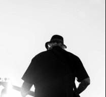
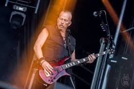
There was not enough video and most of it was from the wrong angle - I want to see people dancing and having a good time. The scene with the guy strolling across the frame seemed really out of place. A few brief scenes from the front to show that you're presentable is fine, but what you're selling is that you can excite a crowd. The static photographs were unremarkable - they're interchangeable with almost any band anywhere. You had a few that showed some energy - concentrate on those.
I know the performance videos and photographs on my band's public pages suffer from the same flaws, so I am sensitive to the issues. We're working on them and have a plan to get better stuff at the next show; it was essential that we get _something_ out to support a festival application submission. As soon as we get better stuff, what we have now will be gone.
Since this is a purpose-built promotional video, it needs to be the very best stuff you've got, from the first scene to the last, showing you can fill a room with happy people.
As a first draft, it's a good effort.