
This can’t have happened that recently, my 2020 Squier has the new logo.

TalkBass has been independent since 1998. Add your voice.
Create a free account to reply to discussions, view embedded media, and browse with fewer display ads.
Join free Log in
Want zero display ads or expanded classifieds tools? Compare plans.

I think that's what forums are for. In part, at least.8 pages... On this?

Yup. Change happened in 2018 but people are just now finding out since the designer who did the update just posted about it.This can’t have happened that recently, my 2020 Squier has the new logo.
Every time I hear a marketeer discussing "branding" I want to build a fire and hear the sound of their flesh sizzling under red hot iron. I'm well and truly sick of it.Honestly. Half the comments are omg what a waste blablabla… more of a waste to tell people what they should be interested in instead of letting them enjoy a topic they’re interested in. I don’t see anything wrong with discussing branding and history of a manufacturer that a large percentage of us has used. If you don’t wanna talk about it, cool, get out and let other people continue the conversation.


I would eat there without hesitation.
I'm a soon-to-be-former marketer (just one "e," please and thank you) and I couldn't agree with you more.Every time I hear a marketeer discussing "branding" I want to build a fire and hear the sound of their flesh sizzling under red hot iron. I'm well and truly sick of it.

Every time I hear a marketeer discussing "branding" I want to build a fire and hear the sound of their flesh sizzling under red hot iron. I'm well and truly sick of it.

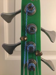
How the script q looks depends very much on the font - you will find plenty of examples of the line leading to the next letter coming both from the tail and the body. Since script fonts are ultimately based on handwriting, there is quite a range, and there is no «right» answer for how any specific letter should look.
I’m also a little confused about the pic you posted, as it looks nothing like the font used in the logo (which I’m willing to bet is not a font at all, but hand-drawn lettering). Did you intend it as an example of how a script should be constructed?