I didn’t ask a question. And I’m also a designer - been one for 35 years.It's called a spin.. Mate.. I good designer.. Does both what they ask and what looks good.. So there's the answer.. To your question..
Last edited:

TalkBass has been independent since 1998. Add your voice.
Create a free account to reply to discussions, view embedded media, and browse with fewer display ads.
Join free Log in
Want zero display ads or expanded classifieds tools? Compare plans.
I didn’t ask a question. And I’m also a designer - been one for 35 years.It's called a spin.. Mate.. I good designer.. Does both what they ask and what looks good.. So there's the answer.. To your question..
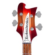
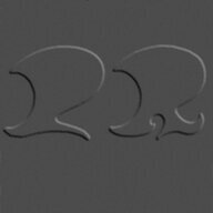
How the script q looks depends very much on the font - you will find plenty of examples of the line leading to the next letter coming both from the tail and the body. Since script fonts are ultimately based on handwriting, there is quite a range, and there is no «right» answer for how any specific letter should look.By coming off the tail of the q to the u, it does give me of an impression of how a script g is written. The tail of the q should be tight and leading line to the next letter comes from the body of the q, like the letter a. Meanwhile a g has a looped tail that leads to the next letter - from the tail. That leading edge comes from lower down and is not tied to the body.
Now a g will loop to the left and a q’s tail loops to the right. Eliminating the q’s loop and bringing the leading edge from the base of the tail makes it resemble more of a g - though with a backwards tail.
The font is confusing at best. It also looks like it’s been in use for years, so maybe your friend works for the CIA or something, and is using this “design job” as a cover?
View attachment 4947379

Don’t think I would have (or will) noticed!
Be sure to spin clockwise for Julie Andrews, if you spin counter clockwise you may turn into Wonder Woman insteadAin't it grand? I imagine myself spinning, arms out, in a freshly grown green field of new wild grass in an old oak tree grove up in the Mt Diablo foothills.
Always hated the name. Kinda like Happy Meal. Sounds like a kid’s toy. Maybe that’s the intention since they have so many “levels” of the same models.

Yeah, should have been called Jester, right? UGH...I never liked the name either. Sounds cheap, keeps me away from it as a brand.
I bet if the q was isolated and angle adjusted to match, the new one would look like a q too. In the old logo the q acts as a vertical anchor point to the diagonal upward slant of the whole word. The new logo doesn’t have the slant, and the whole thing is instead anchored to a horizontal line.The Q also looks like a G and the whole thing should be gold with a thin black outline just like the long enduring Fender logo.


It's called a "greek e" and it's a seldom seen but valid variant of the cursive lower case e. Rarely seen as it takes more time to write than the simple loop most Palmer style writing uses for lower case e....Someone mentioned the uppercase E, what's up with that?

Probably a nice sum but likely not as much if she was a NY firm with three names.They spent HOW much money on this?
This change happened in 2018 and is not new. Both my 2018 bronco and 2021 bass vi have the “new” logo.

So this has been around for over four years and we needed to have the graphic designer let us know it changed.
That says it all.