In a few years from now, we can now look forward to threads about re-issue Squiers with period incorrect logos.

Enjoy the benefits of a premium membership!
Upgrade Account
-
TalkBass has been independent since 1998. Add your voice.
Create a free account to reply to discussions, view embedded media, and browse with fewer display ads.
Join free Log in
Want zero display ads or expanded classifieds tools? Compare plans.
You are using an out of date browser. It may not display this or other websites correctly.
You should upgrade or use an alternative browser.
You should upgrade or use an alternative browser.
New Squier Logo
- Thread starter 48thStreetCustom
- Start date
More options
Who Replied?




Nothing like updates for absolutely no reason like every other company does with every product

 Someone mentioned the uppercase E, what's up with that?
Nothing like updates for absolutely no reason like every other company does with every product
"We're always looking to the future, and creating new and innovative instruments"
Fender/Servco Pacific Inc


It's know that the dictionary changes to adapt to how people mangle words every day, so here's the new logo:

That's *literally* the worst thing I've ever seen in my life

The Q also looks like a G and the whole thing should be gold with a thin black outline just like the long enduring Fender logo.In general I prefer the old one, the new one doesn’t feel as classy.
From a typist perspective, the curve of the S, especially the top half, doesn’t feel as elegant. It looks like it’s bending over to cover the q instead of aligned with the angle of the word. It feels separate.
The thickness of the u’s second line is different than both the preceding line and the subsequent line of the i. The new version has them all the same, which makes it less readable. It looks like a w.
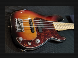
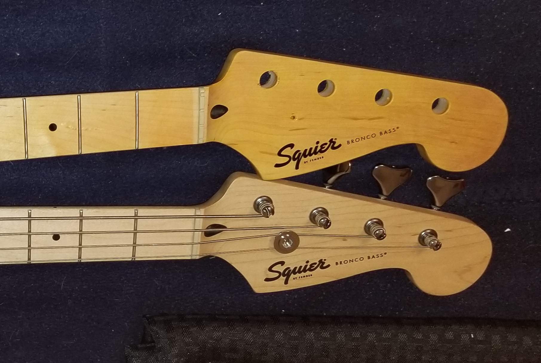
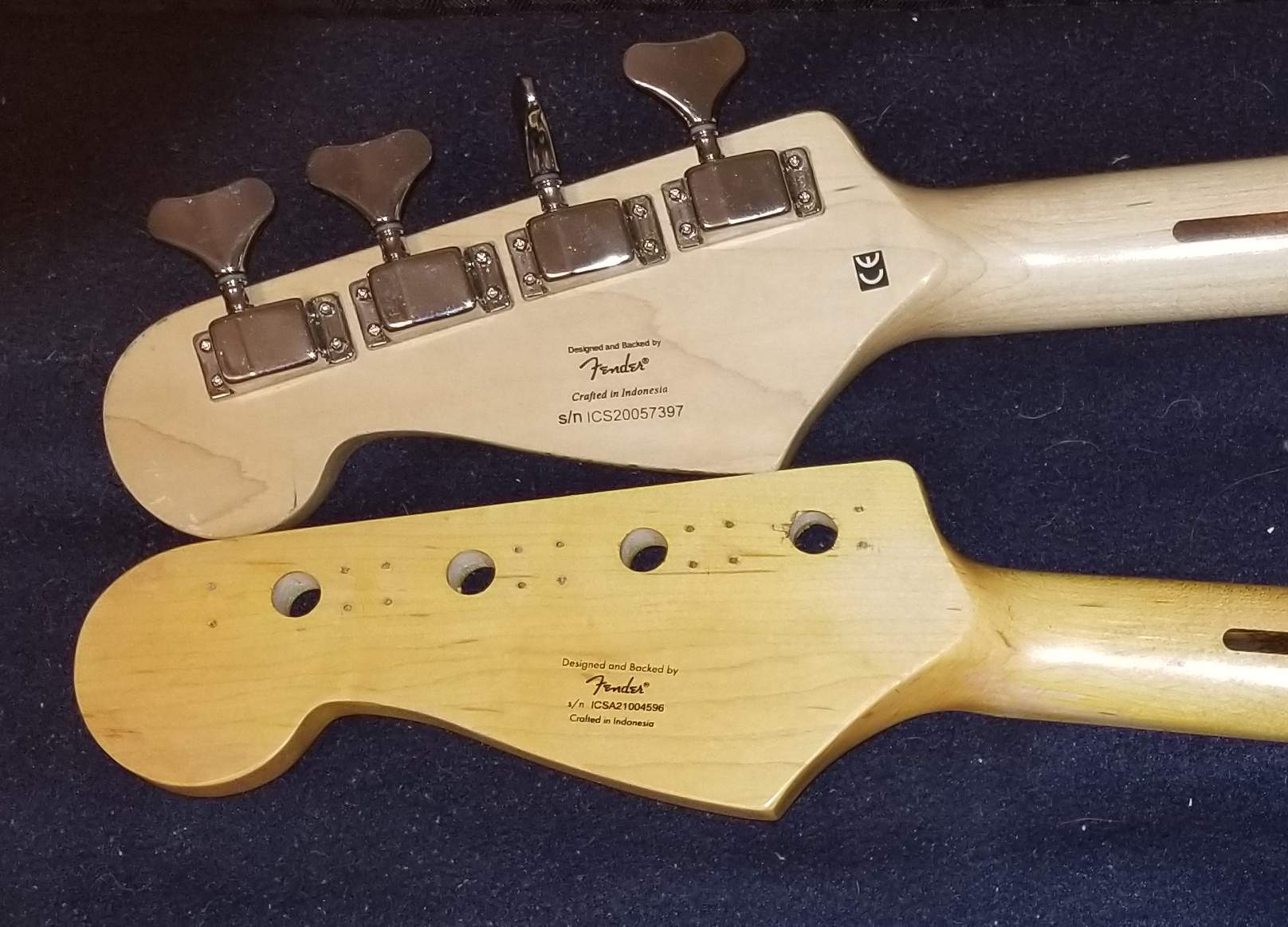
Didn't even read the entire first page. But I checked mine. 2021 on top (my tinting), 2020 on the bottom. "New"?
And just for S&Gs here's my 2001 (which I much prefer):
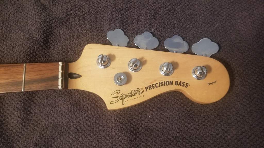
And just for S&Gs here's my 2001 (which I much prefer):
Last edited:

I hardly know myself now.wisdom right there. I feel the glow. I am the glow. We are all glowing.

Ain't it grand? I imagine myself spinning, arms out, in a freshly grown green field of new wild grass in an old oak tree grove up in the Mt Diablo foothills.I hardly know myself now.

Last edited: