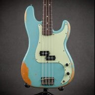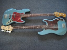
Yes..... or,at least, 5guier.They should make the “S” backwards, like 7ender.

TalkBass has been independent since 1998. Add your voice.
Create a free account to reply to discussions, view embedded media, and browse with fewer display ads.
Join free Log in
Want zero display ads or expanded classifieds tools? Compare plans.
Yes..... or,at least, 5guier.They should make the “S” backwards, like 7ender.

..well despite the tuners lining up perfectly as they should, how come the 'A' string slot is on a different angle?Despite having the more basic older logo, it’s still made to a higher standard than these new ones IME


Interesting… It’s so similar, why even bother?A graphic designer I follow on Twitter posted yesterday that Fender just had her update the Squier logo.
View attachment 4946524
[Invalid or Expired Link Removed]
[Invalid or Expired Link Removed]

I think it’s more likely that the brief said specifically not to stray too far from the original.I'm a typographer so I can tell you.. She probably gave them a lot of choices.. And they chose the ugliest one that was like the old one.. Lol.. But don't blame her for giving them what they want.. Good on her for it and making a buck..
This has already been answered. It's more even and easier to read though I hate the open qInteresting… It’s so similar, why even bother?
I can’t imagine how many meetings, opinions, iterations and dollars went into this project, only to barely change it.


Putting a glow on Squier, in a sense, puts a glow on each of us in turn.I think it makes a powerful statement about the alienation of modern humans from the world around them and creates a path for us to reconnect in a meaningful way with the true nature of the universe and our Creator, while maintaining the freedom from hate, unconditionally; freedom from self-pity; freedom from fear of possibly doing something that may help someone else more than it would him; and freedom from the kind of pride that could make a man feel that he is better than his brother.

wisdom right there. I feel the glow. I am the glow. We are all glowing.Putting a glow on Squier, in a sense, puts a glow on each of us in turn.

Really? That bad?
Yes, it's bad.




They should make the “S” backwards, like 7ender.
This is what we old farts that've been in the corporate world a long time call an "existence justification project". Someone's bucking for a good writeup in their performance review: "Managed and executed re-branding project for Squier product line". Doesn't that sound better than "made tiny subtle tweak to logo that no one looks at anyway"?I imagine many people were involved in this decision. Not to mention, how much has to be changed throughout the company, let alone in actual instrument production? Signs, letterheads, cards, PowerPoint logos, store displays...
All for a change which may likely make absolutely no difference whatsoever to anyone considering buying one of their instruments. I mean, you have to look closely to see the difference.
I imagine many people were involved in this decision. Not to mention, how much has to be changed throughout the company, let alone in actual instrument production? Signs, letterheads, cards, PowerPoint logos, store displays...
All for a change which may likely make absolutely no difference whatsoever to anyone considering buying one of their instruments. I mean, you have to look closely to see the difference.

As a former graphic designer, I like it. It’s subtle, but I can see why they did it:
- More even stroke widths, more consistent
- Each individual letter stands out more, vs the original where they were melting together in the “joins” along the baseline
- Better letterspacing
- Easier to reproduce at small sizes without the details “blobbing out” due to ink gain in print / low pixel resolution on screen
- Definitely makes the ending ‘er’ easier to read
- Overall better readability
A graphic designer I follow on Twitter posted yesterday that Fender just had her update the Squier logo.
View attachment 4946524
[Invalid or Expired Link Removed]
[Invalid or Expired Link Removed]
A graphic designer I follow on Twitter posted yesterday that Fender just had her update the Squier logo.
View attachment 4946524
[Invalid or Expired Link Removed]
[Invalid or Expired Link Removed]