
Enjoy the benefits of a premium membership!
Upgrade Account
-
TalkBass has been independent since 1998. Add your voice.
Create a free account to reply to discussions, view embedded media, and browse with fewer display ads.
Join free Log in
Want zero display ads or expanded classifieds tools? Compare plans.
You are using an out of date browser. It may not display this or other websites correctly.
You should upgrade or use an alternative browser.
You should upgrade or use an alternative browser.
New Squier Logo
- Thread starter 48thStreetCustom
- Start date
More options
Who Replied?

The good news is that I own two Squier basses which have now become "pre-2023 logo" instruments! Cha-ching! $$$ 



The new logo now speaks to the raw truthfulness of Fender's budget line in a way that I was never able to connect with before. As a consumer, I am drawn to buy them all.

Wait: I call shenanigans (@WI Short Scaler will back me up):
View attachment 4946648
She does good work (including the cover of at least one book I've enjoyed). Assuming this is her work, wonder why she'd be calling it "new."
Yes sir, I see it now. Must admit I didn't notice it before. Only photo I have at this moment but maybe you can see it. So does that prove we have truly "new" Comp Mustangs? Love it either way.
I think it makes a powerful statement about the alienation of modern humans from the world around them and creates a path for us to reconnect in a meaningful way with the true nature of the universe and our Creator, while maintaining the freedom from hate, unconditionally; freedom from self-pity; freedom from fear of possibly doing something that may help someone else more than it would him; and freedom from the kind of pride that could make a man feel that he is better than his brother.The new logo now speaks to the raw truthfulness of Fender's budget line in a way that I was never able to connect with before. As a consumer, I am drawn to buy them all.

My new Squier logo is better than any Fender logo I've ever played.

Huh, that Q sorta does look like a G now that it’s been pointed out. I’ve always wondered about the Q in the Squier logo, they’ve made me feel like something’s wrong with me for doing my lowercase cursive Qs like this:

I think the wording in her post may be leading to confusion as well. She says, “Posted this brand refresh today,” which may me she did it today and is posting about it, or may also mean that she did it previously and is only now posting about it. I’m leaning towards the latter, as my brother’s a graphic designer and I know a lot of times (but not always) he’s not really able to share what he’s been working on until after it’s been released to the public by the company.
I think the wording in her post may be leading to confusion as well. She says, “Posted this brand refresh today,” which may me she did it today and is posting about it, or may also mean that she did it previously and is only now posting about it. I’m leaning towards the latter, as my brother’s a graphic designer and I know a lot of times (but not always) he’s not really able to share what he’s been working on until after it’s been released to the public by the company.

wintremute
mediocrity at its finest
- Oct 16, 2014
- 6,942
- 29,551
- Disclosures
- Endorsing Artist: Langstrom Carrot Farms
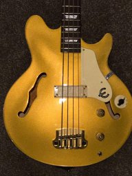

I’m glad your friend made a few bucks, but it looks the same to me. Never would have noticed if you didn’t point it out
I don't really care either, but since TB posts are cataloged forever, I thought I should document it.




[Invalid or Expired Link Removed]
Thanks. That'll be $20,000 for the redesign. (After agency markup).
Not much of a "redesign" if you can't tell the old one from the new one at a glance. More like a really minor tweak.
Fender would ever let them do a complete overhaul. It's a legacy brand. The Fender logo has only had minor tweeks over the past 70 years.

Thanks. That'll be $20,000 for the redesign. (After agency markup).
 I'll bet it went through 20 rounds of revision because everyone on the committee had to put their ¢2 in.
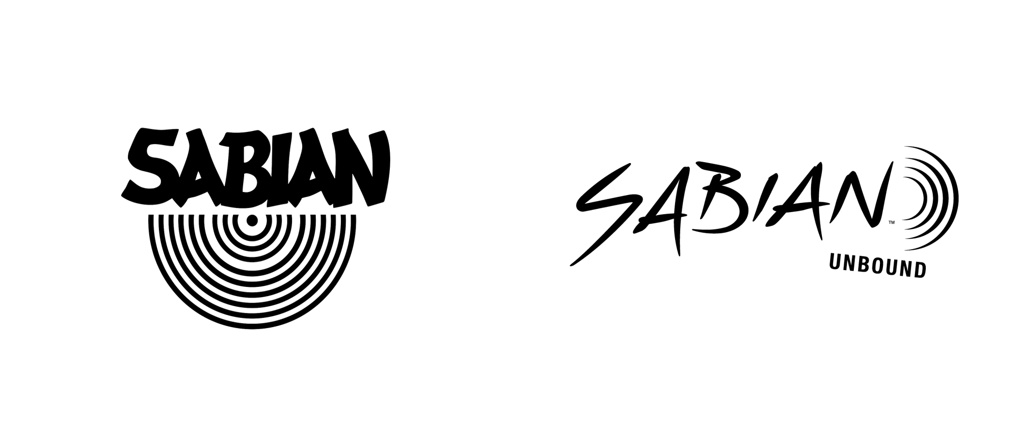
It doesn't bother me. I still think the worst music logo redesign is Sabian cymbals. Thank God they only print them on the underside now.
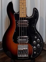
Looks like the "minimalist" approach is taking off. Eventually, everything goes full circle. Not a big fan of the "new" look, but it doesn't bother me a whole lot.
As a former graphic designer, I like it. It’s subtle, but I can see why they did it:
- More even stroke widths, more consistent
- Each individual letter stands out more, vs the original where they were melting together in the “joins” along the baseline
- Better letterspacing
- Easier to reproduce at small sizes without the details “blobbing out” due to ink gain in print / low pixel resolution on screen
- Definitely makes the ending ‘er’ easier to read
- Overall better readability


