• TalkBass has been independent since 1998. Add your voice.
    Create a free account to reply to discussions, view embedded media, and browse with fewer display ads.
    Join freeLog in
    Want zero display ads or expanded classifieds tools? Compare plans.

Amp Design (Looks, Not Sound)

Nov 3, 2003
2,397
2,522
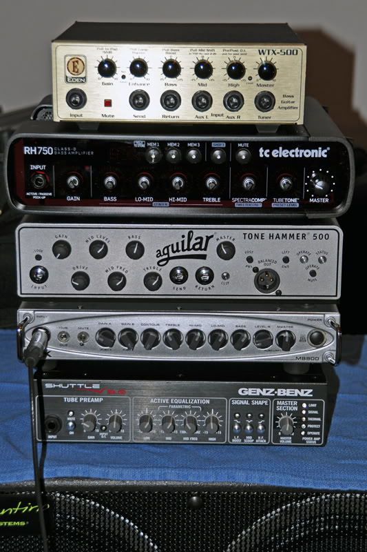
Here is a pic posted by Munjibunga in another thread:
5micros-2.jpg


What strikes me about this pic is the design layout of the Genz Benz amp. When compared to the others it looks downright amateurish. (I've always thought the same about Carvin.) I'm talking about colors, the fonts, buttons, etc... It looks like it was designed by the guy doing AC Delco stereos in the '80s.

Considering how much money a company has to put into product development one would think it a relatively minor expense to hire a competent design firm. Why do you think some companies don't think of this as important?
 
It looks utilitarian to me. I'd bet that it was a decision they thought about, too. IMO the Aggy is a visual nightmare.

The Genz looks like the winner in terms of easy legibility, so yes, you're right in that regard. However, they have 3 different fonts on that front that bare no relation to one another. A competent designer could have given them a utilitarian, legible front if that's what they wanted, but as it is, it looks homemade.
 
Here is a pic posted by Munjibunga in another thread:

5micros-2.jpg


What strikes me about this pic is the design layout of the Genz Benz amp. When compared to the others it looks downright amateurish . . .

:hmm: I'm not terribly crazy about GB styling either, but if we are going to judge, its photo should at least feature the correct knobs (aluminum). As well, the TC is missing several knobs.

 
I agree, the easy read-ability of the Genz front panel trumps any question of prettiness. I personally bought the GK head for many reasons, but its visual styling was not one of those reasons. That said, of the amps in that stack, if I had to choose one based on looks I would either pick the Genz for legibility or the GK for style. The rest leave me cold.
 
Genz benz in the pic looks like the knobs have been replaced and the 3 fonts make sense 2 are branding and the main label font is clear and easy to read. The design is pretty solid IMHO.

shuttle6_lg.jpg


Aguilar branding/design has a really elegant design style history. The recent tone hammer amps has veered a tiny bit mainly in layout of controls which I do think is a flaw design wise. I think the pedal makes more sense layout wise.
new_db359.jpg


I love old GK 400RBs before they went to II - IV... the original design/layout is was very elegant usable. I looks like the Genz Benz Shuttle series design/layout gives a nod to this classic design.
6830552137_e1fcc10499_z.png
 
While I'm partial to the GK ( I own 2) and I like the looks of the TC, I think the rest look like they came out of a Heathkit catalog in the 70's. Ya, I know it's the sound that counts the most, but looks are important too. Who would buy a 500 horsepower supercar if it looked like a Yugo?
 
It's funny when I first saw the picture in the OP and before I read the paragraph beneath it I though the Genz Benz looked best! But I wonder how much this has to do with everyday context - I'm a biophysicist and we use lots of custom made electronics kit with no thought at all on the front panel design! Meanwhile I'm suspicious of anything that looks too good (the Aguilar for instance - the knobs look all over the place!).
 
I love old GK 400RBs before they went to II - IV... the original design/layout is was very elegant usable. I looks like the Genz Benz Shuttle series design/layout gives a nod to this classic design.
6830552137_e1fcc10499_z.png

Funny you should mention and show that GK. Its the one amp head I've always thought had AWFUL industrial design. White on light grey text for extreme low contrast viewing? Ugh. And that split front panel with the black lower half and the grey upper half looks completely cobbled together to me.
 
I find the TC the easiest to read on a dark stage.....mainly due to the lack of knobs. Maybe they're on to something there.


Ya, I like my GK's but, you have to know what controls are what, very hard to read in the dark, including the line on the knobs. Of course, it's easier to read after the knob centers fall out and you mark them with whiteout.
 
I find the TC the easiest to read on a dark stage.....mainly due to the lack of knobs. Maybe they're on to something there.


Ya, I like my GK's but, you have to know what controls are what, very hard to read in the dark, including the line on the knobs. Of course, it's easier to read after the knob centers fall out and you mark them with whiteout.

Grey on grey with white markings and grey knobs... :)

I just remember an era of about 1993-1999 where about half the provided backline would have these GK heads and having a hard time on a crowded stage with bright stage lights figuring out what the heck was going on with them.
 
I think they all are pretty good designs, and I like that the GB does not feature some gimmickly "flashy" control panel. ...Like these, which pretty much give me a headache:
Invalid Link Removed
 
I think they all are pretty good designs, and I like that the GB does not feature some gimmickly "flashy" control panel. ...Like these, which pretty much give me a headache:
Invalid Link Removed

BLING!

Get some stage lighting on those and see if you can find the tiny font or the indicator line on those knobs.