• TalkBass has been independent since 1998. Add your voice.
    Create a free account to reply to discussions, view embedded media, and browse with fewer display ads.
    Join freeLog in
    Want zero display ads or expanded classifieds tools? Compare plans.

Amp Design (Looks, Not Sound)

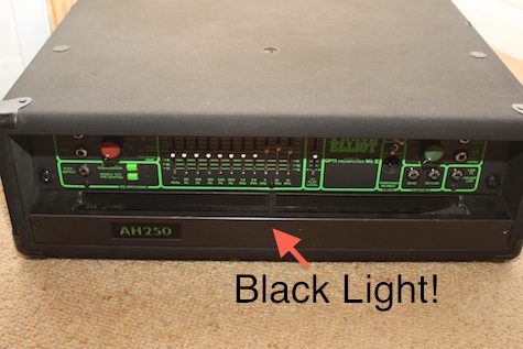
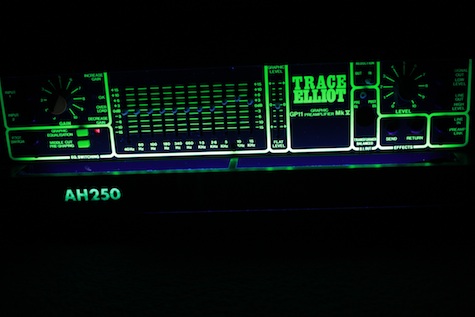
Well since we have now branched out into "all amps" I dug out my old and sadly unreliable Trace Elliot complete with a built in black light. I never had any problem finding the controls to tweak things on a dark stage AND it made other things nearby look cool as well! Also good big knobs for the gain and volume.

Trace1.jpg


Trace2.jpg
 
In the OP picture borrowed from another OP, I'd call the GB the easiest to look at and perhaps the easiest to use. The TC isn't as horrid as other comments have made it out to be, particularly when you take into account that the knobs are missing. I can understand that the lighted up panel can be a drawback in certain stage settings, but I think it would be very handy.

To me, the GK looks like a bad radio design without the channel readout.

I've come to respect JohnK's comments, but in this instance I've got to say that I never understood the VOX design. The only thing worse to me would have to be having the knobs on the back side of the head. I do agree though that the old Sunn design simply rocked when it came to ease of operation, to say nothing of pretty much rocking in general.

iJazz - I only wish I could suffer the "poor design" of the Genz.

The knobs at the top/back or just on the back of the amp date to the earliest days of guitar and bass amps. Because most of the players were seated on the bandstand and usually playing with bigger bands, their amps were next to or right in front of them, and in that position, those controls are easily visible and reachable...as opposed to later 'rock' setups where the players stood in front of their amps to hear them. In the case of the Vox amps, which date to the 'rock' era, it really seems just like a stylistic hold over.
 
Even though I never (NEVER!) did buy an amp because of its looks but because of its tone, I think that GenzBenz makes beautiful amps. Look at this beauty!

I think discussing about the design of bass amps is like having an argument about forks with 3 or 4 teeth instead of enjoying the meal.
 

Attachments

  • !!!!!!!!!!!!!!!!!!!!!!!!!!!!!GBE1200.jpg
    !!!!!!!!!!!!!!!!!!!!!!!!!!!!!GBE1200.jpg
    9.3 KB · Views: 52
It looks utilitarian to me. I'd bet that it was a decision they thought about, too.

Agreed .. and everything is in it's own grouping. You could easily tweak this head blindfolded after having owned it for a few hours. I can look at the other bass player's amp on the platform from my seat and have an idea of how he has it set just by looking at the lights. The GK looks like a knob nightmare they are all so close together.

It's really useful in those low-light gig settings.
Just tweak the lowend a bit... no wait is that the gain? Now it's a messed up.... Give me a minute guys.

ROFL!! Now that was funny...
 
Based on the options in the photo, I think the GB looks best hands down. I don't care much for the looks of any of the others. With respect to micros, my favourite looking one would be the Streamliners, and the most hideous without a doubt is anything MarkBass. Ugh.


+1

I heard a guys markbass on a gig shared with another band. Sounded pretty darn good, but call me whatever you want, can't get past that Stryper yellow. The guy sounded damn good on that little markbass, offered to let me play it for our set, I told him "no thanks", put my T-max and my homemade cabs up there and rocked the house my way.
 
:hyper:I like the straight ahead look of the GB, like GK's but the knobs and lettering are too hard to figure out quickly on a dark stage. I used to like how certain companies like Trace Elliot had lit keys. One year the old Acoustic Control Corporation had out a bass amp with all lit controls and a lit graphic eq.
Now here's an amp that really is professional looking and you know it's undergone years of graphic development. And it means business. None other than the Sears Silvertone!

http://johnkvintageguitars.homestead.com/silvertone-front.jpg
 

Attachments

  • silvertone-front.jpg
    silvertone-front.jpg
    69.2 KB · Views: 61
:hyper:I like the straight ahead look of the GB, like GK's but the knobs and lettering are too hard to figure out quickly on a dark stage. I used to like how certain companies like Trace Elliot had lit keys. One year the old Acoustic Control Corporation had out a bass amp with all lit controls and a lit graphic eq.

Now here's an amp that really is professional looking and you know it's undergone years of graphic development. And it means business. None other than the Sears Silvertone!

Now that is one clean amp. No getting lost in those controls there.
 
Ah, for the good old days of just Volume, Bass, and Treble. :bassist:

This oldie's controls are pretty straight forward; you don't need "the manual", you don't need to do any math, you don't need a flashlight, you don't even really need to look, just reach back and twist away until it sounds good.

You do need to pay attention to your technique to adjust/fine tune your tone though... ;)

Unique design on the head cab as well, kind of "googie".
Truthfully I never was a big fan of that slanted faceplate look, but it sort of grows on you.

DSC00065S1.jpg