
Enjoy the benefits of a premium membership!
Upgrade Account
-
TalkBass has been independent since 1998. Add your voice.
Create a free account to reply to discussions, view embedded media, and browse with fewer display ads.
Join free Log in
Want zero display ads or expanded classifieds tools? Compare plans.
You are using an out of date browser. It may not display this or other websites correctly.
You should upgrade or use an alternative browser.
You should upgrade or use an alternative browser.
Amp Design (Looks, Not Sound)
- Thread starter matante
- Start date
More options
Who Replied?
Grey on grey with white markings and grey knobs...
I just remember an era of about 1993-1999 where about half the provided backline would have these GK heads and having a hard time on a crowded stage with bright stage lights figuring out what the heck was going on with them.
I do have a handful of mini-chickenheads around here I had considered putting on it
 , but frankly, I'm used to the thing, can set it with my eyes shut. Once it's dialed in for the room, or lack of a room, it pretty much stays that way the rest of the night. Might crank up the growl knob for some songs, down for others, but most of the tone changes come from the hands and/or the bass.
All those amps are pretty god awful looking IMO. Another one, while simpler, but I just can't stand it is some of the ORange stuff. I mean they look like a freaking mailbox!
I've always like me some Trace Elliot gear because it's that high intensity green over black, pretty easy to read...
I've always like me some Trace Elliot gear because it's that high intensity green over black, pretty easy to read...

BurningSkies
CRAZY BALDHEAD
- Feb 20, 2005
- 27,956
- 20,348
- Disclosures
- Endorsing artist: Dingwall Guitars
I do have a handful of mini-chickenheads around here I had considered putting on it
That's why I'm loving my Kern. Chicken heads, black box with bold white type.

Truth be told, I'd rather an amp company put their R&D dollars into sound and reliability, as opposed to spiffy looking faceplates. I need to judge at a glance where things are set, which buttons are in/out and be able to see it when the ADD light guy is flicking back and forth between deep reds and all blue.
The TCE wins hands down in that department, but the Genz is not bad, I'd imagine.
The TCE wins hands down in that department, but the Genz is not bad, I'd imagine.
That's why I'm loving my Kern. Chicken heads, black box with bold white type.
Ya, that's about the best layout I could imagine. Flashy panels, blinding lights, knobs with thin marker lines, thin/small font, none of that stuff is practical, especially if it's supplied backline where you have a lot of players coming through, many of whom may not be familiar with it. If it's somebody's personal amp nobody else plays....not such a big deal.

Out of that grouping, I have a hard time agreeing with the OP that the Genz Benz is the weak one of the bunch.
Eden heads look sloppy and cheap to me, and the Aguilar is all over the place. The GK is at least unique in that they tooled a special face, rather than simply drilling holes through a sheet metal box.
Eden heads look sloppy and cheap to me, and the Aguilar is all over the place. The GK is at least unique in that they tooled a special face, rather than simply drilling holes through a sheet metal box.
It's really useful in those low-light gig settings.Funny you should mention and show that GK. Its the one amp head I've always thought had AWFUL industrial design. White on light grey text for extreme low contrast viewing?
Just tweak the lowend a bit... no wait is that the gain? Now it's a messed up.... Give me a minute guys. [/professionalism]

- Feb 16, 2008
- 21,240
- 23,633
- Disclosures
- John K Custom Basses
IMO, the TC looks the cheapest. its rounded cabinet looks ike it's made out of two piece plastic, kinda like those 'hobby boxes' that you can buy.
i think that the GK looks the most stylish/custom, and the silver GB's always looked great to me, but in the end, all i really care about is how they sound.
i think that the GK looks the most stylish/custom, and the silver GB's always looked great to me, but in the end, all i really care about is how they sound.

I like the GK a lot, and always thought Aguilars looked great. I dig the TC as well, and know from experience that it is a very practical head. Very solidly built as well.
Don't like the Eden at all, but the GB is OK imo. The silver GBs remind of '70s home stereo systems.
Don't like the Eden at all, but the GB is OK imo. The silver GBs remind of '70s home stereo systems.
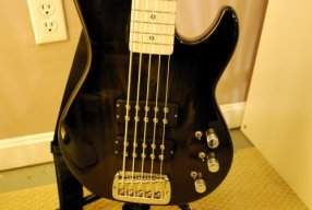
BLING!
Get some stage lighting on those and see if you can find the tiny font or the indicator line on those knobs.
I have the doubler, I have no problems seeing the knobs and the labels. There is not a lot of space for large lettering on there...
Coolest design I still find the 80s Trace Elliot with the UV active print and the built-in UV tube.

I think the Benz amp is the best looking here, just second to the GK.Here is a pic posted by Munjibunga in another thread:
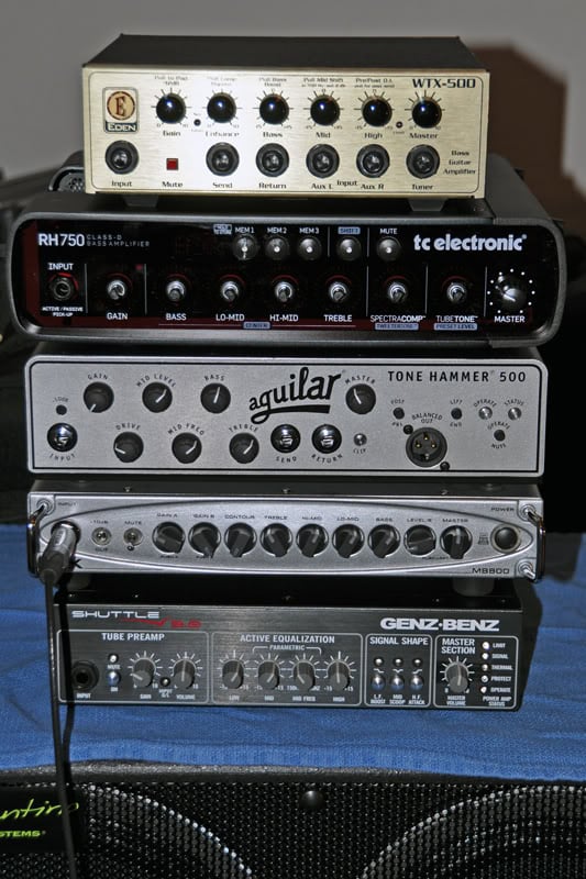
What strikes me about this pic is the design layout of the Genz Benz amp. When compared to the others it looks downright amateurish. (I've always thought the same about Carvin.) I'm talking about colors, the fonts, buttons, etc... It looks like it was designed by the guy doing AC Delco stereos in the '80s.
Considering how much money a company has to put into product development one would think it a relatively minor expense to hire a competent design firm. Why do you think some companies don't think of this as important?
Straight forward looks easy to use and to the point .
Functional and good looking as far as I'm concerned.
No cheap plastic look( tc)
goldhamster(eden) or wanna be old timer( aguilar)looks needed here.

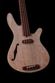

I agree that the GB is the best. Not only because i am a user. But, its user friendly and straight forward. If you want a nicer more stylish case and face plate why dont ad the Streamliner in there. GB is absolutely easy to set up. No BS or gimmicks and sound terrific!
I'll be honest. I want to invest in an amp that makes me want to plug in. Needless to say, it should sound as such that I want to stay plugged in. I want an amp that feels finely machined. My LMII feels like a toy in comparison to my SWR 220.


