• TalkBass has been independent since 1998. Add your voice.
    Create a free account to reply to discussions, view embedded media, and browse with fewer display ads.
    Join freeLog in
    Want zero display ads or expanded classifieds tools? Compare plans.

Build II - Paradox MJ5 - New design!

Finishing can't take any longer than this bass has been under construction. Whatever you do don't rush. Especially when it comes to finishing there's nothing worse than trying to rush. Take your time and let everything cure longer than you first thought.
 
Finishing can't take any longer than this bass has been under construction. Whatever you do don't rush. Especially when it comes to finishing there's nothing worse than trying to rush. Take your time and let everything cure longer than you first thought.

I will, I promise. For the test piece, I let everything dry just long enough to be able to proceed. For the bass itself, I will do the following:
  • Finish sand the complete bass
  • Tape of the tops with quality tape
  • Seal the edges with varnish, using a Q-tip for more precision
  • Varnish the rest of the back of the bass with a brush
  • Wait several hours, until the first layer of varnish cures, but no more than 24 hours
  • Varnish the complete back for the second time
  • Wait at least four hours, preferrable more (one day), until the varnish feels dry
  • Remove the tape from the top
  • Tape the other side (the back and sides) of the bass using the same tape. This is another precision task.
  • Stain the tops black
  • Wait one day (at least 12 hours, Clou says)
  • Sand back the black stain partly
  • Stain the top red, using several layers of red, waiting 20 minutes between the multiple layers, to build up the colour to a nice and deep red
  • Wait one day (at least 12 hours, Clou says) before varnishing the top (using the same procedure as above)
  • Take off the tape after one hour (the tape shouldn't be on there for too long, it's already been there for three days now)
  • Varnish the complete bass afterwards with a final complete coat
  • Polish the bass to get a more gloss like finish
 
That turned out very nicely, Rob! I don't have anything more to add than what has been said really. Just waiting till you are comfortable to commit.

<edit: Oh, I might add that it is worth trying a thin wash of a yellow or amber before you put your red over the top. I hate red turning pink! Of course, test on scrap.>

<edit: edit: I am such a u-turner.>
 
Thanks! About the amber: you mean it turns pink over time or it comes out pink right away? My test pieces aren't turning pink so I would think it ain't necessary. They do have a purple shine to them in a certain light, but nothing bad. It's more like a maroon-ish red than a bright clear red, but I actually like that!
 
It's a similar idea to what was suggested earlier on in the thread about adding a drop of blue to your red. Same as putting a gold coat under a red candy on a car to give a brighter and less-easily washed out red for example, the same works with reds on instruments. I think that it is less useful in this case since your Maple is remains golden as it stands. If you had bleached it first then you would certainly need to consider warming it up.

I'm talking from the perspective of what I would do, or at the very least would rule out in my own "strategic analysis". It's difficult to put these ideas out there without sounding condescending when if this were my work I would be testing it on my own scrap to compare the differences. Difficult to do so when you are just typing words. I'm sure you see what I mean. I had a hunt through my work archive to see if I had any examples but unfortunately not. I guess you could look at how the redder sunbursts work on Les Pauls to see how an amber base warms up reds over the top.

Yeah, red makes me paranoid anyway. It's the hardest colour to get a big bright colour out when you are aiming for the primary. Darkening, adding blue, adding amber underneath....all the same thing. If I am thinking right (not always the case) sunlight washes red out faster than other colours so I would see a warmer base as an insurance against pink if you are going bright.

Don't allow my rants to change your course of action....or choices of beer....
 
I will, I promise. For the test piece, I let everything dry just long enough to be able to proceed. For the bass itself, I will do the following:
  • Finish sand the complete bass
  • Tape of the tops with quality tape
  • Seal the edges with varnish, using a Q-tip for more precision
  • Varnish the rest of the back of the bass with a brush
  • Wait several hours, until the first layer of varnish cures, but no more than 24 hours
  • Varnish the complete back for the second time
  • Wait at least four hours, preferrable more (one day), until the varnish feels dry
  • Remove the tape from the top
  • Tape the other side (the back and sides) of the bass using the same tape. This is another precision task.
  • Stain the tops black
  • Wait one day (at least 12 hours, Clou says)
  • Sand back the black stain partly
  • Stain the top red, using several layers of red, waiting 20 minutes between the multiple layers, to build up the colour to a nice and deep red
  • Wait one day (at least 12 hours, Clou says) before varnishing the top (using the same procedure as above)
  • Take off the tape after one hour (the tape shouldn't be on there for too long, it's already been there for three days now)
  • Varnish the complete bass afterwards with a final complete coat
  • Polish the bass to get a more gloss like finish

This sound good. I do have a couple suggestions tho....

First of all, I wouldnt bother retaping the back after varnishing it. Unless you intend to stand back a ways and throw the stain at it, you will be fine. Any stain that happen to get on the clear can be lightly sanded off. Two. Instead of just one coat on the top, I would let it dry 24hrs and LIGHTLY wet sand it level-actually the whole body at this time-and then varnish/sand two more times the whole body. Then polish.
 
Good suggestions, thanks! I'll do that. I might tape of one line of tape to prevent spilling / unnecessary clean ups. I will follow your suggestion of varnishing layers. The one I used though is a satin (happened to have that), but high gloss wouldn't be any good due the fact that I want the grain to come through (be felt) and I don't want to use grain filler first. Right?
 
Good suggestions, thanks! I'll do that. I might tape of one line of tape to prevent spilling / unnecessary clean ups. I will follow your suggestion of varnishing layers. The one I used though is a satin (happened to have that), but high gloss wouldn't be any good due the fact that I want the grain to come through (be felt) and I don't want to use grain filler first. Right?

You can knock the gloss off of high gloss with sand paper or steel wool, if you feel it needs to be satin after your finished.
 
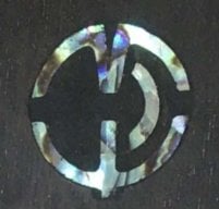
What about this logo? Please shoot :smug:

Link Removed

This is the logo I like best until now. It's also suitable for inlaying. The only disadvantage is that it doesn't spell out my name, what I actually intended. My other option would be:

Invalid Link Removed

But that may be hard to read in the size it fits my headstock, and only possible via a decal.

I'm thinking about this for a long time now, but it's decision time right now..

:confused:
 
While IMO they are both nice, I think you should go with the full name. I also think it should go from the end of the truss rod cover to just shy of the A string post ferrule.

Aesthetically, I like both the shape and the placement of the "rh" logo, but after the time and design effort invested, I think this bass really deserves your name on it.
Additionally, again IMO, I think the longer layout of the full name better complements the overall plan you have described, contrasted with the full stop block effect of the "rh" logo.

Again, again, I also think you should lose the "guitars" part of the logo, and just assign your name to the bass and be done with it. ;) Again, to repeat, again, :D just "Habraken" seems enough.
It's your creation. Own it.

wraub
 
I like the RH for inlaying into the headstock. Although, personally, I would extend the H up just a bit. The Habraken (without the 'Guitars') I would inlay into the fingerboard around the 12th fret using a technique similar to this:

[Invalid or Expired Link Removed]

Or just above the neck like the above bass.
 
The top one is very funky, but maybe just a tad 1970's vintage cheese, (which I like) but the bass has a vintage style, yet there is a sharp contemporary design edge. I'd like a similar sharp edge to run through the logo design, the bottom design has this.

maybe a change of font for the top design would make it cleaner (something like Magneto) how about something like this?

Link Removed
 
Personally I only use my full last name on a 4 inline (Fender) style headstock. Its a bit to long to go horizontally on a 3/2 or 2/2 and gets obstructed by strings when placed vertically.

I would do the RH in the same font that you have your Last name in so your logo is easily identified, between the different styles. Also, if you do the full name, put a 'R.' before the Habraken for consistency.
 
Thanks guys!! You're a tremendous help! Great feedback!

The second one looks great. Get yourself some laser printer decal paper and get testing.

Yes, it's my favorite for several weeks now (since I started looking for a logo). I do struggle to fit it on this headstock design (see reply to Hopkins further down this post), I should've figured this out while designing the headstock shape I guess..

I like the first one, design-wise. Put the 2d one on the back of the headstock.

That's a good idea too, but I'd like to go with one logo style and I feel the two options differ too much. I could, though, have two variants of the same logo-style (short logo and full last name) and use this tip, thanks.

While IMO they are both nice, I think you should go with the full name. I also think it should go from the end of the truss rod cover to just shy of the A string post ferrule.

Aesthetically, I like both the shape and the placement of the "rh" logo, but after the time and design effort invested, I think this bass really deserves your name on it.
Additionally, again IMO, I think the longer layout of the full name better complements the overall plan you have described, contrasted with the full stop block effect of the "rh" logo.

Again, again, I also think you should lose the "guitars" part of the logo, and just assign your name to the bass and be done with it. ;) Again, to repeat, again, :D just "Habraken" seems enough.
It's your creation. Own it.

wraub

Great feedback wraub! Like your ideas and considerations! I am totally with you on wanting to put my full name on there, but it's a tight space, so I came up with a logo-style alternative. But after your suggestions, I'm totally back with putting my name on there actually :smug:

Is that a standard headstock for you?

Yes, it is. It's different from the first one, but in the same line - more of an evolution of the first headstock. I put a lot of effort into coming up with a shape that's rather unique, aesthetically pleasing and having a perfect string distrubition (I want the tuners in line with the string paths). So from now on, this will be my standard headstock shape.

I like the RH for inlaying into the headstock. Although, personally, I would extend the H up just a bit. The Habraken (without the 'Guitars') I would inlay into the fingerboard around the 12th fret using a technique similar to this:

[Invalid or Expired Link Removed]

Or just above the neck like the above bass.

Nice bass! I actually have a version with the written last name parallel to the binding just above the neck. I like it, but in my case, it places the logo onto the pickguard... and I don't like decals on a pickguard (may induce discolouring).

The top one is very funky, but maybe just a tad 1970's vintage cheese, (which I like) but the bass has a vintage style, yet there is a sharp contemporary design edge. I'd like a similar sharp edge to run through the logo design, the bottom design has this.

maybe a change of font for the top design would make it cleaner (something like Magneto) how about something like this?

Wow.. good one!

Yep, it's funky and 70's style.. that's what I was looking for, but you may be right that doesn't really fit the design.

I like your suggestion, I will try Magneto, I know that font but didn't think it would match, but now I see it I guess I'll give it a try too.

Personally I only use my full last name on a 4 inline (Fender) style headstock. Its a bit to long to go horizontally on a 3/2 or 2/2 and gets obstructed by strings when placed vertically.

I would do the RH in the same font that you have your Last name in so your logo is easily identified, between the different styles. Also, if you do the full name, put a 'R.' before the Habraken for consistency.

You're right, I tried a lot of angles, sizes and locations, but the full last name doesn't really fit the small 3/2 headstock. I think it's also a good idea to have the same font for both logo variants.

I also like the suggestion of putting an R. in front of the name, it actually looks really good in that font, didn't even try it or think of it myself :).


You loaded me with new ideas, thanks, awesome!

:bassist:
 
I worked hard tonight :smug:...

First, I checked the neck profile, decided I didn't like it and started carving again! I concentrated almost completely on the treble side of the neck and carved it in a much tighter curve. It's not really slim now, but about average I guess. The bass side was left almost untouched, because I felt it's nice the way it was and I like the asymmetrical shape that emerged while doing so. This way, the neck is still of a regular thickness, not being too thin for a fiver, but it also has a more slim feel; it's mainly the treble side that determines the playability of the neck.

Secondly I routed some small channels within the pickup cavities for the wiring to go in. They're not very deep and the wires are rather thick (it's shielded wiring the Delano pickups come with), so it didn't help all that much, but it's a small improvement anyhow.

Then, I started sanding the entire bass. Because the body was sanded quite a while ago, the wood darkened and the local spots that were sanded while working on some details later on created an uneven tint. So I started with 120 grit again and worked my way up to 240 for the body and 320 for the neck. The hard rock maple of the neck already feels silky smooothhh after some tender love and care with the 320 grit sandpaper. The body and headstock face need to be sanded again rather drastically after the black stain, so I do not see any reason to go any further than 240 grit right now.

After sanding and dusting the bass off I placed the parts on convoluted foam to prevent the parts from scratching / damaging while waiting for their finish to go on.

Link Removed

371-finish-sanded-complete-bass.jpg
 
This bass is looking absolutely fantastic..!! I have a question for you, are you having any trouble with your wooden cavity cover rapidly warping ? The ash cover plates for my bass tend to move everyday..!! they're installed on the bass right now. The inside of the cavity is dryer than the outside, so it warps a little every now and then. Just wanted to know if your going through something similar.