
Enjoy the benefits of a premium membership!
Upgrade Account
-
TalkBass has been independent since 1998. Add your voice.
Create a free account to reply to discussions, view embedded media, and browse with fewer display ads.
Join free Log in
Want zero display ads or expanded classifieds tools? Compare plans.
You are using an out of date browser. It may not display this or other websites correctly.
You should upgrade or use an alternative browser.
You should upgrade or use an alternative browser.
Hofner-(not just Beatle Basses)-Group Part 2
- Thread starter Bryan R. Tyler
- Start date
More options
Who Replied?

It's been a while since I've frequented these boards,but I am back and wanted to post a few of my Hofners
Peacefrog35:
I'm glad you're back.

Thank you do much. Glad to be back.
And for all concerned, that cup was empty and was not in danger of falling. Hahah. It wa just a goofy moment.
And for all concerned, that cup was empty and was not in danger of falling. Hahah. It wa just a goofy moment.
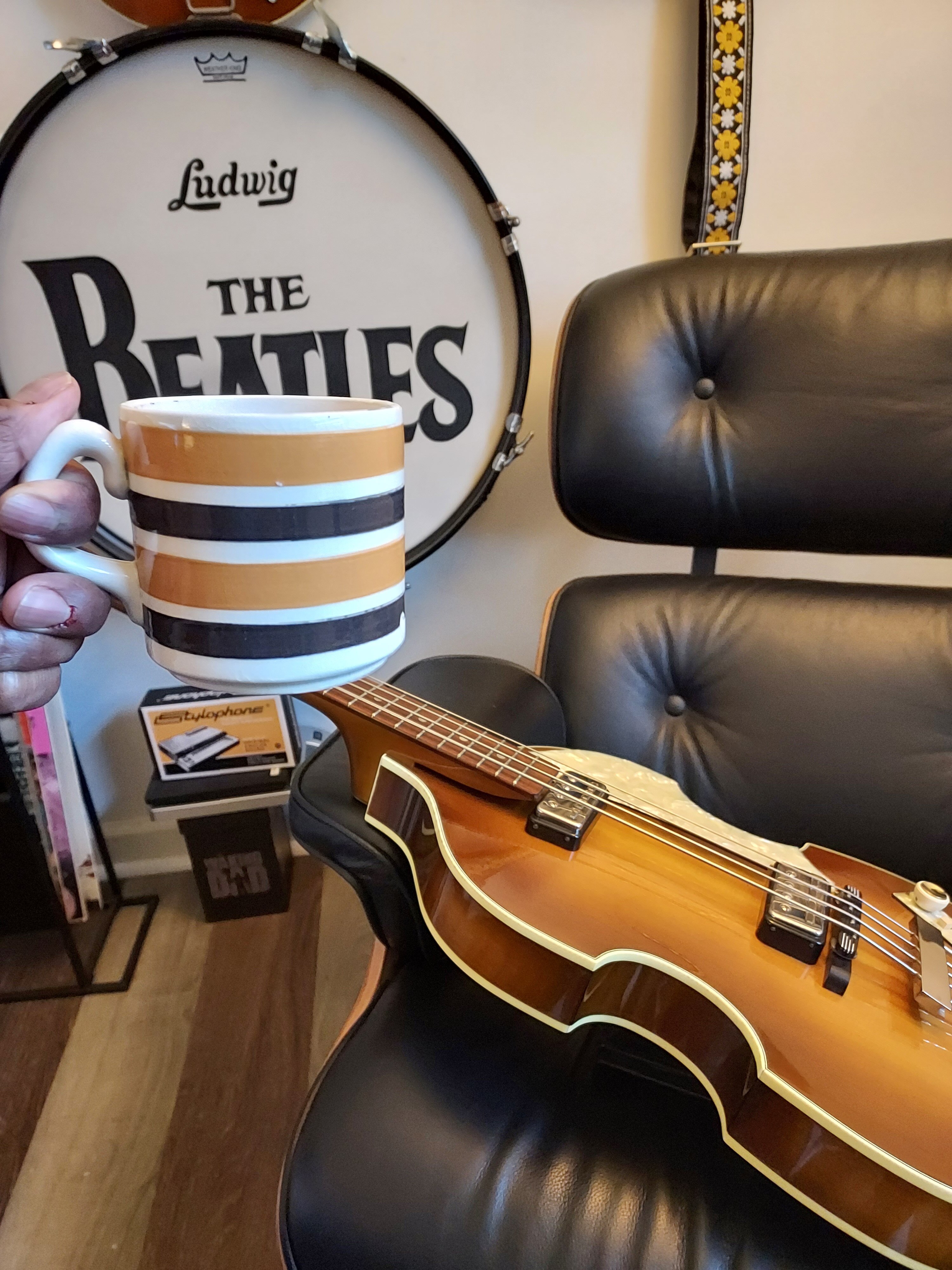
It's funny that I got that cup in the pic because it reminded me of the one seen in Get Back. Then I tracked down the actual exact kind after I took this pic. Talk about embarrassingly hard core into the Bestles. Lol
It's funny that I got that cup in the pic because it reminded me of the one seen in Get Back. Then I tracked down the actual exact kind after I took this pic. Talk about embarrassingly hard core into the Bestles. Lol
nice! Well in that case you might like this story. I took my wife and youngest daughter on a trip to Liverpool. Booked a tour inside the childhood homes. At Lennon’s home, my daughter kept coughing so badly that the tour guide offered her a cup of water, which she was allowed to go make herself in the kitchen! No pictures are allowed inside the homes, but this was just too huge

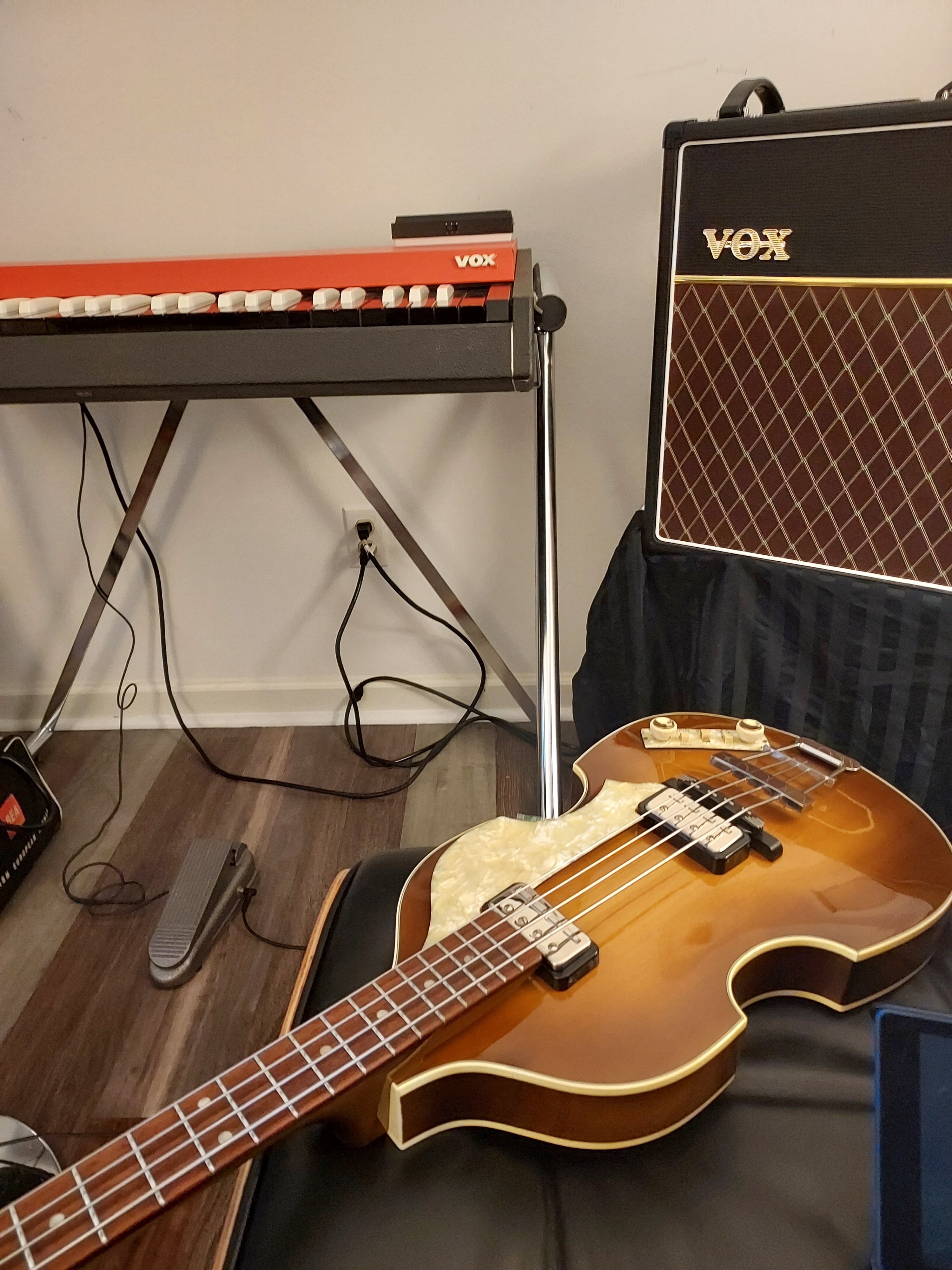
That is awesome. I'd love to take that tour!!! Not to digress too far from basses but I love my cup.

Last edited:

That is dedicationThat is awesome. I'd love to take that tour!!! Not to digress too far from basses but I love my cup.View attachment 5343166 View attachment 5343167View attachment 5343169
 .
.
Hey all, new here, have a question regarding the Contemporary series I’m hoping someone might have some experience with. I adore this bass, got it a little over a year ago, but I’m really not a fan of the “Contemporary Series” logo on the truss rod cover, pic related.
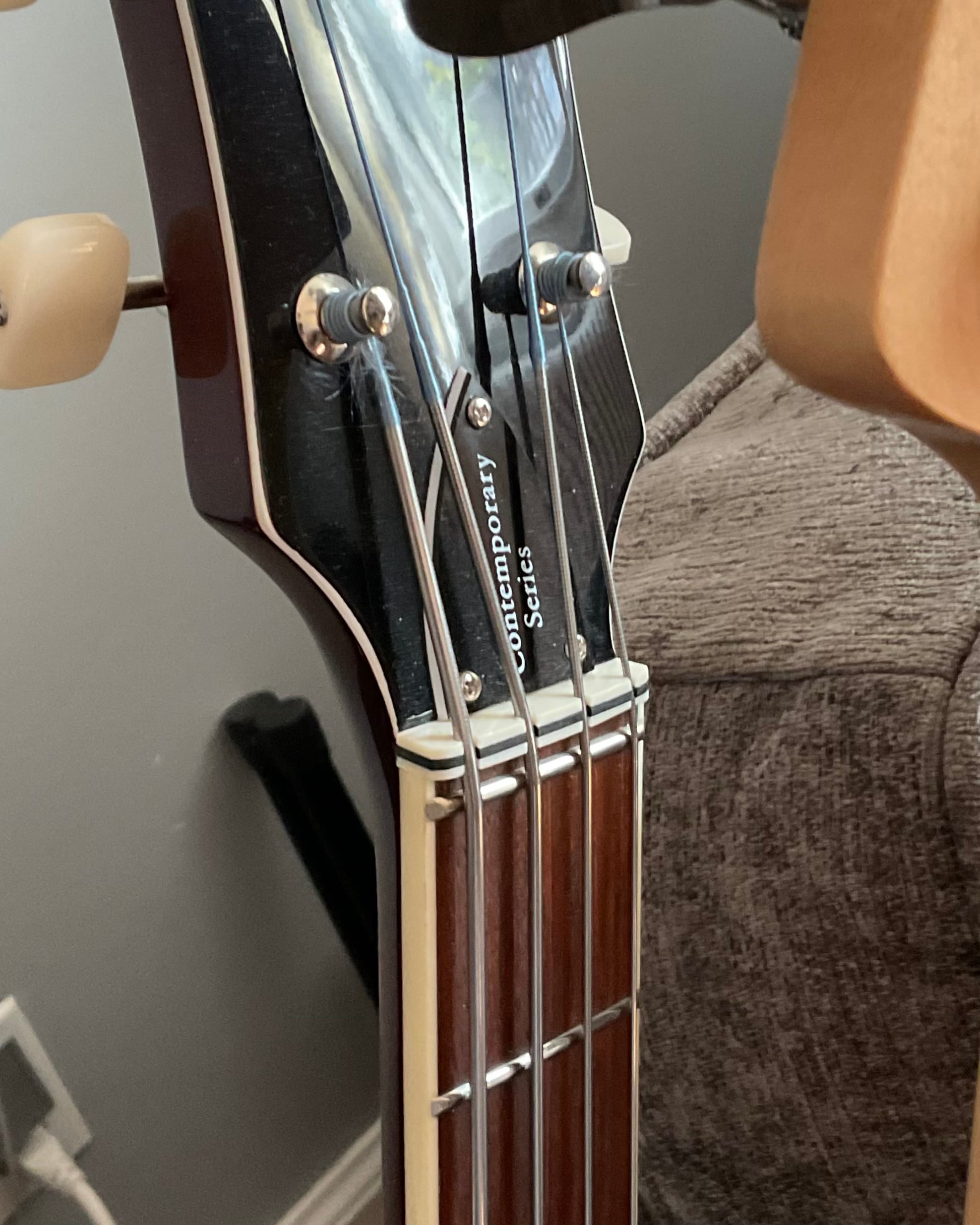
It’s not really an issue of it displaying the cost of the bass or anything… I just find the font choice and positioning to be super unfitting visually with the classic design of the rest of the instrument. I tried buying one of the replacement blank covers made for the German models, but the screw holes unfortunately don’t match up — not even close.
I’m wondering if anyone has either found a blank replacement that fits, or otherwise knows of a way to remove the lettering? I can feel it with my nail so it seems like it could possibly be removed with paint thinner or something, but I figure I’d check before trying something like that and ending up making it look worse. Thanks!
It’s not really an issue of it displaying the cost of the bass or anything… I just find the font choice and positioning to be super unfitting visually with the classic design of the rest of the instrument. I tried buying one of the replacement blank covers made for the German models, but the screw holes unfortunately don’t match up — not even close.
I’m wondering if anyone has either found a blank replacement that fits, or otherwise knows of a way to remove the lettering? I can feel it with my nail so it seems like it could possibly be removed with paint thinner or something, but I figure I’d check before trying something like that and ending up making it look worse. Thanks!

Try Berry Clark or Thomann. They might have something that could help you out.Hey all, new here, have a question regarding the Contemporary series I’m hoping someone might have some experience with. I adore this bass, got it a little over a year ago, but I’m really not a fan of the “Contemporary Series” logo on the truss rod cover, pic related.
View attachment 5344891
It’s not really an issue of it displaying the cost of the bass or anything… I just find the font choice and positioning to be super unfitting visually with the classic design of the rest of the instrument. I tried buying one of the replacement blank covers made for the German models, but the screw holes unfortunately don’t match up — not even close.
I’m wondering if anyone has either found a blank replacement that fits, or otherwise knows of a way to remove the lettering? I can feel it with my nail so it seems like it could possibly be removed with paint thinner or something, but I figure I’d check before trying something like that and ending up making it look worse. Thanks!
Never bothered me; but I suspect others have found replacement covers. Until then, try a sharpie.
I'm actually surprised the German cover didn't fit.
<aybe North Coast Music has a replacement.
I'm actually surprised the German cover didn't fit.
<aybe North Coast Music has a replacement.

Rubbing alcohol will the it off. Try something higher than 70%
Another Contemporary user here. Just took this advice and tried some 99% Isopropyl alcohol on mine. Worked like a charm. Thanks.
Perhaps the truss rod cover & other things was done by Hofner (Germany) as a way separate their flagship German models, from their Chinese HCT & Ignition models.Hey all, new here, have a question regarding the Contemporary series I’m hoping someone might have some experience with. I adore this bass, got it a little over a year ago, but I’m really not a fan of the “Contemporary Series” logo on the truss rod cover, pic related.
It’s not really an issue of it displaying the cost of the bass or anything… I just find the font choice and positioning to be super unfitting visually with the classic design of the rest of the instrument. I tried buying one of the replacement blank covers made for the German models, but the screw holes unfortunately don’t match up — not even close.
I’m wondering if anyone has either found a blank replacement that fits, or otherwise knows of a way to remove the lettering? I can feel it with my nail so it seems like it could possibly be removed with paint thinner or something, but I figure I’d check before trying something like that and ending up making it look worse. Thanks!
The headstock on the HCT is a little longer & sharper than, that on my '64 500/1. Also the control panel is positioned slightly differently again to my German made 500/1. Just my own opinion but maybe Hofner didn't want the HCT if all the parts were changed to, German parts to be passed off as a German made 500/1.
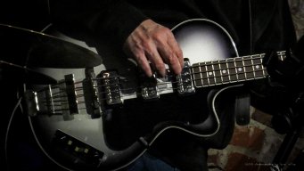
Glad to see my buddy Shawn playing that lovely 64 again. I love mine.
 .
.
How many Hofnes do folks on here have? I know some only have a couple. Currently I am at six, and that accounts for all of my basses. For some that would be too much and for others too little. I am asking out of interest but also because someone is selling a beautiful blue HCT on Reverb right now. I want it so bad, but I am not sure if I should grab it. The struggle is real!
Only the 2 that are in my post above, I used to have a 1964 Hofner Senator bass wish I'd kept that.
I have 4 HCTs; Three 500/1s and One 500/2:
A Cavern SB, a Blond/Natural finish, a Black with a third pickup added, and a Red Club.
I just sold a German Club because it wasn't getting as much time as the others. But I'm considering an Ignition Pro but realize 4 may be my limit (Unless I sell my Guild Junior Jumbo. Maybe the Ignition would be a good replacement for that).
The Blue 500/1 does look appealing... But I remind myself I am retired and only playing part-time. So the $$$ makes it much more difficult to manage than an Ignition. If only the Ignition came in blue (I think they did come in different colors at one time. Maybe I'll hold out for one of those).
Note: The '64 in your pic has great coloring. A fine example of an amazing bass.
A Cavern SB, a Blond/Natural finish, a Black with a third pickup added, and a Red Club.
I just sold a German Club because it wasn't getting as much time as the others. But I'm considering an Ignition Pro but realize 4 may be my limit (Unless I sell my Guild Junior Jumbo. Maybe the Ignition would be a good replacement for that).
The Blue 500/1 does look appealing... But I remind myself I am retired and only playing part-time. So the $$$ makes it much more difficult to manage than an Ignition. If only the Ignition came in blue (I think they did come in different colors at one time. Maybe I'll hold out for one of those).
Note: The '64 in your pic has great coloring. A fine example of an amazing bass.

I only own 1 bass, 1965 500/2. It’s a gig machine I love it
I love it


