
Enjoy the benefits of a premium membership!
Upgrade Account
-
TalkBass has been independent since 1998. Add your voice.
Create a free account to reply to discussions, view embedded media, and browse with fewer display ads.
Join free Log in
Want zero display ads or expanded classifieds tools? Compare plans.
You are using an out of date browser. It may not display this or other websites correctly.
You should upgrade or use an alternative browser.
You should upgrade or use an alternative browser.
LOG LOGO CONTEST
- Thread starter basspraiser
- Start date
More options
Who Replied?

Horizontal ideas...
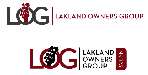
uh...how do you use an image in your signature?Or is it not allowed??
I really like the way that second 'LOG' works, with the headstock coming out of the O at a more pronounced angle.
Also, using just two colours is good because it'd be cheaper to embroider or silkscreen. For my last one, I ignored that because I was just having fun...
Nice work. Really.
I'll play. Here's a few color variation of my LOG logo.

Horizontal ideas...
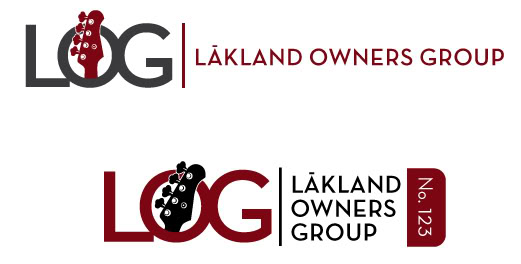
I like these two.
chingas's second one looks cool, and I like the idea of having the LOG membership number, although I'm not sure what it would take to have that done.
Mine looks line it would make a good web header, or maybe an iron on decal. If something else comes to mind I'll try another one.
These are the best, imo. Make the O & the G a bit more flat oval to resemble the bridge, and that'd be killer.
OK. Here's another try. This time the O is the pickups and the G is the bridge.
Here's another go at it with the headstock. I like this one a little better and it has the LOG in it.

Here's another go at it with the headstock. I like this one a little better and it has the LOG in it.

I like the color scheme and ideas in these latest ones, zac.
I like the color scheme and ideas in these latest ones, zac.
Thanks. Just trying to keep it real to what's on the Lakland website. They seem to have the yellow/black thing going on.
There's some really good stuff up there.
Hey Munji - welcome to the fray!!!
Ubber - creative!
Man! you guys are going to make it tough to decide!!!!
There is ALOT - and I mean ALOT of good ideas here!
Man! you guys are going to make it tough to decide!!!!
There is ALOT - and I mean ALOT of good ideas here!
Thanks. Just trying to keep it real to what's on the Lakland website. They seem to have the yellow/black thing going on.
Makes sense. I'll have try a few with yellow/black!
Trying some more Lakland "colors" and going a bit overboard with gradients...
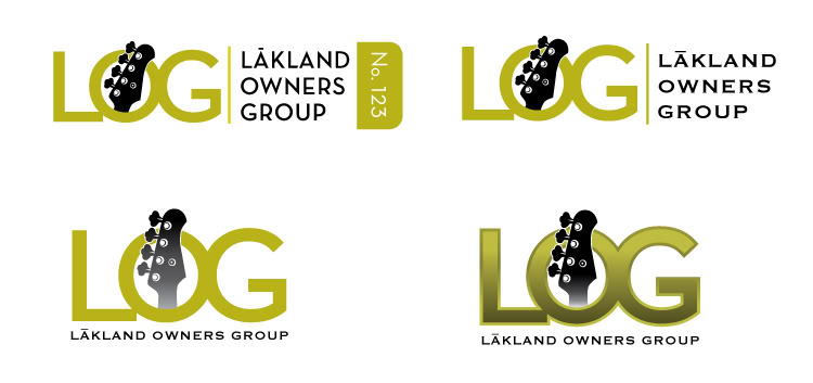
can you make the yellow "more yellow" (i.e. to match wat is on the site?)....I would like to see that.....(NOTE: THIS IS NOT PLAYING FAVORITES OR AN INDICATION OF ANY TYPE - I WOULD JUST LIKE TO SEE IT.....I needed to say that per the LOG attorney!)

Zac and Chingas seem to have the leaders here.
It ain't over 'til Munji sings!!!!
+2Zac and Chingas seem to have the leaders here.
You guys have done this before, no?

Would you guys mind briefely explaining the technique you used to blackout/silhouette or outline the headstock and skyline?
The Fonts too. Am I correct in assuming they are stock fonts that have been modified. The way some of them seemed to be merged together, is each letter is a separate layer.
I'd love to be able to do more.
Thanks!
+2
You guys have done this before, no?
Would you guys mind briefely explaining the technique you used to blackout/silhouette or outline the headstock and skyline?
The Fonts too. Am I correct in assuming they are stock fonts that have been modified. The way some of them seemed to be merged together, is each letter is a separate layer.
I'd love to be able to do more.
Thanks!
I'm not a graphic designer or anything. I just do it for fun. I'm using photoshop. The headstock and body that I used were traced from photos with the pen tool to create a vector graphic. Once I got the shape I wanted I used a stroke to create the outline. The overlaping fonts are each in a seperate layer.
Here are 2 more. There's some tough competitors around here. I love this!
Here goes another try.
Here goes another try.


