
Enjoy the benefits of a premium membership!
Upgrade Account
-
TalkBass has been independent since 1998. Add your voice.
Create a free account to reply to discussions, view embedded media, and browse with fewer display ads.
Join free Log in
Want zero display ads or expanded classifieds tools? Compare plans.
You are using an out of date browser. It may not display this or other websites correctly.
You should upgrade or use an alternative browser.
You should upgrade or use an alternative browser.
LOG LOGO CONTEST
- Thread starter basspraiser
- Start date
More options
Who Replied?
Cool idea using the body, Zac!
Thanks for the props. I dig your design too!

Some colors?
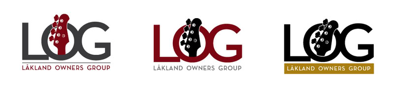
Also, I thought maybe the LOG logo could incorporate an element that would allow for membership numbers.
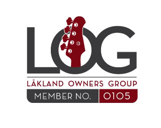
Also, I thought maybe the LOG logo could incorporate an element that would allow for membership numbers.

Some colors?
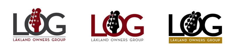
Also, I thought maybe the LOG logo could incorporate an element that would allow for membership numbers.
I quite like these. I like the idea of using the headstock because it's really the most noticeably 'Lakland' element, aside from the bridge.
I'm not so into the ones that use the Chicago skyline, because while that might be appropriate for obvious reasons, it still seems kinda local. For the Chicago Lakland users group, sure... but for an international group? Doesn't sit right..
I quite like these. I like the idea of using the headstock because it's really the most noticeably 'Lakland' element, aside from the bridge.
I'm not so into the ones that use the Chicago skyline, because while that might be appropriate for obvious reasons, it still seems kinda local. For the Chicago Lakland users group, sure... but for an international group? Doesn't sit right..
I always thought the headstock of any Lakland was it's "signature"(the Hollowbody as an exception, of course). I was really tempted to make it a five string headstock, but figured the four is more emblematic of bass guitars in general.
The Skyline logo of various cities would be cool for a local GTG!
The Skyline logo of various cities would be cool for a local GTG!
Yeah, that'd be pretty cool.
Okay, here are a few more ideas, riffing off of what Nubs said he was thinking of... then something different.

I'll play. Here's a few color variation of my LOG logo.

These are the best, imo. Make the O & the G a bit more flat oval to resemble the bridge, and that'd be killer.

These are the best, imo. Make the O & the G a bit more flat oval to resemble the bridge, and that'd be killer.
+1
The bridge is another signature of a Lakland.
My only concern about using the body and bridge in any potential logo for LOG is that Lakland offers different models with differing body shapes-while the headstock remains the same on almost all of there models(except the hollowbody).
And while the bridge itself is indeed a Lakland trait, I don't find it as interesting or as immediate an image as the headstock.
Just my 2 cents.
And while the bridge itself is indeed a Lakland trait, I don't find it as interesting or as immediate an image as the headstock.
Just my 2 cents.
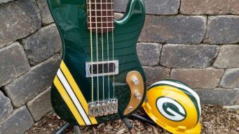
I don't think basspraiser is familiar with Ren & Stimpy...
Let's hook him up!
That is GREAT!!! I love it!!!
Yup - must have been "between generations" when that was out.....
I was a big "Pinky and the Brain" fan when my kids were younger - did not watch Ren & Stimpy much!
Writing says: Lakland OG's

So...where can I pick up my shirt?
I TOTALLY agree with LMAO!!!! That is great!
You guys have some GREAT ideas!!
as NUBS said, keep 'em coming....soon, I will start grabbing them off the forum and putting them into "blind" files so we will not know who sent what...that is the best way....
If you cannot do photoshop, feel free to sketch something out and fax it to me at (815) 477-1001 or scan it and e-mail it to me.....
as NUBS said, keep 'em coming....soon, I will start grabbing them off the forum and putting them into "blind" files so we will not know who sent what...that is the best way....
If you cannot do photoshop, feel free to sketch something out and fax it to me at (815) 477-1001 or scan it and e-mail it to me.....
L.O.G/Lakland Owners Group
how's that for a first attempt


Now Nubs.....stop polluting the field with "your" ideas....let them be creative (JK!)


This stuff's great!! I haven't done any graphic design since high school (a course I took). I gotta get a graphics program for my computer other than Paint .
.

Latest posts
-

-

-

-

-
De-fretting - How much fretboard chipping/removal is expected on a Jatoba neck?
- Latest: bass player 53