Zac and Chingas seem to have the leaders here.
I second that. Pretty neat and clean, what you would expect for a logo...

TalkBass has been independent since 1998. Add your voice.
Create a free account to reply to discussions, view embedded media, and browse with fewer display ads.
Join free Log in
Want zero display ads or expanded classifieds tools? Compare plans.
Zac and Chingas seem to have the leaders here.
OK. Here's another try. This time the O is the pickups and the G is the bridge.

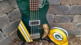
I really dig the G like that, it's great. I *dunno* about the O lookin like a pup silouette, but it's in the right direction...(maybe instead make it look like a pick or something??? But that could be lame...) but overall it's hot man, hot. The ONLY other suggestion I would say is maybe make the letters a tad bolder, to stand out a little bit.
Real nice work man.
Here's another shot at it.

how could that happen?
keep the logo ideas coming!



OK - are we "out of ideas"? I see a few new entries.....
should we (our team choose) or narrow it down to 4-5 for a vote????
We have some great ideas here!!!
+1So pick one already.


Yes I nominate Chingas and Me
Go ahead and choose one already. There are a lot of good ones
One of chingas with the number tag would work best for that.


