
Enjoy the benefits of a premium membership!
Upgrade Account
-
TalkBass has been independent since 1998. Add your voice.
Create a free account to reply to discussions, view embedded media, and browse with fewer display ads.
Join free Log in
Want zero display ads or expanded classifieds tools? Compare plans.
You are using an out of date browser. It may not display this or other websites correctly.
You should upgrade or use an alternative browser.
You should upgrade or use an alternative browser.
Restoration: Roadstar (II) to hell
- Thread starter DaveRhys
- Start date
More options
Who Replied?

Wow! I was trawling through TB as I sometimes do, and I found this thread. I read it from top to bottom, because
Funny, I always loved this bass for the way it played and the way it sounded, and it's the only bass that I have never sold in all these years. But I assumed that only I appreciated it, and that others saw it as a old Ibby 80's relic. It's great to hear that others also appreciate what I reckon is a classic bass!
Mine is a little different from this one in that it's active with a pair of Ibanez covered PUs, only 3 controls (PU balance, master vol and a master tone pot), and black chrome hardware, but otherwise it's pretty much a perfect match (except it wasn't beat to hell - still has the boomerang strap locks and all).
The bridge is shiney on the top where I have worn through the black chrome finish with my hand over the years, and the bridge spings are a bit oxidised, but other than that I have kept it in near perfect condition even after years of gigging with it (even if I say so myself). I was going to try to find a Badass or something that I could use as a replacement bridge, but luckily I never got around to drilling holes in this beauty! If I could find another original bridge or refurb this one, I'd definately do that, but that's all I think. I love what you've done with this one, but I think I'd like this one to stay factory original if at all possible. It really doesn't need the usual hardware/PU upgrades that my basses routinely get in my humble opinion.
I'll try to get some photo's together for you all - maybe it can help with logo plcement or whatever.
Thanks for giving my old girl some love!
- It's a great read - thanks! And
- I own a pretty much pristine example of an RB850 (in Dark Wine in my case), and have done since it was brand new in 87.
Funny, I always loved this bass for the way it played and the way it sounded, and it's the only bass that I have never sold in all these years. But I assumed that only I appreciated it, and that others saw it as a old Ibby 80's relic. It's great to hear that others also appreciate what I reckon is a classic bass!
Mine is a little different from this one in that it's active with a pair of Ibanez covered PUs, only 3 controls (PU balance, master vol and a master tone pot), and black chrome hardware, but otherwise it's pretty much a perfect match (except it wasn't beat to hell - still has the boomerang strap locks and all).
The bridge is shiney on the top where I have worn through the black chrome finish with my hand over the years, and the bridge spings are a bit oxidised, but other than that I have kept it in near perfect condition even after years of gigging with it (even if I say so myself). I was going to try to find a Badass or something that I could use as a replacement bridge, but luckily I never got around to drilling holes in this beauty! If I could find another original bridge or refurb this one, I'd definately do that, but that's all I think. I love what you've done with this one, but I think I'd like this one to stay factory original if at all possible. It really doesn't need the usual hardware/PU upgrades that my basses routinely get in my humble opinion.
I'll try to get some photo's together for you all - maybe it can help with logo plcement or whatever.
Thanks for giving my old girl some love!

Just when we'd all lost interest...
Riiight.
Me and this headstock have been having a disagreement.
I'm presently on the 4th iteration, but with high hopes this will be the last.
Various things weren't working out:
I also had to re-tile a bathroom.
Anyho- I was left with something that looked like this:
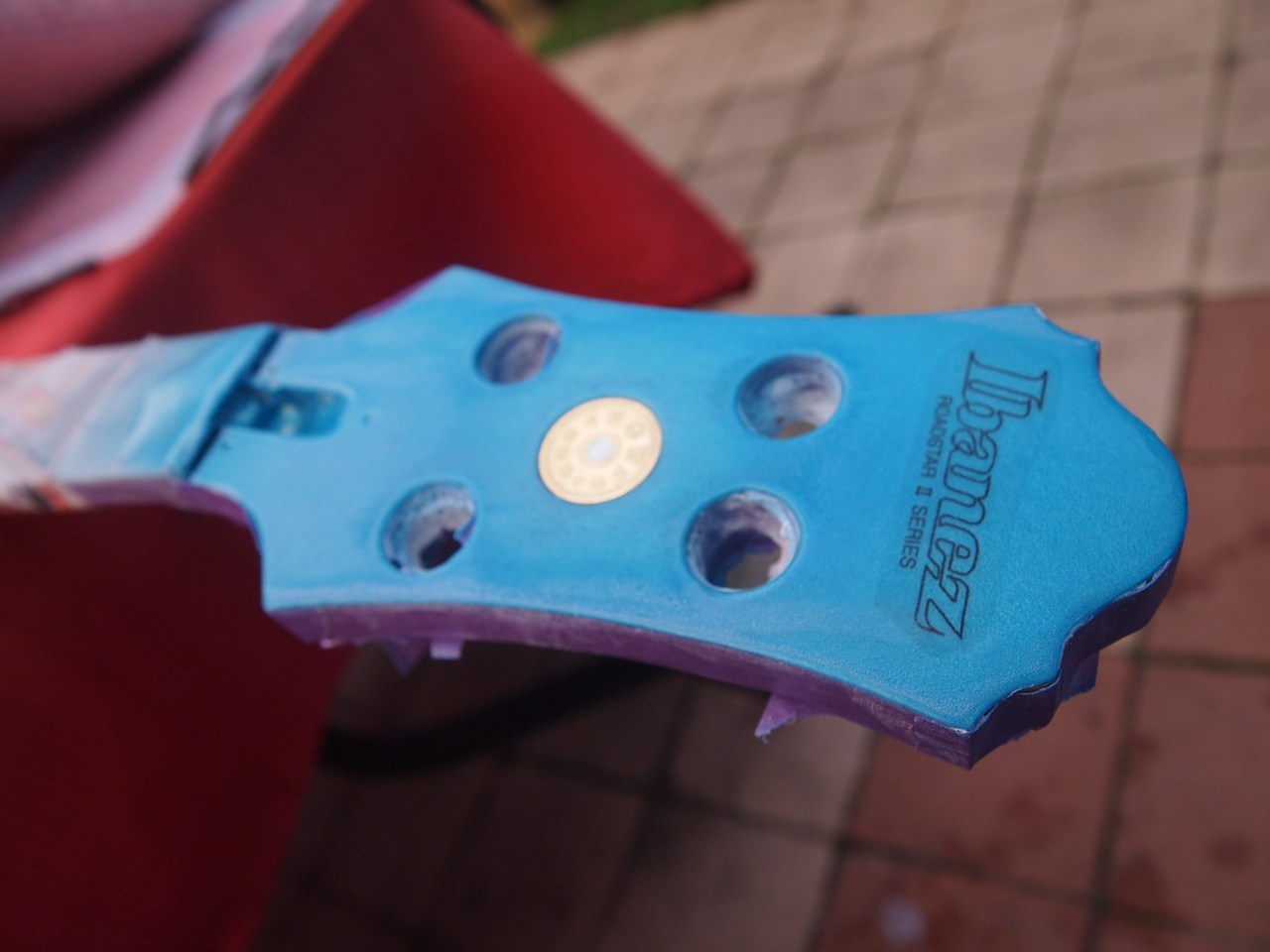
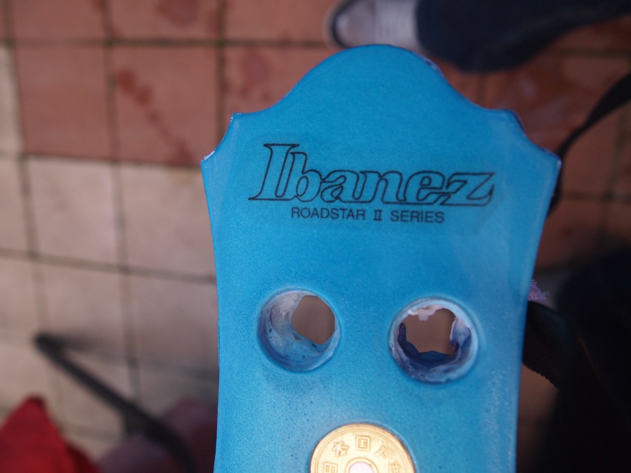
... and it just wasn't working for me.
I can do better.
So I've started again (again).
First things first, the coin needs to match the truss cover.
Required an awful lot of steady-hand work (which ain't easy when you live on a diet of coffee), but I'm pleased with the results:

(had to scrape each of the characters clean with the pointy-thing)
Next I have to re-colour the headstock, apply the solid logo, then, (controversially) I'll be using epoxy to in-fill any gaps.
It'll work. Trust me
... I'll try and keep updates a little more frequent.
Riiight.
Me and this headstock have been having a disagreement.
I'm presently on the 4th iteration, but with high hopes this will be the last.
Various things weren't working out:
- Abandoned the gold logo.
- Tried it solid black - thought it would look better as an outline.
- Sanded back and replaced with outline logo - now reckon the solid looked better.
- Decal paper seems far more visible than usual (perhaps I'm being overly picky there) - maybe some lacquer crept under, so reason enough to do it again.
- Didn't like the contrast of the coin against the truss-cover (too sparkly).
- Lacquer wasn't in-filling some gaps as predicted.
- blah blah, whine, jibber-jabber, meh.
I also had to re-tile a bathroom.
Anyho- I was left with something that looked like this:
... and it just wasn't working for me.
I can do better.
So I've started again (again).
First things first, the coin needs to match the truss cover.
Required an awful lot of steady-hand work (which ain't easy when you live on a diet of coffee), but I'm pleased with the results:
(had to scrape each of the characters clean with the pointy-thing)
Next I have to re-colour the headstock, apply the solid logo, then, (controversially) I'll be using epoxy to in-fill any gaps.
It'll work. Trust me
... I'll try and keep updates a little more frequent.

I just picked up one of these basses on the Classifieds here based largely on how much everyone has been raving about them in this thread. Mine appears to be in MUCH better shape though; a bit of setup and she should be good to go. Kudos to you for a very nice restoration, and entertaining narrative. Cool looking basses!



Good on you to keep re-doing it until you got it right, I'm also in the process of refinishing a headstock, although mine is maple fender so a tad easier, but still had to re-do it once.
Keep on it, it's turning out great so far!
Keep on it, it's turning out great so far!
this is my favourite talkbass thread I would love a Roadstar in that finish, got bad Ibby gas right now thanks to you



Loving this thread!
...and inevitably, this thread gave me GAS, especially this fella:
...and inevitably, this thread gave me GAS, especially this fella:
It has sat on my guitar rack for a couple of months since I got my Guild B-301. Even thought about selling it, but took it to practice last Tuesday and fell in love again. Forgot how incredible it sounded and it is one of the best playing basses I've ever picked up!


i keep coming back to this one due to my soft spot for the old ibanezes. I used to have a black beauty artist guitar from the mid 70's that i still regret selling. Strung with flatwounds that thing was a jazz beast, kinda like the finest les paul, but just a bit finer.
I'm still counting myself as a noob, but I feel like I can actually offer some relevant feedback to a thread for once! From my own experience, I also think the headstock got too many coats too quickly. When doing a metallic flake finish, it needs multiple dry coats, you don't want the paint to get liquidy on the surface and pool or float around, because the little reflective bits get muddied and they lay down and dont reflect when they are dry. It took me around 8 coats to get a reflective surface from dry coats and then you have to lacquer directly over that many many times as well to fill all the little rough surface voids left from the metallic spray paint.
And then the waterslide decal. That needs to be "floated" in between several layers of lacquer in order for the edges to become invisible on the surface. I did about 6 coats of clear lacquer first and then put on the decal and then put another 6-10 coats of clear overtop and you can't see the decal at all, it looks like its been mounted right on the surface of the paint and then cleared over.
My first advice! I hope I'm not totally wrong, but I think we can count on someone coming in here and crushing me if I've effed it up!
I'm still counting myself as a noob, but I feel like I can actually offer some relevant feedback to a thread for once! From my own experience, I also think the headstock got too many coats too quickly. When doing a metallic flake finish, it needs multiple dry coats, you don't want the paint to get liquidy on the surface and pool or float around, because the little reflective bits get muddied and they lay down and dont reflect when they are dry. It took me around 8 coats to get a reflective surface from dry coats and then you have to lacquer directly over that many many times as well to fill all the little rough surface voids left from the metallic spray paint.
And then the waterslide decal. That needs to be "floated" in between several layers of lacquer in order for the edges to become invisible on the surface. I did about 6 coats of clear lacquer first and then put on the decal and then put another 6-10 coats of clear overtop and you can't see the decal at all, it looks like its been mounted right on the surface of the paint and then cleared over.
My first advice! I hope I'm not totally wrong, but I think we can count on someone coming in here and crushing me if I've effed it up!

Has there been any progress made on this recently? I'm still waiting patiently to see how this turns out!


I actively seek this thread very frequently.
I don't know why, but I am fascinated to see the finished product now.
I don't know why, but I am fascinated to see the finished product now.


