

Enjoy the benefits of a premium membership!
Upgrade Account
-
TalkBass has been independent since 1998. Add your voice.
Create a free account to reply to discussions, view embedded media, and browse with fewer display ads.
Join free Log in
Want zero display ads or expanded classifieds tools? Compare plans.
You are using an out of date browser. It may not display this or other websites correctly.
You should upgrade or use an alternative browser.
You should upgrade or use an alternative browser.
Show Your Gig Flyers!
- Thread starter Unrepresented
- Start date
More options
Who Replied?
- Dec 15, 2007
- 556
- 45
- Disclosures
- Endorsing Artist: Ashdown/ESP/Dunlop/Line 6/Normandy.

Last week my group decided to start delegating some of the normal band responsibilities, and ended up with flyers due to having some experience with photochop.
I really have no background in design, I've just fooled with it a bit in the past and have a very basic understanding of some of the tricks.
Anyways...here are my first two flyers that I've put together over the past couple days. I realize they are gaudy as hell, and wish they were a bit more 'pro' looking. Any advice or links on the subject would be great.
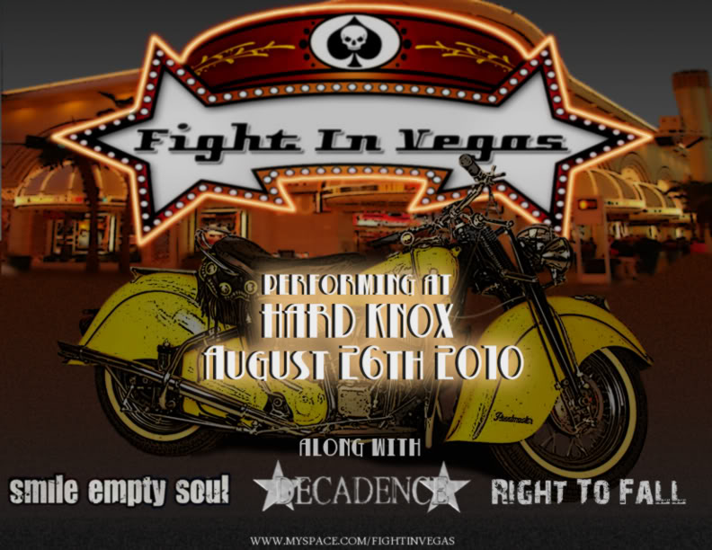
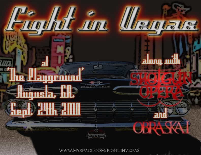
I really have no background in design, I've just fooled with it a bit in the past and have a very basic understanding of some of the tricks.
Anyways...here are my first two flyers that I've put together over the past couple days. I realize they are gaudy as hell, and wish they were a bit more 'pro' looking. Any advice or links on the subject would be great.
- Aug 25, 2007
- 835
- 6
- Disclosures
- I manufacture for several companies including but not limited to: Bridge City Sound, Catalinbread, more.
One mistake people make, although not many here, is theyre so concerned to make the band name stylish, it becomes the most unreadable part of the poster, sometimes extremely difficult to make out.
Or try to fit so much imagery, its a jumbled up mess.
I remember a thread on this subject a while ago, on another similar forum, and some graphic designers or whatever, pros on the subject were chiming in and making a lot of sense.
I saw a lot of nice posters here that seem to be very-well done, imo.
Or try to fit so much imagery, its a jumbled up mess.
I remember a thread on this subject a while ago, on another similar forum, and some graphic designers or whatever, pros on the subject were chiming in and making a lot of sense.
I saw a lot of nice posters here that seem to be very-well done, imo.
Our first ever Gig poster:

Our House Style Version 1:

We have changed the posters a bit but i don't have any images of them
Our House Style Version 1:
We have changed the posters a bit but i don't have any images of them

Passinwind
I know nothing.
- Dec 3, 2003
- 23,044
- 45,901
- Disclosures
- Designer/Toaster Tech @ Passinwind Electronics



Okay, I'll play. These are a couple I've done for our band. I whip them out pretty quickly in photoshop.
I can't find you on google, what's your url? Your posters make me wanna listen to your music! XD
Thanks for the compliment.
We hardly ever play out, maybe four times a year if we're really motivated. Never really recorded anything, the closest would be the files that our songwriter throws up on his ReverbNation page for us to download the songs he's written for us to learn from. If you're interested in those you can find him under Kevin Brocker, but its not the full band, he's playing everything.
We hardly ever play out, maybe four times a year if we're really motivated. Never really recorded anything, the closest would be the files that our songwriter throws up on his ReverbNation page for us to download the songs he's written for us to learn from. If you're interested in those you can find him under Kevin Brocker, but its not the full band, he's playing everything.
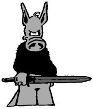
Here are a few for some upcoming shows we have. Our trumpet player designs the flyers.


These ones are totally inspiring for me. Not too busy, that's the thing. Simple but creative.


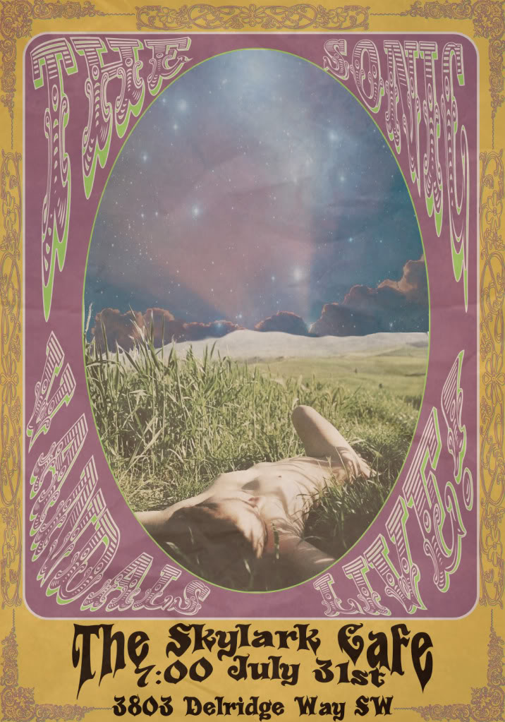
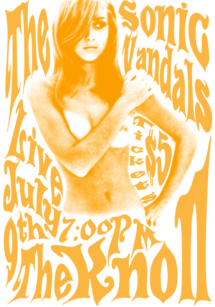
Some recent ones I've been tweaking around. The first is an early version of a poster for this weekend (it now has a ticket price and the other band on the bill), and the second is a mock-up that I've been kicking around (so none of the info is real). The second one also now has BLACK lettering to create better contrast, cause the orange is a bit too much.
Latest posts
-

-
 Buying a vintage neck to pair with vintage body... risks/really bad idea?
- Latest: Chicken Wing
-

-
