
Enjoy the benefits of a premium membership!
Upgrade Account
-
TalkBass has been independent since 1998. Add your voice.
Create a free account to reply to discussions, view embedded media, and browse with fewer display ads.
Join free Log in
Want zero display ads or expanded classifieds tools? Compare plans.
You are using an out of date browser. It may not display this or other websites correctly.
You should upgrade or use an alternative browser.
You should upgrade or use an alternative browser.
The Hossenfeffer Bass Build
- Thread starter Gilmourisgod
- Start date
More options
Who Replied?
Finished building the Vinson neck jig. I have two flat bottom basses planned next, so i didn't see much point in using levelers. I followed the instructions, which have the main beam just a 2x4. In retrospect, its too flexible. I can push the end down by hand and see the flex on the dial indicators. I need to either stiffen the beam with plywood or build a vertical "leg" coming down off the beam to the floor. The plans I had for the jig seem to have been made for guitar, not sure what the optimum location for the dial indicators is along the neck, mine fall at 10th and 3rd frets.

The axemasters pre-cut brass nut was a fiasco. After gluing the two pieces back together, I noticed the string spacing looks off, but maybe I'm wrong. Do these measurements look even close to correct?


I e-mailed the Ebay vendor, he agreed to swap it for another one, one piece this time, so off it goes, but in the meantime I ordered an OEM black plastic bass nut from Pick of the Ricks as a reality check.
Thanks for looking
The axemasters pre-cut brass nut was a fiasco. After gluing the two pieces back together, I noticed the string spacing looks off, but maybe I'm wrong. Do these measurements look even close to correct?
I e-mailed the Ebay vendor, he agreed to swap it for another one, one piece this time, so off it goes, but in the meantime I ordered an OEM black plastic bass nut from Pick of the Ricks as a reality check.
Thanks for looking
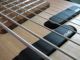
I thought that string spacing was set by the center of the string. If that is true, the edges of 2 thicker strings will be closer together than the edges of 2 thinner strings. Since you are measuring edges, that looks correct to me. Keep in mind I don't have much experience in this area. I am just saying how I thought it was supposed to work.

There's two ways I'm aware of to set up the string spacing on the nut. Even centers, which is what your's appears to be, and even spacing, which will take into account the gauge of the string, and have the same spacing between strings. Even spacing would yield the same measurement as you took them on your nut. Even centers will yield different measurements for each space between each string.
For what it's worth, I tried a nut with even spacing. I didn't like it. I set up my nuts with even centers, so the lower strings are actually closer together because those strings are thicker. I suppose it's what I'm used to.
For what it's worth, I tried a nut with even spacing. I didn't like it. I set up my nuts with even centers, so the lower strings are actually closer together because those strings are thicker. I suppose it's what I'm used to.
Reality Check Arrived:
OEM bakelite Ric bass nut from POTR, and danged if the A and D sting slots don't look too close together. Goes to show you can't always trust your eyes! I sent the two piece brass nut back for a one-piece, I may just put this black one in and call it good, haven't decided. I can always use the brass one on Hossenfeffer II.

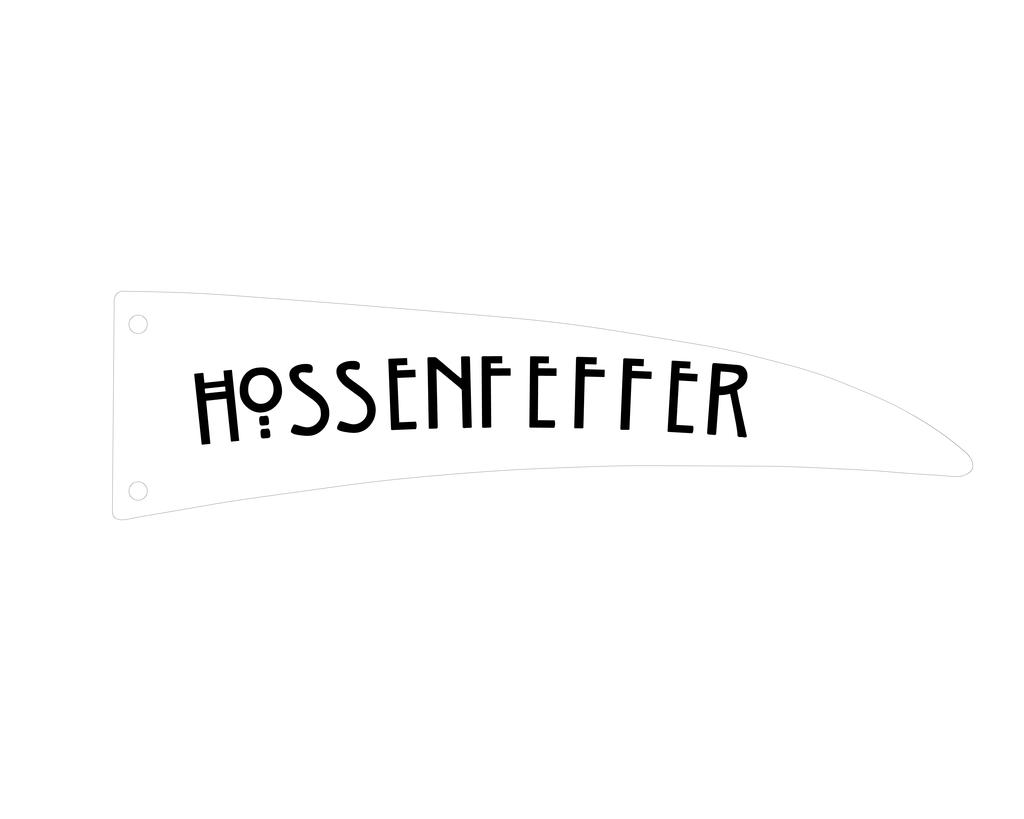
On another front, first attempt at a TRC logo. This was laid out using the Autocad "ARCTEXT" command, which allows text to be arranged on any arc. I don't feel I have to be slavish to the Rick logo size or exact orientation, but would appreciate any comments or suggestions. I don't have much experience monkeying with text. I definitely want this font, but height, spacing, degree of arc, etc all up for grabs. I got a couple extra pieces of pearloid from Pickguardian to match the pickguard, will use the clear plastic one made for me by @Aceonbass as a template. The clear one will get backpainted and used on Hossenfeffer II, probably with the same logo. This one will be black text over a pearloid TRC. Any advice on how best to apply the logo appreciated, waterslide vs. vinyl sticker, clearcoating, all new to me.
OEM bakelite Ric bass nut from POTR, and danged if the A and D sting slots don't look too close together. Goes to show you can't always trust your eyes! I sent the two piece brass nut back for a one-piece, I may just put this black one in and call it good, haven't decided. I can always use the brass one on Hossenfeffer II.
On another front, first attempt at a TRC logo. This was laid out using the Autocad "ARCTEXT" command, which allows text to be arranged on any arc. I don't feel I have to be slavish to the Rick logo size or exact orientation, but would appreciate any comments or suggestions. I don't have much experience monkeying with text. I definitely want this font, but height, spacing, degree of arc, etc all up for grabs. I got a couple extra pieces of pearloid from Pickguardian to match the pickguard, will use the clear plastic one made for me by @Aceonbass as a template. The clear one will get backpainted and used on Hossenfeffer II, probably with the same logo. This one will be black text over a pearloid TRC. Any advice on how best to apply the logo appreciated, waterslide vs. vinyl sticker, clearcoating, all new to me.
Last edited:
Love the font! Looks like an Arts & Crafts or Dard Hunter style. I'd consider a bit more arc, and if possible, squish the height a tiny bit as it goes from left to right. Don't know if that's possible with that program.
When I made a custom TRC with logo, I scanned the original, fixed up the text by turning it into vector art to get it nice and smooth, then back into bitmap art so I could do some extra things mentioned above, as the plexi shape I ended up using had a bit more arc to it than the TRC of modern days.
Otherwise, it's probably fine as is!
When I made a custom TRC with logo, I scanned the original, fixed up the text by turning it into vector art to get it nice and smooth, then back into bitmap art so I could do some extra things mentioned above, as the plexi shape I ended up using had a bit more arc to it than the TRC of modern days.
Otherwise, it's probably fine as is!
Last edited:
Yeah, I'm basically an Arts and Crafts/Roycrofters/Greene and Greene freak. I found a ton of similar fonts, most wouldn't work with the Arctext function, don't know why, though it has something to do with SHX vs TTF format. As luck would have it, this one called "Willow" is TTF and CAD compatible.Love the font! Looks like an Arts & Crafts or Dard Hunter style.
Roycrofters. Cool.
How about a Stickley mortise and tenon type of bass?
How about a Stickley mortise and tenon type of bass?
Last edited:

- Apr 18, 2008
- 16,013
- 1
- 31,725
- Disclosures
- I'm highly opinionated and extremely self-assured
I have no idea what y'all are talking about. 
But that font is super-cool! Make the H larger though.
But that font is super-cool! Make the H larger though.
I can't change the text height progressively, unfortunately. The Arctext function requires you to draw an arc, select it, pick text style, then it allows you to change text size, offset above arc, etc. The arc is established with first, middle, and last points, and you can "rubberband" the points to adjust how curved or flat the arc is, the text will bend with the adjusted curve. The letter spacing is a function of text height and length of arc. I was wondering if it ought to start out straighter, more or less parallel to neck centerline, then gradually arc downward as it progresses. I'll try a few more options and post them.
Last edited:
Howdy CT! Thanks for dropping in. Which part has you flummoxed, obscure Autocad commands, or the Arts and Crafts stuff?I have no idea what y'all are talking about.
But that font is super-cool! Make the H larger though.
 If you want to see the ultimate Palace of Wood Porn, check out the Gamble House by Greene and Greene:
Invalid Link Removed
I cant isolate one letter of the text unless I literally write an "H" on the arc as one letter at one text size, then the rest of the text as a separate group at a smaller text size. It can be done, but I'd be eyeballing the spacing. I'll give it a try!
Maybe each letter is one increment smaller as the previous one to simulate a regressive height change.
Here's a couple more options, smaller text. i actually kinda like the one with the bigger H per @ctmullins suggestion.


I think you already answered if you can do this, I'm not an autocad guy, but to my eyes; the logo should be bigger at the start (the "H") or get smaller at the other end or both. That said; of the two choices in post #454 I like the top one better
If anybody has a suggestion as to a good place to have custom waterslide decals made, let me know. Lots of them online, don't know who other builders use for custom logos. Here's a couple I found online:
[Invalid or Expired Link Removed]
Link Removed
I'll probably have a full sheet made in case I screw up putting them on.
[Invalid or Expired Link Removed]
Link Removed
I'll probably have a full sheet made in case I screw up putting them on.
When I had mine made, it had it made trimmed as close to the script as possible, it worked out because all the letters are attached in that logo. In your case, you'd have to have slide each letter on separately.
Do you remember who made it for you?When I had mine made, it had it made trimmed as close to the script as possible, it worked out because all the letters are attached in that logo. In your case, you'd have to have slide each letter on separately.
OK, I think this is it unless anybody has other suggestions. I rotated the H a hair so it's parallel to the nut, then the rest of the text has a subtle curve downward. Thanks for suggestions. All.

Okay, as a typography freak I have some issues with the kerning (intercharacter spacing). You need to adjust it so that it is more even. While I like the typeface that you used, I'm wondering if it's too illegible for the word "Hossenfeffer".
I'm attaching a few other doodles that I just did to see if it helps in the legibility:
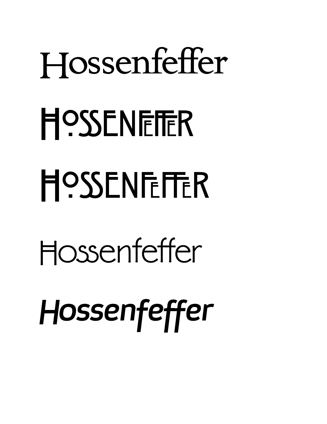
I'm attaching a few other doodles that I just did to see if it helps in the legibility:


