It's a box of knobs designed to make my bass loud. As long as it isn't a hideous color, I'm not worried about it. My GK head makes its statement by sounding awesome.

TalkBass has been independent since 1998. Add your voice.
Create a free account to reply to discussions, view embedded media, and browse with fewer display ads.
Join free Log in
Want zero display ads or expanded classifieds tools? Compare plans.


I guess "Aesthetics" are relative. I was born in the 70s and couldn't be happier they are dead and buried. It looked like everyone went color blind and didn't have mirrors for a decade.Aesthetic is always a factor. If everything was function, we'd all be wearing Dickies jump suits and playing Steinberger basses.


As a "native" guitarist, every time I go to Guitar Center I have this thought. Why are bass amps so ugly compared to guitar amps? Sure, there are some handsome classic bass amp designs such as some Ampegs, and Acoustics, but the vast majority of bass amps currently on the market just have really ugly, gaudy design to my eyes. Here's what I'm talking about:
Bass Amps:

Guitar Amps:
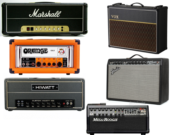



 ) and it all looks essentially the same.
Completely agree. The B15 and blue line SVTs are probably the best looking bass amps along with the V4. It's mainly the modern, solid state amps I feel are so unattractive. A counter example for me is the Warwick LWA1000. The simple design with wood siding gives it a classic look.
 X
X




You have a good point, though I honestly think my cheapo Acoustic B100 with the gunmetal knobs and blue line along the head has a classic character and beauty.
I remember reading an interview with one of the designers from the company that said they started with the blue line because it would read as white on black and white TVs without being glaring. Kinda cool it became a trademark