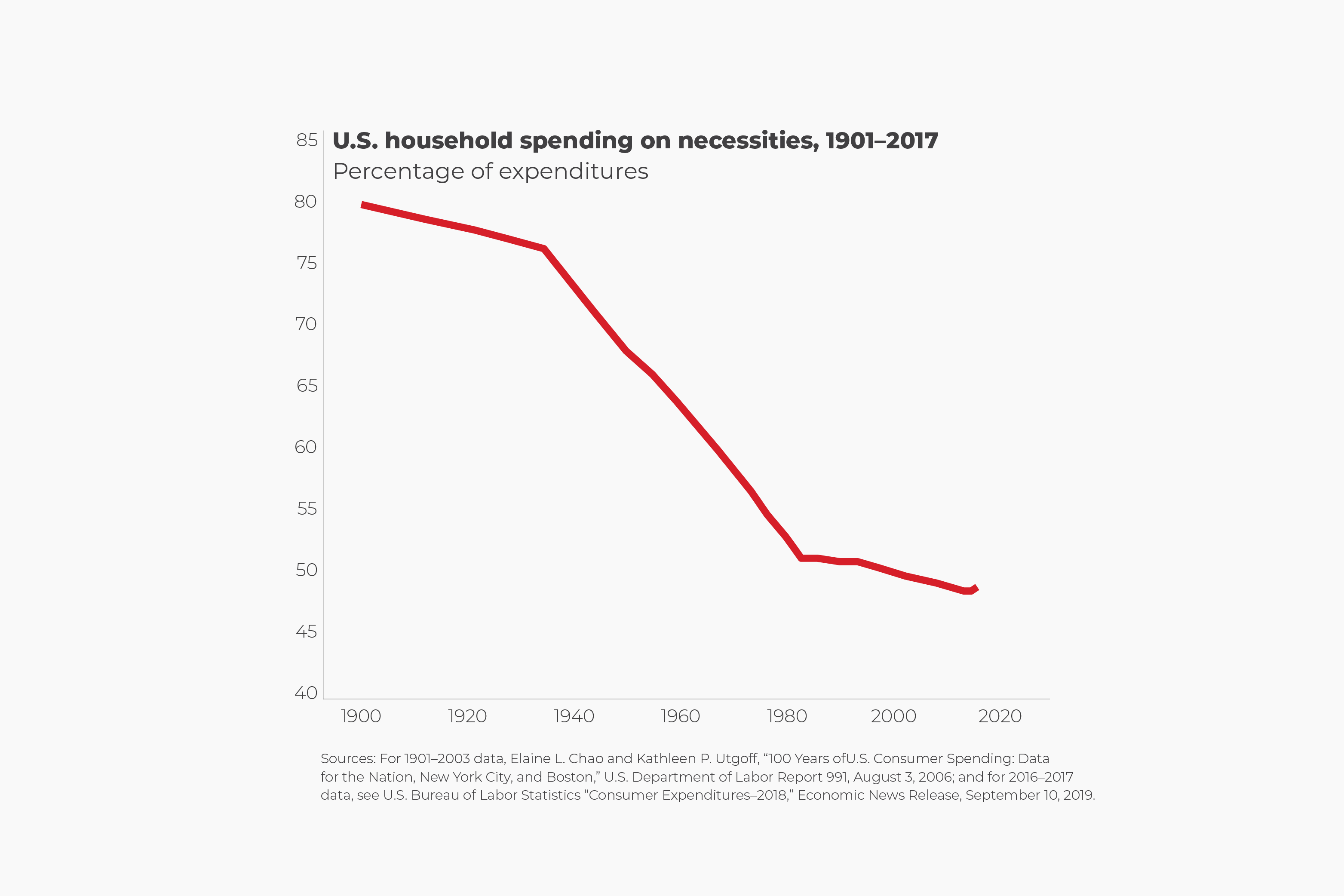
National averages aren't indicative of local job market or even State-level wage stagnation, specifically as it relates to the minimum wage. Here in NC, our minimum wage has stayed the same at $7.25/hr for decades. That's below the certified/recognized Poverty Wage. Certain municipalities have pushed (successfully) for businesses to be Living Wage Certified, but overall the minimum wage in NC has allowed businesses to continue under-paying workers and barely meeting (if they meet at all) adjustments for inflation.
The minimum wage isn't applicable to this discussion because we're talking about all wage earners at all income levels. According to the Bureau of Labor Statistics, 98.7% of workers earned more than the national minimum wage. The 1.3% of workers you're referring to are in no way representative of the entire labor force.
Before you ask, I did look up data sets for wage growth among each income demographic, from the lower to the middle to the upper class, and every group saw wages keep pace with inflation.
Also, your data sets (both charts) are (or are almost) a decade old.
I also checked the stats up to 2024 and found that the past trend continued, with the exception of a glitch during, immediately after, the pandemic.
At first, the massive increase in inflation caused purchasing power to spike downward, but that reversed after 2022, when inflation got under control at the same time businesses massively increased employee pay at all levels inom to entice reluctant workers back into the labor market.
Where burger flippers were making $10/hr in 2020, they're now making $18/hr.
And your 2nd chart literally states in the headlines that while wage averages may have increased, *purchasing power has hardly budged*.
If you look at the numbers, you'll see that "hardly budged" means that it's only increased a few percentage points.
An increase of a few percentage points is most certainly not the same thing as a significant decrease.
Meaning we are not keeping pace with inflation and cost in terms of wages, especially when you look at more micro-level data in areas with high costs of living.
The numbers say that all wage demographics are keeping up with inflation.
Looking at the basic numbers and what it actually takes, on average, to pay the bills is also more helpful than un-nuanced, blanket data. This is an interesting tool which you can investigate living wage requirements and average expenses State-by-State.
Living Wage Calculator
You're correct that prices depend heavily on where you live. But local wages tend to track closely with local prices. Where prices are higher, wages are higher. Where prices are lower, wages are lower. Not just for houses, but for many other goods like fuel and groceries, but also nearly all services.
I live in Northern Illinois, but in a rural area about 100 miles west of Chicago out in the corn fields. In my neighborhood the typical home is about 2,000 ft² with 3 bedrooms and 1½ baths and costs less than $100,000.
Travel 50 miles east into the Chicago suburbs and that same home is $250,000.
Except that there are almost no homes that small available. A "starter" home size there is 3,500 ft² with 5 bedrooms and 3 baths and costs almost $500,000.
When you compare wages between where I live in the sticks to 50 miles east in the suburbs, you'll see that they're roughly commensurate with prices. The suburban house costs twice as much as the equivalent size rural house, but typical wages are also twice as high. Factory jobs here start at $20 an hour. The same job in the burbs is $40.
In my first post, I made a point to say that there are reasons why it's harder for younger people to purchase a house compared to their parents and grandparents, but it has nothing to do with wage stagnation, but rather with other factors (which I dont want to go into here because that would derail this thread.)