
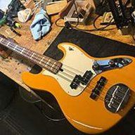
I've got a question to JO Skyline owners. Are there any holes in a body under pickguard?
No...
You could run the bass without a pickguard, or a clear pickguard.

TalkBass has been independent since 1998. Add your voice.
Create a free account to reply to discussions, view embedded media, and browse with fewer display ads.
Join free Log in
Want zero display ads or expanded classifieds tools? Compare plans.
I've got a question to JO Skyline owners. Are there any holes in a body under pickguard?
This one is for Marcus or anybody else who wants to chime in.
I made a new Club Card for my band.
What do you think?
This my first attempt at Photoshop...

So, I went to the Osheaga music festival here over the week-end. I checked out the Decemberists and noticed that Nate Query's got a nice LPB JO. The sound guy'd done his homework, too. There was actual, audible bass coming from the speakers.
yeah, me too...
the worst part, a little nice note from the LOG told me I forgot about something else... a very important thing... worth$29... by tomorrow...
Dude, you take the best pics.
How do you do it?


He he he! No...he's selling a Rick.

See if I can find a use for the "B", other than a thumb rest...

And, if you don't at least find a use for the low D, I'll be shocked. Problem is, you'll get hooked and all your 4s will become useless
(the new  ))
))
I've got a question to JO Skyline owners. Are there any holes in a body under pickguard?
Not bad! I would mix up the font sizes more and keep the the text at the same angle, so the viewer's eyes don't have to search for the start of the line to begin reading. Think about the most important part of the info and keep it up front visually...and then work your way backwards visually. Bright, hot colors will feel more up front...cool colors will recede.
The 45 adapter in the back needs to receded, so make it a color that isn't as bright and not as hot a color.
Hope this helps!
Great advice!
Thank You very much!
I think I have good ideas, but I'm an engineer, not a graphic artist.
Rev 2 on the way...
We all know it's single coils.Let's not get crazy
 the question is if our wives care
No...
You could run the bass without a pickguard, or a clear pickguard.

You were right.
It flows alot better now...
Thanks
we know
okay, okay, I'm stopping
See if I can find a use for the "B", other than a thumb rest...


Wow, I'm not a fan of the white/maple combo on the DJs, looks washed out to me, too much pale-ness.... but w/ the tort guard, yours looks KILLER.


 /
/

