I'm one of the ones who actually likes the logo. But I thought I'd throw a few out there for fun.


TalkBass has been independent since 1998. Add your voice.
Create a free account to reply to discussions, view embedded media, and browse with fewer display ads.
Join free Log in
Want zero display ads or expanded classifieds tools? Compare plans.
I really like the third one down...BUT I found a pic of me in middle school (25years ago) sporting a Peavey T-shirt.. gotta love the classicsI'm one of the ones who actually likes the logo. But I thought I'd throw a few out there for fun.



I thought Peavey changed they're headstock/amp logo to this a while ago:
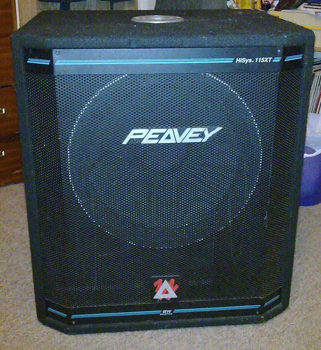
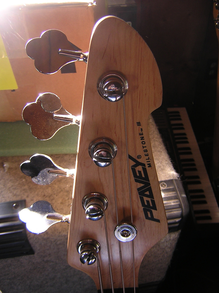

...I just shook my head when they switched back, that old pointy logo cheapens the whole brand, IMO...


I love the pointy logo
... The original pointy logo just screams Peavey IMO and should never have been anything else. Its a very killer looking logo ...

+1
Call me an old fart but to me, this is classic. Straight Old-School.
Link Removed

i honestly think you cant top the orginal but heres this quickie:



+1
Call me an old fart but to me, this is classic. Straight Old-School.
Link Removed