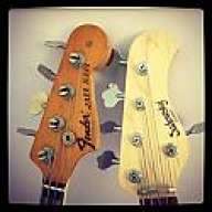
Besides being a bass player, I'm graphic designer and typeface designer too. So, when I see a stompbox, an amp or any other equipment I see beyond. Not only its sound or quality but also its design interest me more than most people, I suppose. The way it's knobs, enclosures and panels are combined with fonts and logos to attracts us is amazing.
So in this post I would like to comment some things that catch my attention and propose, whenever possible, my particular view of the improvements that couldve been made on each of them.
But before anything else, I would like to emphasize that I am a huge fan of the brands ans products which I will talk about here and I respect them above all. So, lets begin.
The first effect pedal that I will comment is the 'T Overdrive Special', a product of a Brazilian manufacturer called T Miranda.
I realized that the brand of pedals, combos and stacks T Miranda could better reflect its quality without losing your original graphic concepts. A simple re-design could make it happen. So, I decided to propose one. A free interpretation of the current 'T Overdrive Special' without briefing but with the same spirit.
I kept the '50s type style on the logo but I re-designed it, adjusted its size and created a volume to highlight the product name on the panel of the pedal. For this I used the Salamander Script Bold font
Furthermore, I conducted an exercise with brand T Miranda, exploring the vintage look in an easy apprehension's graphic sign that can be applied in small objects. The color was maintained, but slightly darkened by increasing the contrast in order to improve the reading of written information.
[Invalid or Expired Link Removed]
[Invalid or Expired Link Removed]
So in this post I would like to comment some things that catch my attention and propose, whenever possible, my particular view of the improvements that couldve been made on each of them.
But before anything else, I would like to emphasize that I am a huge fan of the brands ans products which I will talk about here and I respect them above all. So, lets begin.
The first effect pedal that I will comment is the 'T Overdrive Special', a product of a Brazilian manufacturer called T Miranda.
I realized that the brand of pedals, combos and stacks T Miranda could better reflect its quality without losing your original graphic concepts. A simple re-design could make it happen. So, I decided to propose one. A free interpretation of the current 'T Overdrive Special' without briefing but with the same spirit.
I kept the '50s type style on the logo but I re-designed it, adjusted its size and created a volume to highlight the product name on the panel of the pedal. For this I used the Salamander Script Bold font
Furthermore, I conducted an exercise with brand T Miranda, exploring the vintage look in an easy apprehension's graphic sign that can be applied in small objects. The color was maintained, but slightly darkened by increasing the contrast in order to improve the reading of written information.
[Invalid or Expired Link Removed]
[Invalid or Expired Link Removed]