
Enjoy the benefits of a premium membership!
Upgrade Account
-
TalkBass has been independent since 1998. Add your voice.
Create a free account to reply to discussions, view embedded media, and browse with fewer display ads.
Join free Log in
Want zero display ads or expanded classifieds tools? Compare plans.
You are using an out of date browser. It may not display this or other websites correctly.
You should upgrade or use an alternative browser.
You should upgrade or use an alternative browser.
More options
Who Replied?

Always used the Default and turn my brightness down makes it look more like paper and it easier on the eyes then the black out.
Three hours of use review.
Like the larger words making it easier to read.
On a Chrome Book I have a half inch border on each side, I do not care for this and would prefer it fill in the screen. Give it time should get use to it.
I use the pull down of forums a lot, prefer it over quick nav.
I did not notice that anyone on this page had a LIKE, now see that Paul does. Looking at other pages my eyes also did not catch them.
I like it, but there is always something to complain about. Them are mine.
Three hours of use review.
Like the larger words making it easier to read.
On a Chrome Book I have a half inch border on each side, I do not care for this and would prefer it fill in the screen. Give it time should get use to it.
I use the pull down of forums a lot, prefer it over quick nav.
I did not notice that anyone on this page had a LIKE, now see that Paul does. Looking at other pages my eyes also did not catch them.
I like it, but there is always something to complain about. Them are mine.

I like it on mobile, but not on the desktop. Is there any way for TB to detect what type of device we're browsing on and go to whatever format we select for that kind of device?
Always used the Default and turn my brightness down makes it look more like paper and it easier on the eyes then the black out.
Three hours of use review.
Like the larger words making it easier to read.
On a Chrome Book I have a half inch border on each side, I do not care for this and would prefer it fill in the screen. Give it time should get use to it.
I use the pull down of forums a lot, prefer it over quick nav.
I did not notice that anyone on this page had a LIKE, now see that Paul does. Looking at other pages my eyes also did not catch them.
I like it, but there is always something to complain about. Them are mine.
Thanks for the feedback. I agree, the like bar is very hard to notice. I'll do some fiddling with it. I'll do some performance testing with the forum dropdown menu... I don't like it because it's something extra to have to load, and the developer of that add-on isn't supporting it any longer...

edit: changed the border of the "like" bar to yellow-ish (bass clef and button color) in FLAT LIGHT. Stands out a bit more now I think?

 --- desktop Meh :/
@paul the biggest issue I have with flat (on mobile and desktop) is a mod related one. when I click on the flag up in the top left to view reported posts, it opens up in a new window on the phone and a new tab on the computer. I much prefer th default style where it keeps you in the current browsing window. is there any way to keep it in the current window?

FLAT DARK now available in the style chooser. Let me know what you think!
I like it a little better than the flat light one. I surf in the dark a lot and the white screens of the retro and flat light are too blinding

I TB about half the time on my phone and half on PC. I haven't had a sec to check out the flats on PC yet, but FLAT DARK is the new default on my phone. It is "snappy" by comparison Paul. Both the flat themes look more like the few times I have checked out a Kindle Paperwhite or similar ebook format. More of a "matte finish" if that even makes sense. It will take a little more getting used to, kind of like the short transition from app to browser on my phone. But it looks sharp and I like the cleaned up layout.

Snappier, easier, etc. on mobile phones and tablets seems to be the consensus.
I was look at real-time Google Analytics stats (snooping on y'all ) this afternoon, and for the first time that I've seen, a majority (56%) of all TalkBass traffic was on a phone or tablet. This makes me want to make FLAT styles the site default. If I can help to make it look better on desktops, maybe we can make the majority happy. So those of you who don't prefer the new FLAT styles on your desktop, if you have any suggestions on how to make it better please don't hesitate
  Customization of these styles is way easy.
I was look at real-time Google Analytics stats (snooping on y'all
) this afternoon, and for the first time that I've seen, a majority (56%) of all TalkBass traffic was on a phone or tablet. This makes me want to make FLAT styles the site default. If I can help to make it look better on desktops, maybe we can make the majority happy. So those of you who don't prefer the new FLAT styles on your desktop, if you have any suggestions on how to make it better please don't hesitate Customization of these styles is way easy.
@paul the biggest issue I have with flat (on mobile and desktop) is a mod related one. when I click on the flag up in the top left to view reported posts, it opens up in a new window on the phone and a new tab on the computer. I much prefer th default style where it keeps you in the current browsing window. is there any way to keep it in the current window?
Easy and done!

[in living color mode=on] Hated it. [in living color mode=off] (watch the real old farts and the young whippersnappers try to figure that one out)
I'd guess developing it has something to do with the irritating intermittent death of dropdowns on default style lately? It seemed dedicated to not having those all the time, and it leaves stuff stuck on the screen that's useless without those working, and it makes the sticky threads look just like the regular threads at the top of a forum so it's harder to tell where the start is. Ob course, I've never used a phone to look at the site, and never plan to (sure, it could, I guess, but peering at a tiny screen when there's a nice comfortable big one on my desk, and a real keyboard attached, too? Whisky Tango Foxtrot indeed.
I'd guess developing it has something to do with the irritating intermittent death of dropdowns on default style lately? It seemed dedicated to not having those all the time, and it leaves stuff stuck on the screen that's useless without those working, and it makes the sticky threads look just like the regular threads at the top of a forum so it's harder to tell where the start is. Ob course, I've never used a phone to look at the site, and never plan to (sure, it could, I guess, but peering at a tiny screen when there's a nice comfortable big one on my desk, and a real keyboard attached, too? Whisky Tango Foxtrot indeed.

Really liking the flat black on my iPhone, which is what I use 99% of the time.
Would like to have "Watched Threads" in place of featured threads like it is in the original dark format.
I'd assume most people check that regularly over featured threads.
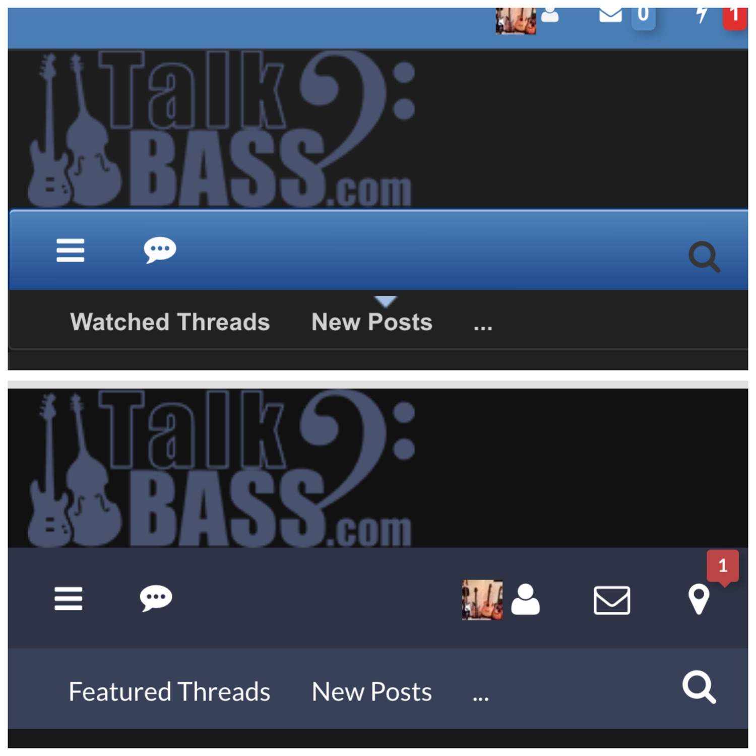
Would like to have "Watched Threads" in place of featured threads like it is in the original dark format.
I'd assume most people check that regularly over featured threads.

Really liking the flat black on my iPhone, which is what I use 99% of the time.
Would like to have "Watched Threads" in place of featured threads like it is in the original dark format.
I'd assume most people check that regularly over featured threads.
...
I agree - would prefer 'watched' over 'featured' in the toolbar...

I like the Flat Dark much better than Flat Light.
I'm not sure if you changed the screen size, but it is now using the full capacity of my desktop display. Thank you.
My preference would be to dial up the visibility of links and user names that are tagged in posts. They fade into the background too easily.
I'm not sure if you changed the screen size, but it is now using the full capacity of my desktop display. Thank you.
My preference would be to dial up the visibility of links and user names that are tagged in posts. They fade into the background too easily.
I like the Flat Dark much better than Flat Light.
I'm not sure if you changed the screen size, but it is now using the full capacity of my desktop display. Thank you.
My preference would be to dial up the visibility of links and user names that are tagged in posts. They fade into the background too easily.
I haven't changed the screen width; I think what's happening is that when you stretch the window wider than a certain width, the margins start to appear. If your window is a "standard" size, you won't see the margins.
I've changed the link color so that links aren't hidden so much: @charlie monroe

Thanks @paul.
That is much easier for me to read.
I think you are right about the screen real estate. I have since switched to a different machine that has a wide screen and the borders reappeared.
In any event, the Flat Dark scheme will likely be my go to theme from now on.
That is much easier for me to read.
I think you are right about the screen real estate. I have since switched to a different machine that has a wide screen and the borders reappeared.
In any event, the Flat Dark scheme will likely be my go to theme from now on.
Paul, I like the Flat Light theme a lot as I use the iphone primarily. It's much easier to read without readers.
You'll have to add back the apple-icon as it's currently using the xenfro default icon. See below.
View attachment 920381
Thanks, will fix! Seeing all those TB bookmarks on your phone makes me happy.


