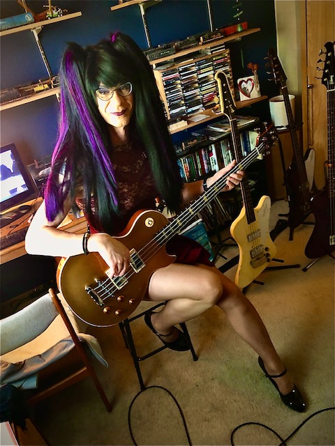
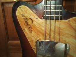
Did some trickery with Snapseed...
Gold wouldn't look bad either.
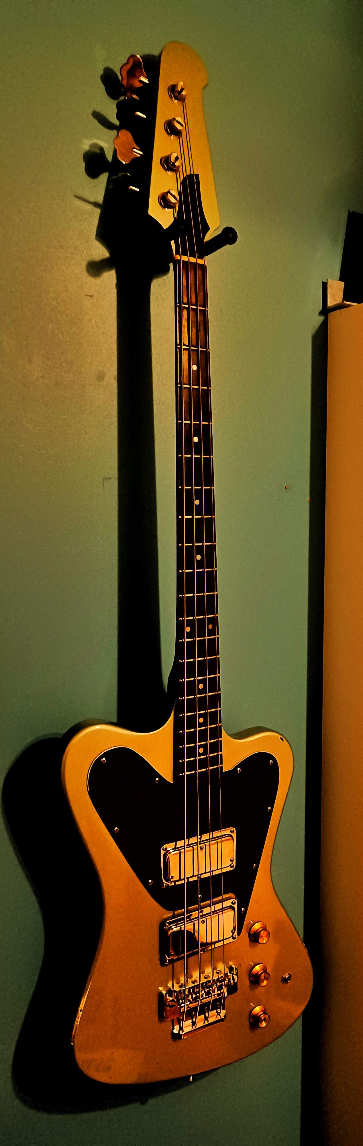
Gold wouldn't look bad either.

TalkBass has been independent since 1998. Add your voice.
Create a free account to reply to discussions, view embedded media, and browse with fewer display ads.
Join free Log in
Want zero display ads or expanded classifieds tools? Compare plans.

Performer?


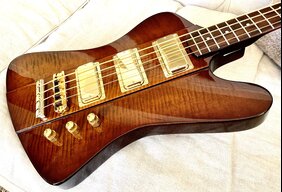
I bet it would look just like…I agree - Gibson never did a gold T-bird... would be cool.

What hope do I have!What dress, I’m fixating on the legs.
ok, the dress - looks cobalt blue and emerald green (maybe some black backing as well). But the green might just be the reflection of the bass in the sequins.
I have zero issues with colors and shades and hues, but I am viewing the vintage Inverness Green with an iPad, who knows how accurate that is. Looks like faded gold to me. Lighting and backgrounds play a huge part in color accuracy of photos.
Here’s four pics of Shoreline Gold taken under different lighting and background conditions with different cameras by different people…
This one has a slight greenish tint
View attachment 4673698
This one almost looks Cream colored or aged white
View attachment 4673699
This one looks Gold
View attachment 4673700
This one looks almost like Inca Silver
View attachment 4673701


That is three colours more than required. Every colour is some combination of red green and blue.Is it that you don’t see the differences? I know guys that only acknowledge Red, Yellow, Blue, Green, Orange and Purple as legitimate names for colours.
That's a great look! Wear the wig all the time!
I'm inclined to blame TalkBass as the picture was displayed correctly, then later was not. I suspect that the software running the site is having trouble handling some aspect of pictures resulting in not rendering.Thanks. That confirms it's something with my browser (Brave, which is Chromium based).
The difference in colour is a result of the camera software doing its automagic white balancing. The software is attempting to adjust all the colours for the lighting based on what it guesses white looks like under those conditions. Pictures can look different from computer to computer as well as the vast majority of monitors are not colour profiled to ensure correct colour presentation.What dress, I’m fixating on the legs.
ok, the dress - looks cobalt blue and emerald green (maybe some black backing as well). But the green might just be the reflection of the bass in the sequins.
I have zero issues with colors and shades and hues, but I am viewing the vintage Inverness Green with an iPad, who knows how accurate that is. Looks like faded gold to me. Lighting and backgrounds play a huge part in color accuracy of photos.
Here’s four pics of Shoreline Gold taken under different lighting and background conditions with different cameras by different people…
This one has a slight greenish tint
View attachment 4673698
This one almost looks Cream colored or aged white
View attachment 4673699
This one looks Gold
View attachment 4673700
This one looks almost like Inca Silver
View attachment 4673701


Timothy Schmidt?
my my, what have we here…...

This was my 1987 Freightliner. According to its spec sheet, it was Dupont Imron "Trumpet Gold". Depending on lighting, it could look green-ish, sorta gray, and whatever else.(Sorry 'bout the raggedy-@$$ trailer. That belonged to the company). I wouldn't object to 2021 NR in that colo(u)r.View attachment 4673730
 I wish someone would make an older '70s Freightliner Conventional in HO!

PM sent.
Have you seen this nice Kenworth and the Peterblit 359 from Brekina?
Sorry, model train dork here.
It's early Thursday.
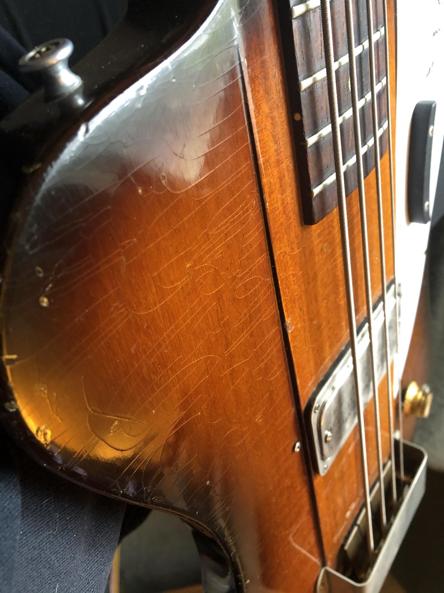
It looks like your PUP is even lower than my neck PUP. One day I may try some adjusting on mine (counting each turn very carefully). I hate messing with perfection, but am curious. I like the finish cracks. They are needed to let that monstrous tone out.
Have you seen this nice Kenworth and the Peterblit 359 from Brekina?
Sorry, model train dork here.
It's early Thursday.
 . Can't really say "Tone is in the cracks." That just sounds a bit off!
They look like they are camera shy.My babies got back for a Thursday.
View attachment 4673888