• TalkBass has been independent since 1998. Add your voice.
    Create a free account to reply to discussions, view embedded media, and browse with fewer display ads.
    Join freeLog in
    Want zero display ads or expanded classifieds tools? Compare plans.

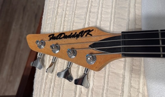
Your favorite headstock logo

pklima

Commercial User
May 2, 2003
8,458
7,048
Kraków, Polska
Disclosures
Karoryfer Samples
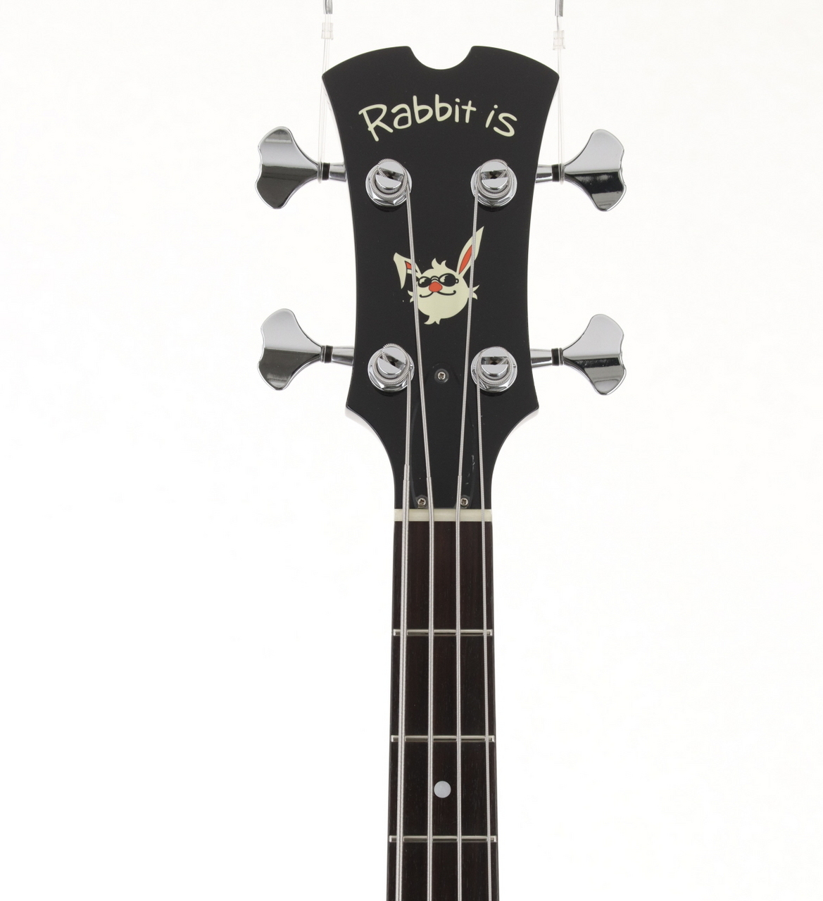
Would I buy a bass that doesn't fit my needs just for the logo on the headstock? No, but...

1763882305039.png


There's also this pink Burny bass with this version of the logo...

1763882424699.png


You might notice a theme developing here. Good thing both are short or medium scale or I might actually have bought them...
 
Here is my favorite headstock decal because it is on my all time favorite bass. HA! About 40% of the decal is gone (that's ok) and it is just a Fender Precision decal. Nothing special but..........from 1953. Two years after I was born.

It'll have to be zoomed in. I don't have a close up, just yet.
20240324_125318.jpg
 
Last edited:
Here is favorite headstock decal because it is on my all time favorite bass. HA! About 40% of the decal is gone (that's ok) and it is just a Fender Precision decal. Nothing special but..........from 1953. Two years after I was born.

It'll have to be zoomed in. I don't have a close up, just yet.View attachment 7374353
Yep, the classic original. :thumbsup:
E2NxAKNGTA6rPq82YGKwjA_thumb_1168a.jpg
 
Hot take: The Ibanez Soundgear logo is the most '80s logo possible on an instrument manufactured in the 2020s. It approaches so-bad-it's-not-that-bad status.
1763904387066.png


It's too awkward to be iconic the way the Fender logo is, and kind of an outlier in 80s graphic design tropes so it doesn't look retro either. It's not timeless like the IBM logo, but not of the moment either. Kind of awkward and unbalanced, proposes an acronym for "Soundgear" that Ibanez does not and has not used ever, so it's hard to understand why it's there.

Clearly somebody or some people at Ibanez feel obligated to continue using it on headstocks though even they apparently don't like it -- they haven't used it in any other media or promotional literature for as long as I can remember. Every so often someone at Ibanez will manage to scrub the SDGR logo off a limited-edition Soundgear, but it always comes back later.
1763905450804.png


Soundgear is one of the only Ibanez product lines to even have its own logo (BTB is the only other one I'm aware of, all other products, including the guitars, has an Ibanez logo variant). So I kind of admire Ibanez's commitment to it considering they've stuck with this one product logo unchanged for longer than Ibanez has to their own corporate logos.
1763904562153.png

1763904613473.png
 
Heh, I knew somebody would bring up the Fender - but it is iconic, successful and often imitated.
Fender's logo has been through changes too...
16539-fender-logo-differences-Hero.jpg

with further variants in outlined and solid shapes, the weight of the outline, and so on. They tend to keep the feel of the original logo (and current corporate materials use a redraw of the original 'spaghetti') but basically Fender's never settled on a single consistent logo.

...and every so often they make a clean break from it :smug:
1763907634333.png
 

Attachments

  • 1763907335725.png
    1763907335725.png
    375.1 KB · Views: 15
Hot take: The Ibanez Soundgear logo is the most '80s logo possible on an instrument manufactured in the 2020s. It approaches so-bad-it's-not-that-bad status.
View attachment 7374352

It's too awkward to be iconic the way the Fender logo is, and kind of an outlier in 80s graphic design tropes so it doesn't look retro either. It's not timeless like the IBM logo, but not of the moment either. Kind of awkward and unbalanced, proposes an acronym for "Soundgear" that Ibanez does not and has not used ever, so it's hard to understand why it's there.

Clearly somebody or some people at Ibanez feel obligated to continue using it on headstocks though even they apparently don't like it -- they haven't used it in any other media or promotional literature for as long as I can remember. Every so often someone at Ibanez will manage to scrub the SDGR logo off a limited-edition Soundgear, but it always comes back later.
View attachment 7374369

Soundgear is one of the only Ibanez product lines to even have its own logo (BTB is the only other one I'm aware of, all other products, including the guitars, has an Ibanez logo variant). So I kind of admire Ibanez's commitment to it considering they've stuck with this one product logo unchanged for longer than Ibanez has to their own corporate logos.
View attachment 7374363
View attachment 7374365

I was going to mention the Soundgear logo as well. Something about the two fonts and it being chrome, to me,it just fits perfectly with the character of the soundgear line.

Not the best photo, but one of my old SR505's:
1000029972.jpg


I'm a big fan of the script version of the Peavey Fury because it's the least appropriate font for the word Fury and I think it's great, especially when next to the pointy Peavey logo
1000037651.jpg
 
I was going to mention the Soundgear logo as well. Something about the two fonts and it being chrome, to me,it just fits perfectly with the character of the soundgear line.

Not the best photo, but one of my old SR505's:
View attachment 7374411


I'm a big fan of the script version of the Peavey Fury because it's the least appropriate font for the word Fury and I think it's great, especially when next to the pointy Peavey logo
View attachment 7374412
I think the raised metallic headstock logos only appear on Soundgear Prestige and Premium models. Everything else gets a white or black or grey decal.

Hadn't noticed that Fury logo before. Great call! Maybe it's like how some people get quieter, rather than louder, when they're angry.