- Jun 30, 2010
- 49,588
- 221,967
- Disclosures
- musician/artist/owner - Gildaxe

TalkBass has been independent since 1998. Add your voice.
Create a free account to reply to discussions, view embedded media, and browse with fewer display ads.
Join free Log in
Want zero display ads or expanded classifieds tools? Compare plans.

Okay, I’ll do it!Rickenbacker! I'm surprised nobody has mentioned them 3 pages into this thread.
Alembic is probably my second favorite. F Bass, Fodera, and D'Angelico are honorable mentions.



Old Skool Kool...View attachment 7374336 View attachment 7374338
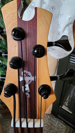
Always loved The Alembic logo - and the more inlaid abalone, precious metals and diamonds the better! Not that I'll ever have one, mind!





I’ve always loved those and think the heart
 tuners are the perfect touch .
Bonus: a couple of the many earlier Mayones logos. Sorry for the guitar content, but, well, searching through lots of photos trying to find a specific old logo on a bass is tiring, and there's at least one other one I can't find that I know I've seen on basses.