• TalkBass has been independent since 1998. Add your voice.
    Create a free account to reply to discussions, view embedded media, and browse with fewer display ads.
    Join freeLog in
    Want zero display ads or expanded classifieds tools? Compare plans.

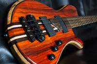
5 string buckeye burl/mahogany neck through

I took the clamps off of the headstock.

tumblr_njzv0yeB011qi8q1ao3_1280.jpg


I can't really tell how good the glue lines are because of the way it's laid out right now, but I'll find out when I cut it out. It looks like I'm going to have to dig the yellow glue out of the bark pockets...

Then I glued the truss rod cover woods on the same piece of mahogany.

tumblr_njzv0yeB011qi8q1ao1_1280.jpg


That will obviously get thinned waaaay down.

tumblr_njzv0yeB011qi8q1ao2_1280.jpg
 
I made a promo catalog for my guitars and basses that I'm going to submit to a company as part of a job application (for a marketing assistant job). If anyone wants to take a look through it and give me opinions by tomorrow that'd be really helpful. I feel weird having a picture of myself on the cover and writing about myself, but I'm hoping that it will make it look like an actual guitar catalog.

Invalid Link Removed

Please keep in mind that this is the first design layout that I've done since my second or third year of college.
 
I made a promo catalog for my guitars and basses that I'm going to submit to a company as part of a job application (for a marketing assistant job). If anyone wants to take a look through it and give me opinions by tomorrow that'd be really helpful. I feel weird having a picture of myself on the cover and writing about myself, but I'm hoping that it will make it look like an actual guitar catalog.

Invalid Link Removed

Please keep in mind that this is the first design layout that I've done since my second or third year of college.

I really like it! I'd make 2 suggestions though. First, while I think the mixture of black and white and color images creates a nice atmosphere, I'd likely put a little more color in the first 5 pages. Keep in mind that I'm old, and the kids these days may have different tastes.

Second, on page 8, you describe the right most instrument as "Okinawan sanshin-like". I'd have likely gone with something like "Custom" or Modified" sanshin.

Overall, very nice work, with a great eye for design.
 
Beautiful work. For a Marketing job, I'd also consider making a press-release as a sample of what you can bring to the job. You could take the angle of Kalamazoo's history with musical instruments or whatever as an example of how you can get the customer's name out there.
 
I really like it! I'd make 2 suggestions though. First, while I think the mixture of black and white and color images creates a nice atmosphere, I'd likely put a little more color in the first 5 pages. Keep in mind that I'm old, and the kids these days may have different tastes.

Second, on page 8, you describe the right most instrument as "Okinawan sanshin-like". I'd have likely gone with something like "Custom" or Modified" sanshin.

Overall, very nice work, with a great eye for design.

Yeah, I agree. I might see how it looks with the bass on the cover in color with myself still in black and white or something.

Perfect! I couldn't think of how to word it when I was typing it and forgot to go back to it. I'll definitely change that.

Thanks!!

Beautiful work. For a Marketing job, I'd also consider making a press-release as a sample of what you can bring to the job. You could take the angle of Kalamazoo's history with musical instruments or whatever as an example of how you can get the customer's name out there.

Thanks! The job doesn't really have anything to do with instruments, they just asked me to send them a marketing campaign that I have made and implemented and I didn't have any that I wanted to send in, so I figured I'd make a new one and implement it now! They also asked how well I know social media, so I made some new accounts (links in my signature) so I can show them that. I haven't really done much with twitter yet, but instagram is going good and I've had the facebook page for a while, so I don't really have to do anything new there right now. I have a youtube channel too and was thinking about putting together a promo video, but I don't think I have enough footage right now, so I'll probably just wait and do that later. I also made a non-related flyer because they asked for a flyer too.
 
Yeah, I agree. I might see how it looks with the bass on the cover in color with myself still in black and white or something.

Perfect! I couldn't think of how to word it when I was typing it and forgot to go back to it. I'll definitely change that.

Thanks!!


Thanks! The job doesn't really have anything to do with instruments, they just asked me to send them a marketing campaign that I have made and implemented and I didn't have any that I wanted to send in, so I figured I'd make a new one and implement it now! They also asked how well I know social media, so I made some new accounts (links in my signature) so I can show them that. I haven't really done much with twitter yet, but instagram is going good and I've had the facebook page for a while, so I don't really have to do anything new there right now. I have a youtube channel too and was thinking about putting together a promo video, but I don't think I have enough footage right now, so I'll probably just wait and do that later. I also made a non-related flyer because they asked for a flyer too.

Hey Lisa....

All the elements they are looking for in terms of your design chops are there - elegance, sense of space, use of color, excellent comprehension of flow and placement. Very nice work all the way around. At first I thought that there could be more color as mapleglo suggested - but when you introduce the color it is such a nice surprise, now I am on the fence.

I think the work speaks for itself and speaks volumes about your many talents. Even more impressive is that you are using photos that you took yourself, of instruments that you designed and built yourself.

It's a powerful presentation and this should be a no-brainer if the decision maker for your prospective employer leans more on the creative side...
 
Last edited:
Beautiful work. For a Marketing job, I'd also consider making a press-release as a sample of what you can bring to the job. You could take the angle of Kalamazoo's history with musical instruments or whatever as an example of how you can get the customer's name out there.


Kalamazoo?

Loved mine, I had the "Mustang" type model on top...

kalamazooKB1.jpg
 
Last edited:
Hey Lisa....

All the elements they are looking for in terms of your design chops are there - elegance, sense of space, use of color, excellent comprehension of flow and placement. Very nice work all the way around. At first I thought that there could be more color as mapleglo suggested - but when you introduce the color it is such a nice surprise, now I am on the fence.

I think the work speaks for itself and speaks volumes about your many talents. Even more impressive is that you are using photos that you took yourself, of instruments that you designed and built yourself.

It's a powerful presentation and this should be a no-brainer if the decision maker for your prospective employer leans more on the creative side...

Thank you so much!

Kalamazoo?

Loved mine, I had the "Mustang" type model on top...

View attachment 562732

Kalamazoo is the name of the city I live near. I'm sure those basses were made here. Gibson was originally in Kalamazoo and Heritage guitars is using the old Gibson factory now.

 
Thank you so much!

Kalamazoo is the name of the city I live near. I'm sure those basses were made here. Gibson was originally in Kalamazoo and Heritage guitars is using the old Gibson factory now.


Hey Lisa

I was teasing more or less - I grew up in Fort Wayne, I know all about your stomping grounds in Michigan - I used to make trips all over Michigan to see bands, Ann Arbor, even Cobo Hall in Detroit. Hate to date myself, but I was actually at Goose Lake, now that is going BACK!

Wasn't teasing about the Kalamazoo though - That is me at the ripe age of 12 playing mine:

1524125_5d6e6a1bc1fbbf314a4381d99222d674.jpg


The Kalamazoo bodies were actually made by a toilet seat manufacturer in Wisconsin. I think "glacier white" was their natural. They were light - more or less particle board. The funny part was, if you removed a screw you had to epoxy it back in because the screw hole would chip away....

As far as the revisions go - I like it even better, mapleglo was right about the color methinks....
 
Last edited:
  • Like
Reactions: lbridenstine
Here is the updated color version:

Invalid Link Removed

I changed the black and white photos to the color versions, but desaturated them so they aren't full color. I changed the cover photo because I only had that one in black and white.

I liked the first black and white cover photo better. The composition is more interesting to me. Then on the third page id bring just the guitar up to full saturation just to make it pop. Though thats kind of an overused effect anymore.
 
  • Like
Reactions: lbridenstine
Here is the updated color version:

Invalid Link Removed

I changed the black and white photos to the color versions, but desaturated them so they aren't full color. I changed the cover photo because I only had that one in black and white.

I prefer the front page of the black and white version. The picture itself is really nice and fits well in B/W. The color version is too cluttered, and looks a bit more "static". The only drawback of the B/W version is that the logo doesn't stand out enough. Maybe do that in color? (Teal with black outline?)

The pictures inside the catalog should be in full color. It should show off the product in all it's glory. Especially since one of your focus points is using nice woods. Let the subject speak for itself. :)

I'm not a huge fan of the picture on page 3/4. The tree is a bit distracting. If the tree were to the far left it would be great, but now the tree and the guitar is fighting for attention.

Apart from that it looks really nice. :)


(All this is my opinion, and I may not know what I'm talking about. ;) I don't intend to sound harsh.)
 
Thanks for the feedback everyone! I have no idea how many applicants they have the position narrowed down to or what kind of experience they have and sometimes experience counts more than creativity, but we'll see what happens. At the very least, I got some practice in on InDesign and Photoshop and have something made out of it. :D

I liked the first black and white cover photo better. The composition is more interesting to me. Then on the third page id bring just the guitar up to full saturation just to make it pop. Though thats kind of an overused effect anymore.

I liked that photo better too, but the guy who took it only gave me the black and white copy and it was from 2 or 3 years ago, so I doubt he'd have the color version if I asked for it. I figured if everything else is in color, the cover probably should be too. The new one is the next best I could find. I wasn't in a band for very long after making that bass and haven't played any shows since then, so I don't have many shots to choose from, unfortunately.

For the sake of it being a fun/interesting project, I'll probably make another after I have some more instruments done and get to go take photos of some other people playing them live. :)


Are any of you on instagram or twitter?
 
Thanks for the feedback everyone! I have no idea how many applicants they have the position narrowed down to or what kind of experience they have and sometimes experience counts more than creativity, but we'll see what happens. At the very least, I got some practice in on InDesign and Photoshop and have something made out of it. :D


I liked that photo better too, but the guy who took it only gave me the black and white copy and it was from 2 or 3 years ago, so I doubt he'd have the color version if I asked for it. I figured if everything else is in color, the cover probably should be too. The new one is the next best I could find. I wasn't in a band for very long after making that bass and haven't played any shows since then, so I don't have many shots to choose from, unfortunately.

For the sake of it being a fun/interesting project, I'll probably make another after I have some more instruments done and get to go take photos of some other people playing them live. :)


Are any of you on instagram or twitter?
Personally i would still use the black and white picture. Especially since the next couple are desaturated. But I'm definately no pro marketing guru! It looks good either way.
 
In this old lady's opinion, I think the new color version is perfect. Yes, there's something to be said about the feeling of black and white photos, no question about it. But for me, the color really pops, even though they are de-saturated. To me, it catches the eye better, and has enough allure to make me want to turn the page and see more.
 
  • Like
Reactions: michaelwayneharwood