• TalkBass has been independent since 1998. Add your voice.
    Create a free account to reply to discussions, view embedded media, and browse with fewer display ads.
    Join freeLog in
    Want zero display ads or expanded classifieds tools? Compare plans.

New Dingwall John Taylor Signature

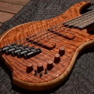
Lot's of knobs don't have any kind of numbering or indicators on them.
a) True, but does that mean it's a good user experience?
b) How many $2500 instruments have blank knobs?

I'm a Rio Dream owner, and I'm also a User Experience designer. This has meant that while I'm mostly very pleased with the bass - it sounds and plays brilliantly - it does have a number of UX niggles that have irritated me.

There are several examples of a "That'll do" solution to a problem, which frankly I wasn't expecting from my first Dingwall - even if it is one based on their "basic" Combustions (if $2500 can ever be considered basic!)

Blank knobs: well, these do the absolute bare minimum of what you need a parameter-changing control to do. I guess going with blank knobs saves on all that pesky aligning of markers and grub-screw anchoring at construction time, which shaves off a few minutes/cents, and makes for a better solution for everyone... except the end user.

As seems to be the consensus from this admittedly small sample group, the worst offender is the pickup selector knob. A simple line or dot would be a start - albeit, again, the least-effort solution. It's entirely possible to engineer, design and manufacture some sort of specialised pickup selector knob - perhaps one that has a window which reveals a graphic of the selected pickup configuration, for example. I'd like to see Sheldon apply some of that "ingenuity without breaking the bank" - that the team have applied to this new bridge - to his instruments' user interfaces.

Would it cost more? Sure. But that thoughtful attention to detail would not go unnoticed by us users... and it's attention to details like these which elevate the instruments you love over the instruments you like.

This isn't just a Dingwall thing, of course. The benchmark for bass/guitar user interfaces is a very low one, and one that's seldom questioned or addressed by manufacturers. And it is partly our fault too - us electric stringed instrument players are a conservative bunch, highly wary of innovation. Just count how many active basses still don't have a low battery indicator. It's insane.

Anyway, enough of my profession-fuelled grumbling! I've ordered one of the Fret Nation upgrade sets, so I'll soon have a slightly better - if still far from optimal - solution to the knob issue [as well as the matching tuners - which I was blissfully unaware of until one of you pointed it out, so thanks :laugh:]
 
Last edited:
a) True, but does that mean it's a good user experience?
b) How many $2500 instruments have blank knobs?

I'm a Rio Dream owner, and I'm also a User Experience designer. This has meant that while I'm mostly very pleased with the bass - it sounds and plays brilliantly - it does have a number of UX niggles that have irritated me.

Great comments! While I figured I'd get used to it, you are right in that additional indicators will always be helpful.

Curious what you (and others) think of this new bridge design, primarily the bridge "saddles" situation. Just seems weird to me.
 
  • Like
Reactions: simisker and zuma
But that thoughtful attention to detail would not go unnoticed by us users... and it's attention to details like these which elevate the instruments you love over the instruments you like.

QFT. I feel seen lol

For those of us who do notice these things and are bothered by them we can then be accused of being "picky" which equally frustrating. I don't want to just be "okay" with something, particularly an instrument, I want to love it! And part of loving it is never having to think about things like that when using it, just playing it.

Also, how does one become a User Experience designer?
 
I find a parallel, for me at least, on the 4 way rotary position marker to a manual transmission. Most have gear patterns printed on the shift knob or nearby. You may need it very briefly, especially if you're new to manual or it's a pattern you're unfamiliar with. But once you do become familiar with them, they're pretty ugly and stand out in a not-good way. I also never look down at my knobs, and I don't tilt my bass in a way that would make "reading" a knob or text/font around it possible.

Edit: I wonder if you used something like nail polish on the perimeter of the knob to mark positions if you needed that? Use a different color for each position maybe?
 
I find a parallel, for me at least, on the 4 way rotary position marker to a manual transmission. Most have gear patterns printed on the shift knob or nearby. You may need it very briefly, especially if you're new to manual or it's a pattern you're unfamiliar with.
Hmm, I'm not sure about the manual gear stick analogy... there are a lot of inputs and cues, both conscious and subconscious, that play a part in changing gears: the visual sense of speed, the engine noise, the speedo and tacho dials, and the fact that you're changing gears regularly enough to always have a short-term 'history' of gear changes in your head as you drive.

How about: you've been given a hire car; a sporty Italian number that you've never driven before, with a manual transmission. It's parked in a tight parking bay, with a wall right behind. The gear knob on this hire car is blank. How many gears has it got: 5? 6? More? And is it a dogleg box? It's up against a wall, so accidentally putting it in Reverse could end up spoiling your day. The only way to figure out that gearbox is by trial and error, and relying on established patterns - just like a bass with blank controls. Clearly, there's room for improvement here.

But once you do become familiar with them, they're pretty ugly and stand out in a not-good way. I also never look down at my knobs, and I don't tilt my bass in a way that would make "reading" a knob or text/font around it possible.
Leo solved the knob angle problem [stop snickering at the back] SEVENTY years ago, with the stratocaster. His solution was to have a skirt on each knob, with gradations. He even put 'VOL' and 'TONE' on them, so what they controlled was completely unambiguous.

Then people like Wal improved on that by adding marker pins next to each knob on the body of their basses so that it was even more obvious where each knob was set. The Wal setup is still not perfect, but at least there's absolutely no doubt about what each knob is set at, any time you need to refer to it.

Now, as our lives have become increasingly dominated by interactions with software, we've become way more sensitive to bad UX than in the past. Yet somehow - probably because of cost and an under-appreciation of the user experience by luthiers and manufacturers? - we've regressed over the decades to a standard of confusing, but apparently better looking, 'mystery meat' controls.

Incidentally, controls on basses are mainly where they are through historic practical and cost-efficiency reasons - convenient routing chambers etc. They don't HAVE to be where they are, below the strings. From a 'glanceability' point of view, maybe they'd be better placed on the side of the upper horn [facing the player, not the audience]? There are all manner of superior ergonomic options that could be explored for the braver manufacturers/luthiers :)

Edit: I wonder if you used something like nail polish on the perimeter of the knob to mark positions if you needed that? Use a different color for each position maybe?
I think there are enough colours on these JT basses as it is!:D Actually, this is kinda what I'm intending to do with these upgrade knobs when they arrive: they have a handy little crater that would take some acrylic paint very nicely :thumbsup:
 
  • Like
Reactions: zuma and ModuMan
So this opportunity came up today and I purchased it and cancelled my preorder for the cream one, should have it by Wed or Thursday.
IMG_0051.jpeg
 

Latest posts