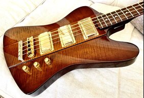
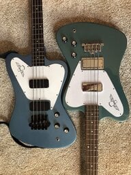
And here I thought I was the only one thinking about ways to cover the logo

.
Honestly, I thought I would hate the logo, but it's not that bad. It's kind of like a Trini Lopez headstock. What I'm realizing with this bass is that it's its own thing. Gibson doesn't appear to have any desire to make a vintage accurate reproduction. I mean, let's face it, pretty much EVERY detail is different than the model it was based on. The headstock is smaller, the tuners are smaller, the logo is not on the truss rod, the pickguard is shaped differently, the neck pickup is further away from the bridge, it's using a 3-point bridge, the pickups have ceramic magnets. They could have very easily not done all of these things, but they did. Which suggests to me that this is their attempt to re-invent the instrument. (Not saying that it's for the better)
You might also find that it's not that big of a deal when you see it in person. If not, then I eagerly await to see what you do to make the instrument look closer to it's 60s counterpart.



 ..
..