BTW: That TR cover changes everything. Go with the brass-n-black look. With the yen coin inlaid in the HS the whole thing will just look freakin' awesome.

TalkBass has been independent since 1998. Add your voice.
Create a free account to reply to discussions, view embedded media, and browse with fewer display ads.
Join free Log in
Want zero display ads or expanded classifieds tools? Compare plans.


If you measure the nut width and the width between the two pointy bits on the top of the headstock, and the length from ...


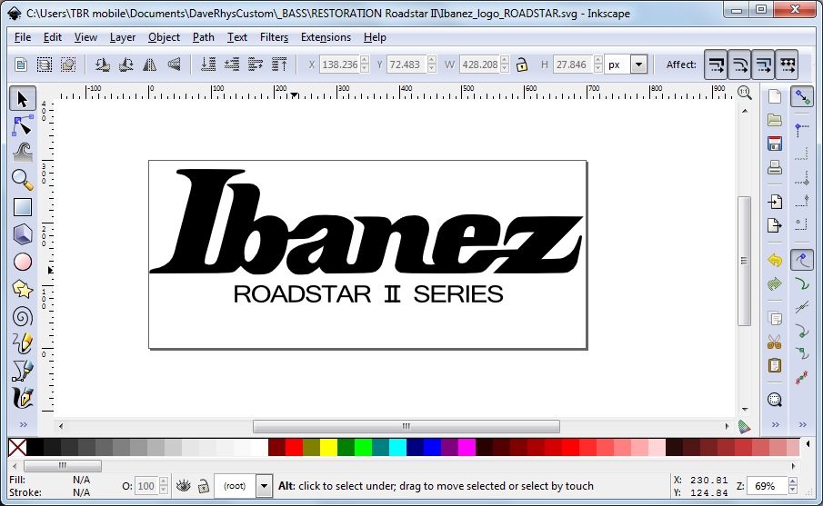
I can't match the lower font exactly, but I reckon that's pretty close?? Thoughts??
On the positive side: I get the words 'Roadstar II Series' back
), so I can't help with measurements, but your logo scares me. You are going to print this in GOLD, yes?You are going to print this in GOLD, yes?


Ah, that's the only problem.
Both the logos I ordered were in gold (as with the original), but there's no way I can print it unfortunately
Gonna have to be black I'm afraid
I can't match the lower font exactly, but I reckon that's pretty close?? Thoughts??
The original strap buttons on these are proprietary and wing-shaped. They would be hard to find to make this restoration authentic, but regular strap buttons or Strap-locks would be a vast improvement on that nail job! Sheesh! DaveRhys, was the original strap button present on the body wing? I didn't see it in the photos.
.
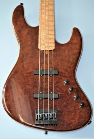


It's hard to tell from the various low resolution pictures I've seen on the google, but I'm 99.999% positive that the font used for "ROADSTAR II SERIES" is Helvetica (aside from the roman numeral II). It looks like you used Arial, which is close, but wasn't widely available when your bass was made). If you want it in Helvetica, I can set that line for you and send you an .eps, .ai, or .svg file.
C'mon man, I'm going through withdrawal here.. I have the DT's bad, and a cold sweat...
Update for the love of God!


