• TalkBass has been independent since 1998. Add your voice.
    Create a free account to reply to discussions, view embedded media, and browse with fewer display ads.
    Join freeLog in
    Want zero display ads or expanded classifieds tools? Compare plans.

Horrible Stock Colors

Status
Not open for further replies.
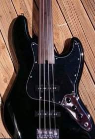
I think there is one rule that 98% of us can agree on, don't paint the fretboard to match the guitar. And if you do, your choices are brown or black.

Someone is now going to post the most beautiful all-white bass on the planet to prove me wrong... :cool:
Well you did ask for it...
Triumviratewebcopy.jpg
JJ4withSubtleBackgroundandOuterGlow_zpscef24176.png
 
The age of ochre. It made a lot of sense after years of bright, shiny plastics and bakelite.

I read through some kids books from when my mum was a kid. Everything back then seemed to be coloured Hospital Ward Green, Faded in the Sun Beige, Battleship Grey, A Little-Dried-Out Orange, or Faeces Brown.
I think they just picked bright primary colours and then threw some white and brown into the mix until the result was basically a green/beige/grey/orange/brown version of brown.
 
  • Like
Reactions: Sartori
Painting the fingerboard just looks awkward and wrong, but then I'm more of a traditionalist so I hold my opinion as my own and won't think wrong of anyone who would be inclined to tell me to "get over it."
That's interesting considering you literally already did exactly that, which is perfectly fine by the way. From my point of view, maple fretboard necks are usually completely covered in a finish, so what's the difference if that finish has color? It honestly makes more sense to me to make the entire instrument match with the same color than to tint the lacquer on the neck to look vintage when it's actually brand new, a practice which is far more widespread. If we can't have painted fretboards, why is it ok to have painted bodies/neck/headstocks? Tradition? More like resistance to change/progress or anything otherwise outside the norm.
 
Last edited:
It's also hard to go wrong with a maple fretboard.,
I read through some kids books from when my mum was a kid. Everything back then seemed to be coloured Hospital Ward Green, Faded in the Sun Beige, Battleship Grey, A Little-Dried-Out Orange, or Faeces Brown.
I think they just picked bright primary colours and then threw some white and brown into the mix until the result was basically a green/beige/grey/orange/brown version of brown.
Very likely. I can't imagine a time when things were made any cheaper. This was the age of Ernest & Julio Gallo and exploding Pinto's.

After coming of age in the 70s, it took me twenty years to have faith that a consumer product might actually work and do what it says...
 
Last edited:
For me it was the Champagne Gold SR300. Loved the way it played and sounded but couldn't cope with the colour, and it was the only one they had.

View attachment 644616
I like it.

Now having posted about liking Antigua & Champagne Gold (And I forget if I mentioned I love Burgundy Mist), but my preference is a finish where I can see the woodgrain--at least part of it--so sunburst, transparent, blonde, natural, or stained.
 
Status
Not open for further replies.

Latest posts